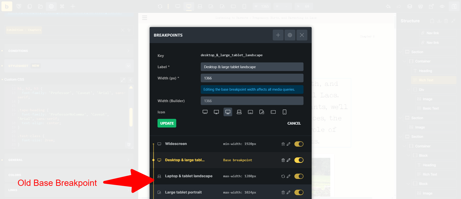
I started developing a website in Bricks v1 and had changed the base breakpoint to one my custom breakpoints. After Theme Stylesheets were introduced in the Theme settings, in v2, I started using them for this site. However, I noticed that all my entries in the Theme Stylesheet are automatically linked to the previous, ‘standard’ base breakpoint, even though this is not the base breakpoint anymore. The old base breakpoint is now set to max-width: 1280px, and all the custom CSS in the Theme Stylesheet is not loading for higher widths than that.
I have disabled caching on my server, regenerated CSS in Bricks, changed the CSS from inline to external files, etc., but the issue stays the same.
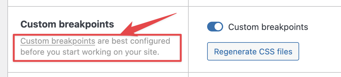
this is why we suggest configuring custom breakpoints before you start working on the website.
If I understand correctly, I don’t think this has anything to do with the 2.0 version (Theme Styles were there even before), but with changing the base breakpoint.
Styles are still applied to the same breakpoint, but because it’s not base breakpoint anymore, they are inside a @media selector. So, what I suggest is that you set your old breakpoint as a base one again, and just update the width of it (and name and icon if you want), to match your new one. Then you can update your new one, to match the old base breakpoint, effectively switching them.
Just be careful, as all the styles that you applied to the new one, will then be applied to different screen width.
I hope it’s understandable; otherwise, please let me know.
Hi Matej, yeah it might not be v2 related. I didn’t remember when the Theme Styles popped up in the Theme settings in the editor exactly. Thought it was in v2 alpha
So you’re saying that the Theme Styles are always linked to one breakpoint, even when that is not the base breakpoint anymore? Might be good to mention that in the docs?
Thanks for the suggested solution. I’ll see what I’ll do. For the moment, I have moved my custom CSS to the Bricks settings, which might be less work than changing around the CSS linked to my breakpoints.
No, sorry for the confusion. You can style the Theme styles on any breakpoint without the issue. But if you then change the breakpoint settings (like in your case), the styles are still applied to the breakpoint that you applied it to - but with new settings.
In your case: If the breakpoint is “base breakpoint”, then it will not be wrapped in the @media CSS rule. So all settings you applied on that breakpoint, will apply everywhere, unless you manually override them on other breakpoints.
But then if you change the “base breakpoint” to some other breakpoint, then suddenly all the styles that you had applied are wrapped in the CSS media rule, effectively changing the styling of your layout.
That’s why it’s advised to set up custom breakpoints before starting the project.
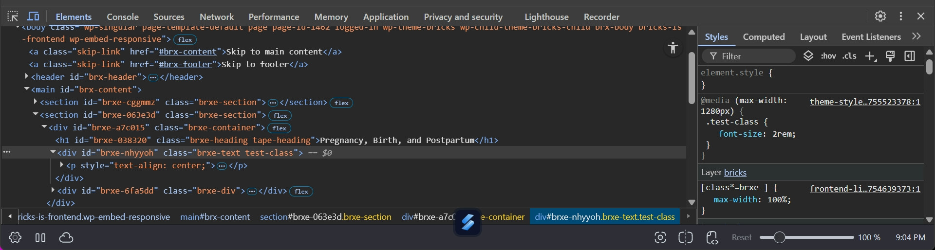
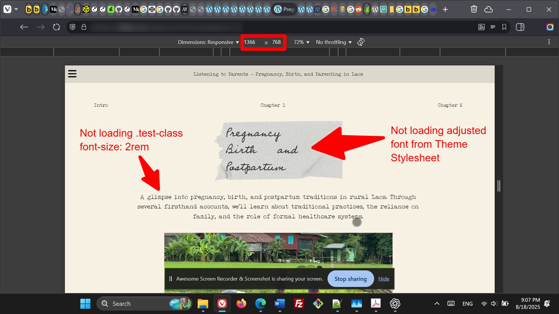
Thanks. I am still not 100% sure if you get what I mean. I am talking about the custom CSS field in the Stylesheet tab under Theme Styles in the editor. Not about any settings on elements. Shouldn’t the custom CSS under Stylesheet be breakpoint independent, or at least linked to the current base breakpoint?
Ahh, that is a clue. (And yeah, this field and contextual spacing were introduced in 2.0) I was only testing with controls. But you are right, if I test with stylesheets, it’s broken, at least on the front end.
Stylesheets in the theme files should not be breakpoint aware. I’ll create an internal task for this.
We fixed this issue in Bricks 2.3, now available as a one-click update in your WordPress Dashboard. The stylesheets are no longer attached to any breakpoint and require custom media queries, if needed.
Please read the changelog entry before updating, and let us know if you continue to experience issues.