VPET
November 8, 2022, 11:27am
1
Hello,
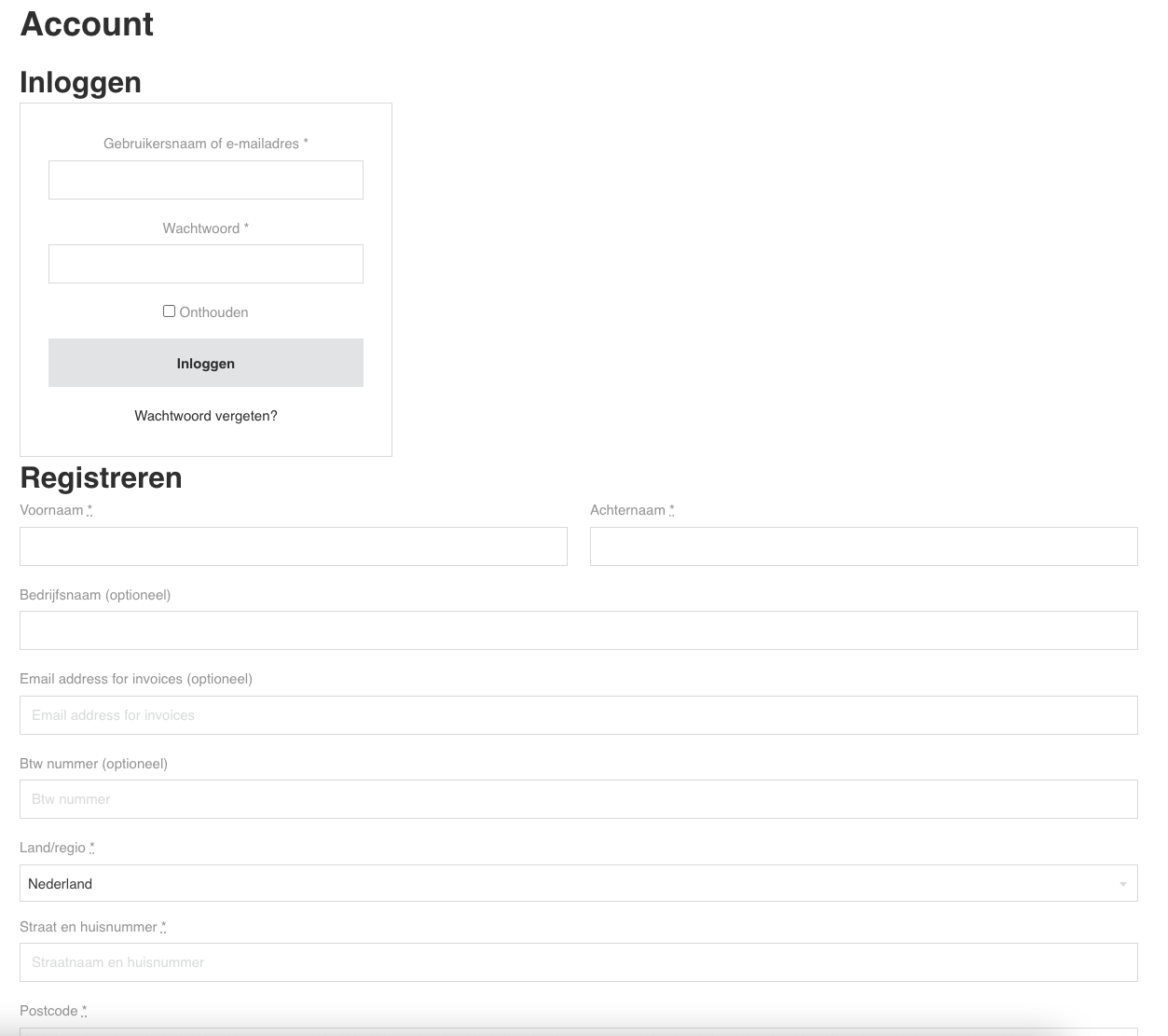
I am trying to style the my-account page from WooCommerce. I’m now busy with the login part but can’t get what I want. The login box and register form aren’t on the same row but in column style.
Is there someone who would like to point me in the right direction or maybe knows the proper css rules for this?
Kind regards,
div
November 8, 2022, 12:19pm
2
Hi there,
VPET
November 8, 2022, 12:44pm
3
Yes of course. Sorry about that.
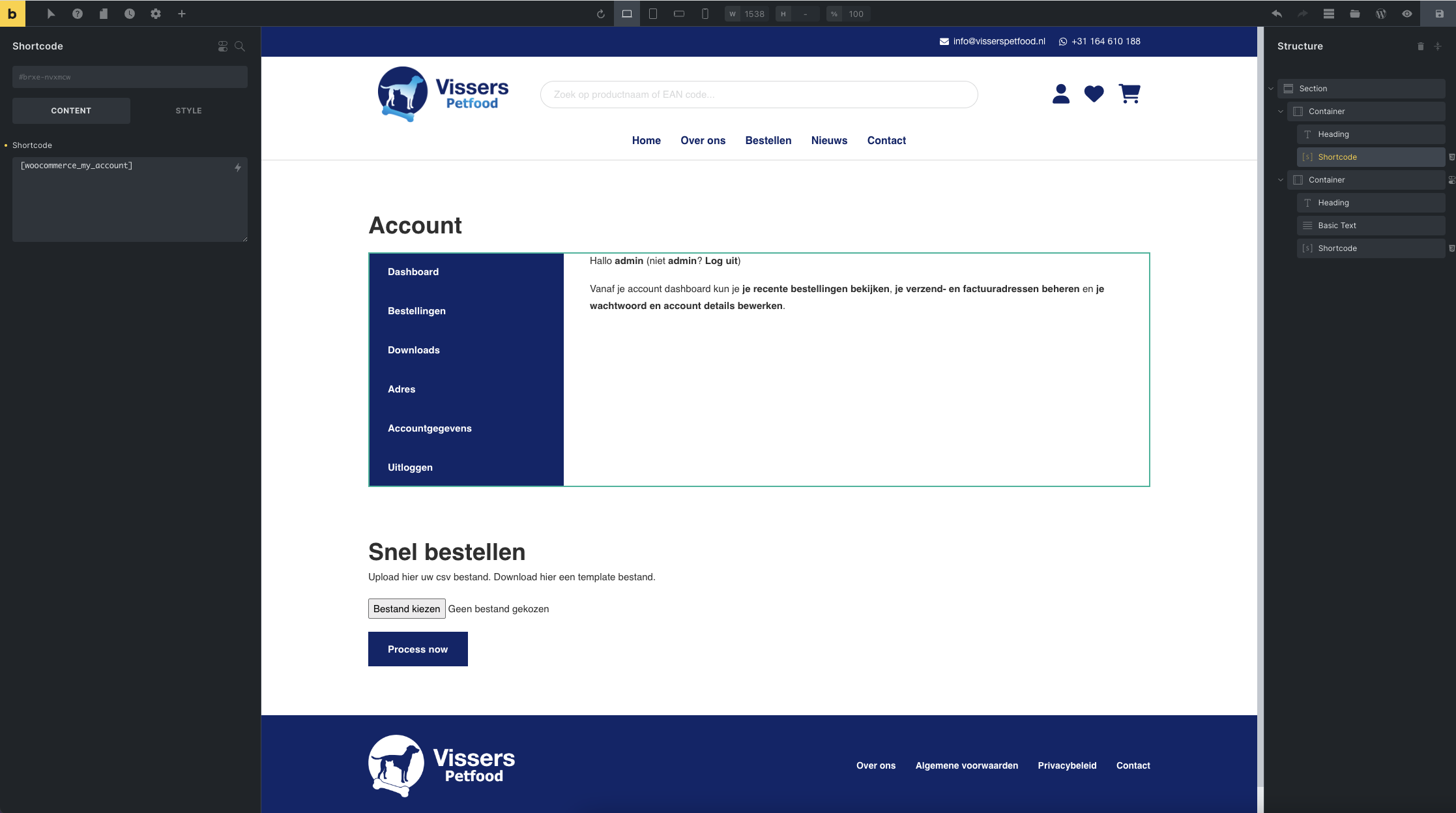
Page: Account – Vissers Petfood
Backend:
div
November 8, 2022, 12:59pm
4
Try adding this to the container:
div#customer_login {
    display: flex;
}
I do recomment to only do this for desktop.
VPET
November 8, 2022, 3:48pm
5
Thanks, this works, what would you recommend for max media size?
@media only screen and (min-width: ***px)
1000px width?
div
November 8, 2022, 4:16pm
6
Click the tablet and enter the following:
div#customer_login { }
Then check on the mobile if the CSS is also changed. (this is the lazy way)
If you wanna get it right, I’d recommend doing the following:
@media screen and (min-width: 990px) { div#customer_login {
    display: flex;
} }
This makes sure that the change is only on desktop.
VPET
November 9, 2022, 9:28am
7
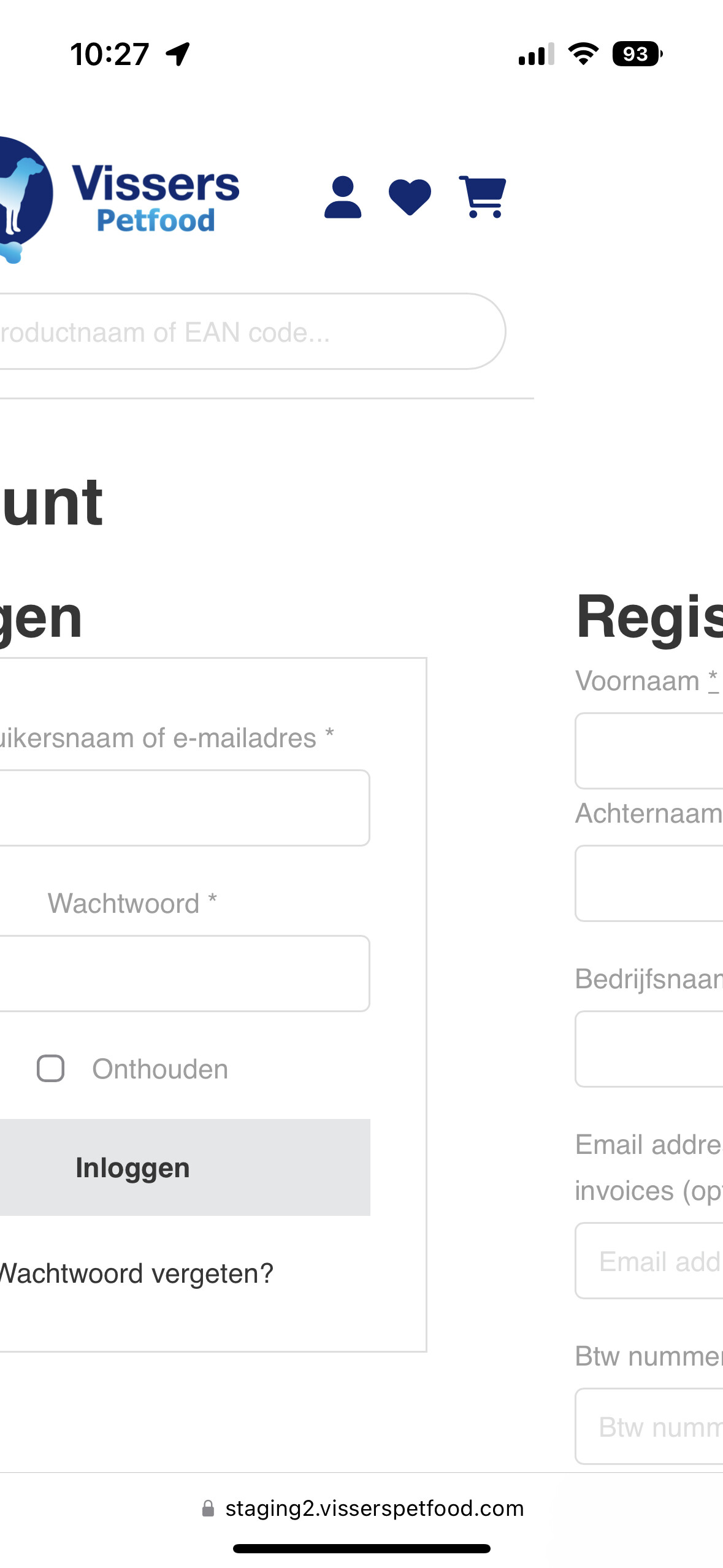
Thanks, if I check this on my iPhone 14 Pro it doesn’t make any change unfortunately.
div
November 9, 2022, 10:28am
8
Ahh I see, the please add this css per device (from tablet and down):
div#customer_login { display: contents; row-gap: 2em; }
VPET
November 9, 2022, 11:16am
9
This did the trick, thanks!
1 Like