You’re welcome. The only question is whether submenus will still work then 
@timmse I can confirm that it does create issues with submenus getting clipped.
I also tried it with overflow-x instead but that just made it worse…
So, this workaround is only fine for sites that don’t have submenus (and are not planning to add any in the future…)

The alternative is to prevent the overflow on the html element @Niko_S
html {
overflow-x: hidden;
}
Then also the submenus work without problems. However, introducing this as default could lead to significantly more problems…
@timmse yep. Wouldn’t it be easier to just re-open this ticket and have the header element fixed in the Bricks system? 
2 Likes
Could you fix the problem. I don’t think it makes sense to fix problems with “tricks”. At some point this will lead to chaos.
I don’t think the problem has been solved.
Using html » overflow-x: hidden solves the problem for now, and it’s not a trick. It’s just regular CSS.
If we provide a quick fix for this, it would probably be nothing different - but could cause other problems. The problem is already on the list, but as I said: one thing at a time…
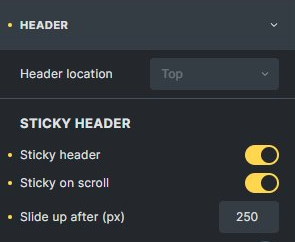
@timmse So, I think I found the culprit that triggers the horizontal scrolling. It only happens when the mobile menu is set to “Right”.
Mobile Menu Setting:

Sticky Header Settings:
Hi Claudio,
Yes, Niko had already mentioned it here: SOLVED: Sticky Header (sticky on scroll + slide-up) causes overflow - #15 by Niko_S
1 Like
I had seen the post, liked and also forgotten again. 
I’m really glad to see the ticket status has changed to “Work in progress” 
Anyway, for those who can’t wait, here’s a neat alternative solution that works like a charm in Bricks: Sliding Sticky Header For Your Website (Headroom.JS Tutorial) - Isotropic
Just make sure the header container you’re targeting is set to position: “fixed”…
Hey guys,
Bricks 1.6 (Beta 2) contains a fix for this problem.
You can download it manually in your account:
https://bricksbuilder.io/account/?v=1.6-beta2
Best regards,
timmse
1 Like
How is this solved when I’m using 1.6.1 and I am still having this issue and not using sticky on scroll and it doesn’t matter if mobile is right or left.
I think my problem (for which I am still waiting for an answer) is somehow connected to this.
Something is just not working with the scroll-up function.
Cheers
Patric
Same here. @timmse
When i turn on Sticky header (just the sticky option) the header will be overflow in mobile view.
When i turn off, the header is good.
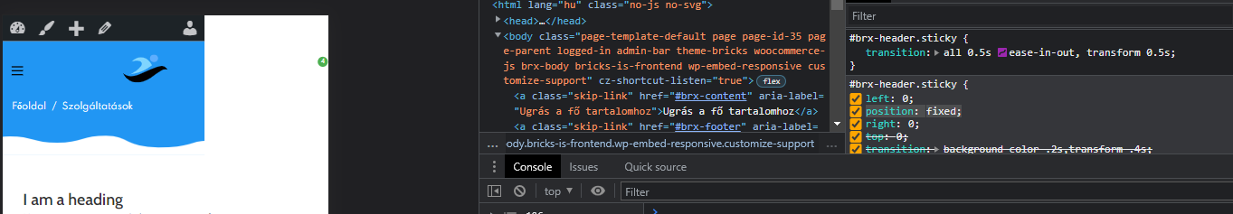
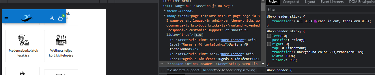
The problem is position:fixed.
If i change it in chrome postition: sticky; and top:0 change top:0 !important will working good!
I just got this solution from timmse (put this code in custom css)
#brx-header::-webkit-scrollbar {
display: none;
}
and it works.
My problem is gone.
Cheers
Patric
Sorry, I posted my answer to wrong topic.
Hey guys!
@Quint & @simplecreative Can you provide me with a live link?
@Patric I still think your problem is completely different - maybe it’s caused by the sticky header CSS, but the fix won’t do anything about this issue.
Best regards,
timmse
Same here - had to disable sticky on scroll to get rid of overflow problem - but I have to add margin on all pages right? Just checking if there is any better solution to this problem has been found since 2022
#brxe-ntvdip:not(.show-mobile-menu) .bricks-mobile-menu-wrapper {
display: none;
}
This fixed it for me. The mobile menu is hidden to the right so it creates a horizontal scroll. Needs display none until it is unhidden.