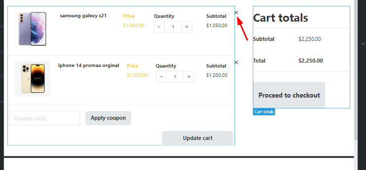
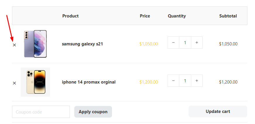
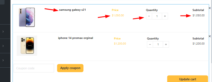
6- It may be strict, but the quantity button is not in the center and should be placed a little lower. (The reason for this is that quantity has Margin from the bottom by default)
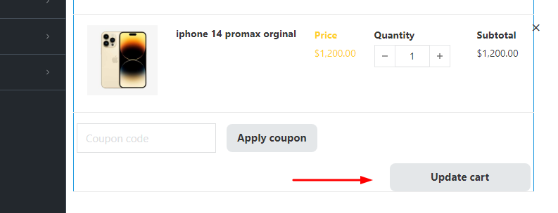
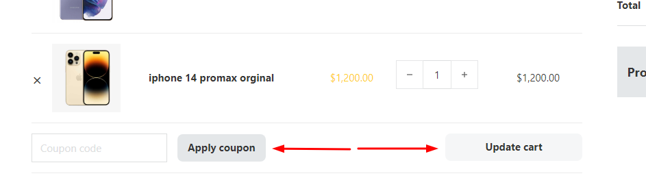
7- This is not a bug. But the very strange thing in this element is that the style of the cart update button and the application of the coupon are controlled in an integrated manner. Please separate the style of these two buttons from each other.
8- If you add the width control for the coupon form and update cart and apply coupon button, it will be even better. Because it will help a lot for Responsiveness.
Hi Hosein,
Some points (at least 1, 2, 4, 5) in your report are caused by different widths (while comparing). In the builder, you usually have much less space available than in the front end (because of the elements and structure panel). If you make the front end smaller, you will see the same behavior, and accordingly, all these points are not a bug.
#3 The border-radius is applied to the thead, which does not work in regular HTML either - so this is not a bug.
#6 This is due to the margin-bottom of the quantity input, which seems superfluous at first glance.
#7 Well, both are WooCommerce buttons You can target both of them with CSS, e.g. button[name=“apply_coupon”] {…}
#8 What is the problem with the current implementation?
About 1,2,4,5, this is the only element that behaves like this.I don’t know if the current situation can be improved or not, but it doesn’t feel good in Builder. Although the front end is important, but still…
#3 Yes, it seems that there is no way.
#6 Yes, but not solvable by default?
#7 Yes, but bricks have customization options for almost everything. But in some sections, although they are simple, there is no customization option for them. There is exactly this position in the mini cart element. I think it would be great if you could improve the current customization options a bit in addition to the great features you add. Please note that not all users know css.
#8 No problem, but it allows users to control the width of these items if needed. For example, on mobile, we want the field width to be 50%, coupon application width to be 50%, and cart update width to be 100%. In this case, there will be no restrictions.
I personally know css to a great extent. But it will be more appropriate to customize the elements with the bricks themselves.
Jet woobuilder plugin offers complete customization options in its cart items widget. But unfortunately, it is only compatible with Elementor.