SOLVED: Size of "Social Sharing" element icons messed up

Bricks Version: 1.5.1 RC
Browser: Chrome Version 105.0.5195.52
OS: macOS 12.5.1

The colors of the “Social Sharing” element are all messed up in 1.5.1 RC (on both the backend and the frontend).

Steps to reproduce on your end:

1.) Add a “Social Sharing” element on a page.

2.) Observe results. :slight_smile:

Screenshot - Google Chrome - 2022-08-30 at 08.12.59 PM@2x

2 Likes

Hi Chris,
Thanks so much for your report!

I was able to reproduce the issue and added it to our bug tracker. It’s not about the colors, the icon size is messed up :wink:

Best regards,
timmse

And what about all the whacky colors?

I cannot see any “whacky colors” on my test site.
Without a live link, I cannot say where they are coming from.

1 Like

I’ll test some more today.

Something changed with 1.5.1 RC though. The colors only showed up then.

It could also be AutomaticCSS though. So will test today with that deactivated.

Probably the body a {} link color :sunglasses:

2 Likes

Yeah, for sure.

However, do a little more playing around. Try this…

1.) Flip on the switch for “Use brand colors”

2.) Go to the “Style” tab and choose a Typography color to style the symbol in the icon.

No issues, no bugs?

Also…

How do you space the icons apart from each other, without Custom CSS?

Right now I’m resorting to this:

[data-balloon] {
    margin-left: 11px;
}

[data-balloon]:first-of-type {
    margin-left: 0px;
}

Thanks for all your help! Bricks is AMAZING. :star_struck:

Okay… This Custom CSS fixes all the issues I cited in this post.

But I still think there are a few issues, some with Bricks, and some with AutomaticCSS.

.brxe-post-sharing.brand-colors [data-balloon] {
    margin-left: 11px;
}

.brxe-post-sharing.brand-colors [data-balloon]:first-of-type {
    margin-left: 0px;
}

.brxe-post-sharing.brand-colors a {
    color: #fff;
}

.brxe-post-sharing.brand-colors svg {
    height: 19px;
}

The final outcome now looks like this:

Hey Chris,

The problem exists only on the canvas, on the frontend it is displayed correctly. After reloading the builder, however, the styles are displayed correctly on the canvas. Nevertheless, a reload should not be necessary :v:

What’s the problem? As I said, probably the styles are overwritten by something (ACSS).

By using margin, as it is by default.

Bildschirmfoto 2022-09-03 um 10.53.09

Best regards,
timmse

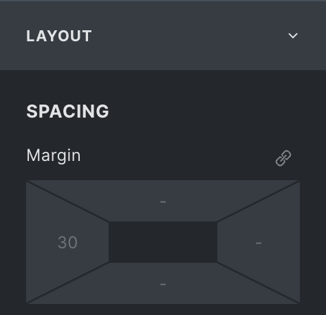
@timmse - The problem with the margin approach like that is it applies a margin-left on all breakpoints, making it harder to center automatically, you have to override it (which you could do by switching to a lower breakpoint and remove in the builder, as you have shown).

However, it would be nice if there was an option in the builder to simply add space between the icons (without using margin). It’s a very common need, use-case.

1 Like

Hi Chris,
We’ve fixed the sizing issue in Bricks 1.5.1, which is soon available as a one-click update in your WordPress Dashboard. Please let us know if you are still experiencing issues.

If you want to use gap instead of margin – it’s a one-liner custom CSS, which should not be too much for anyone :slight_smile:

Best regards,
timmse

1 Like

Thanks for the update.

I’ll give “gap” a try as well.

@timmse - I applied .gap--xs via AutomaticCSS and I get this now. :slight_smile:

Screenshot - Google Chrome - 2022-09-07 at 07.55.38 PM@2x

1 Like

And I solved the issue of the link color by simply changing the Typography color to white (this didn’t work in 1.5.1 RC. It works in 1.5.1 official though).

1 Like

Thanks for posting your fix - worked for me. Using ACSS.

1 Like