It’s a drag fiddling with paddings/margins for flexbox items. There is a flexbox gap property that just got wider browser support: Can I use... Support tables for HTML5, CSS3, etc. Be awesome to have this added to the UI. Works in similar way to grid gaps.
Yes, the gap for the child items of the container has to be managed somehow. And it has to be managed easily in one place (messing around with the individual margins/paddings of each child is definitely not a good solution).
Not sure about the use of the flex version of the gap though - it still has got only 70% support.
The grid gap is a different story, it can be used right away (when the CSS grid support comes). But the flex “gaping” has to be resolved anyway, waiting for the grid version of the container is not the solution.
Agreed. Elementor has a gap selection i.e. small, extended, wider (something like that I don’t remember). I’m not sure how they achieve these gaps. Are they using flexbox gaps or some other way? 70% isn’t bad, it surely will go up quickly. Note recent dvelopment for safari support: Safari 14.1 Adds Support for Flexbox Gaps | CSS-Tricks
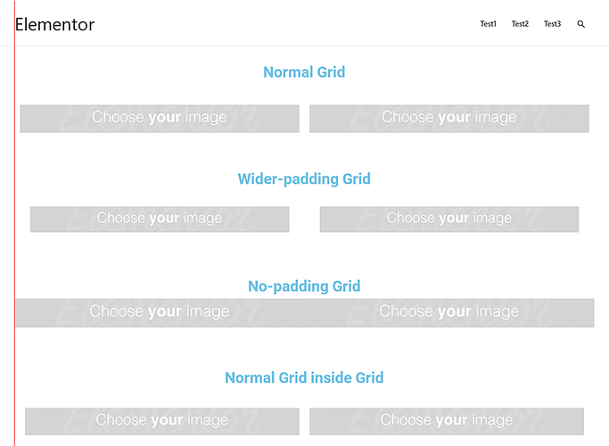
Unfortunately, Elementor uses simple padding on the column div, half of the desired width on each side. Which brings one big negative impact: it also creates unwanted gap for the whole row (rows with the different gaps are not inline on the left and right side). This could be resolved by a little trick using negative margins on the row element, but there has to be one there.
Here is the illustration of the problem:
@mike In Bricks 1.2 you can now set “Column gap” and “Row gap” when editing the new “Container” element. So I am going to mark this request as solved 
