Browser: Chrome 110
OS: Windows
Hello,
In most sections of the builder, the search box acquires a white border on hover and focus. But in some areas this is not the case. Such as:
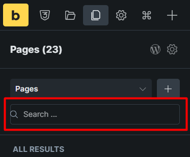
1- Pages panel
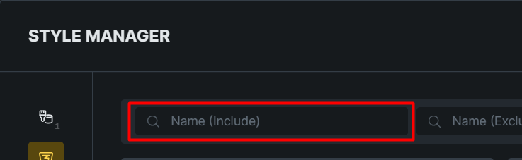
2- Style manager
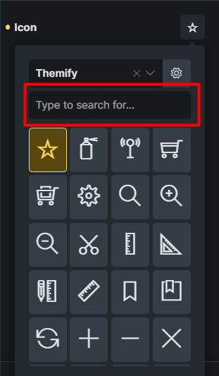
3- Icons list
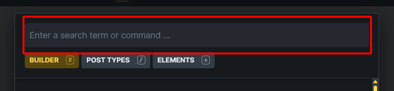
4- Command palette
I noticed that too. With the introduction of many new features, the UI needs tightening and unification across the builder.
Thanks for your report!
Yes, overall it could be a bit more consistent—though whether it has to be that rather “bright” white everywhere is another question.
I’m moving this thread to “Improvements” because the functionality isn’t limited by the lack of border colors 
We’ve addressed this in Bricks 2.4, now available as a one-click update in your WordPress Dashboard.
Please read the changelog entry before updating, and let us know if you experience any issues.