Bricks Version : 15.2Browser : Chrome 90OS : macOS / Windows / Linux / etc.URL : https://bricksify.com/
Since I upgraded to 1.5.2, I have an issue with the responsive position of the prev arrow: it looks like the bottom settings are not applying:
The issue is only on frontend - On backend, it shows correctly. I tried to change the value and resave several times, but it didn’t work. The next arrow is working fine. I thought it was a “relative” position issue at first, but then I figured out no bottom values get printed in the CSS.
Cheers,
cmstew
September 13, 2022, 4:38pm
2
Seems to be working for me. Do you think perhaps you’re making the change on a specific breakpoint that you are aren’t looking at on the front end?
Yes! I confirm it’s happening on a <768px breakpoints only.
timmse
September 14, 2022, 10:06am
4
Hi Maxime,
Unfortunately, I cannot reproduce the issue. What exactly do I have to do?
Best regards,
Hey @timmse ,
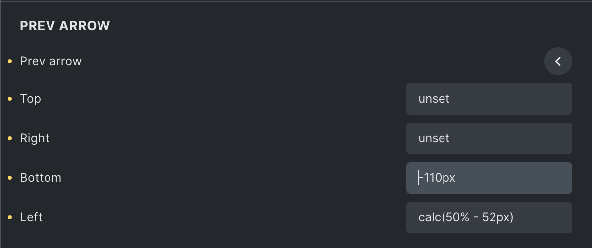
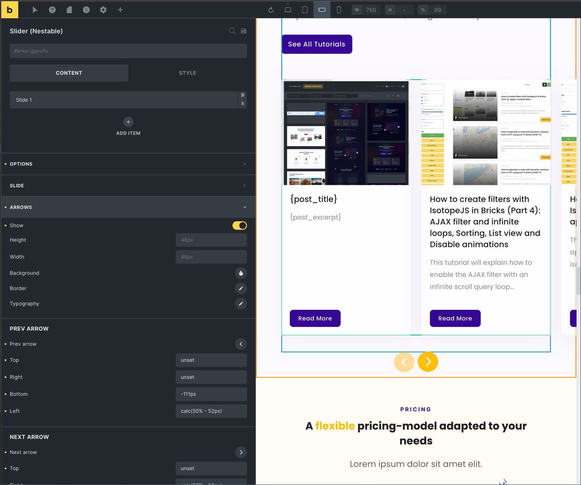
To see the issue, you can check the link I shared, resize it on < 768px breakpoint, inspect the prev arrow that is overflowing from the slider and see there is no bottom css property added to the stylesheet (should be bottom: -110px).
Btw I inspected the JSON, and the value is correctly printed in it:
        "prevArrowBottom:mobile_landscape": "-110px",
        "prevArrowRight:mobile_landscape": "unset",
        "prevArrowLeft:mobile_landscape": "calc(50% - 52px)",
        "nextArrowTop:mobile_landscape": "unset",
        "nextArrowBottom:mobile_landscape": "-110px",
        "nextArrowRight:mobile_landscape": "calc(50% - 52px)",
That’s the reason why it looks good on backend:
Unfortunately it’s not working on frontend.
Cheers,
timmse
September 14, 2022, 11:05am
6
Ah sorry, now I understand - but unfortunately, I still can’t reproduce it. Can you test whether this also happens with a new slider?
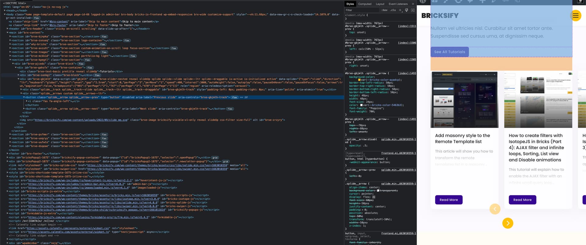
if you inspect the source code, you can see there is weird “2” printed in the css. I guess this is the issue:
/* BREAKPOINT: Tablet portrait */
@media (max-width: 991px) {
2
}
/* BREAKPOINT: Mobile landscape */
@media (max-width: 767px) {
2
#brxe-gqvvfo .splide__arrow--prev {bottom: -111px}
#brxe-gqvvfo .splide__arrow--prev {right: unset}
#brxe-gqvvfo .splide__arrow--prev {left: calc(50% - 52px)}
#brxe-gqvvfo .splide__arrow--next {top: unset}
#brxe-gqvvfo .splide__arrow--next {bottom: -110px}
#brxe-gqvvfo .splide__arrow--next {right: calc(50% - 52px)}
#brxe-gqvvfo .splide__arrow--next {left: unset}
#brxe-gqvvfo .splide__arrow--prev {top: unset}
}
1 Like
maybe that “2” comes from the perPage settings?
        "prevArrowLeft": "unset",
        "perPage:tablet_portrait": "2",
        "perPage:mobile_portrait": "1",
        "perPage:mobile_landscape": "2",
        "prevArrowBottom:mobile_landscape": "-110px",
        "prevArrowRight:mobile_landscape": "unset",
        "prevArrowLeft:mobile_landscape": "calc(50% - 52px)",
        "nextArrowTop:mobile_landscape": "unset",
        "nextArrowBottom:mobile_landscape": "-110px",
        "nextArrowRight:mobile_landscape": "calc(50% - 52px)",
timmse
September 14, 2022, 11:13am
9
Yep, it is
btw, I have just deleted the “2” perPage on mobile landscape → Saved → readded the 2 → saved → issue solved. Might be useful for your bug tracker
timmse
September 14, 2022, 11:34am
11
Yes and no, because the “2” is still there - just now at the end, so it doesn’t affect the following styles
timmse
September 19, 2022, 3:02pm
13
Hi Maxime,
Please let us know if you are still experiencing issues.
Best regards,