No offense but I have the same problem and frankly it is offensive to tell a paying customer, who uses your theme for the purpose of having a tool to build a specific look and feel without a bunch of custom CSS, that they should just add this one of custom code, which mind you… doesn’t work.
I assume your team has since changed the class selector associated with the nav menu but that only reinforces my point. Making your customers have to keep track of changes you guys make to the theme so that their custom code can continue working isn’t how you do business.
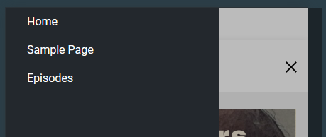
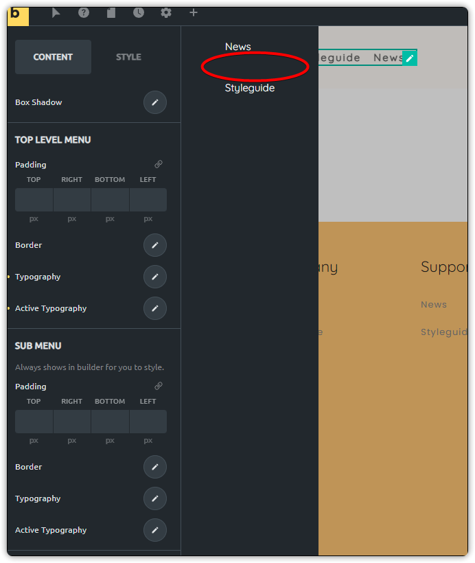
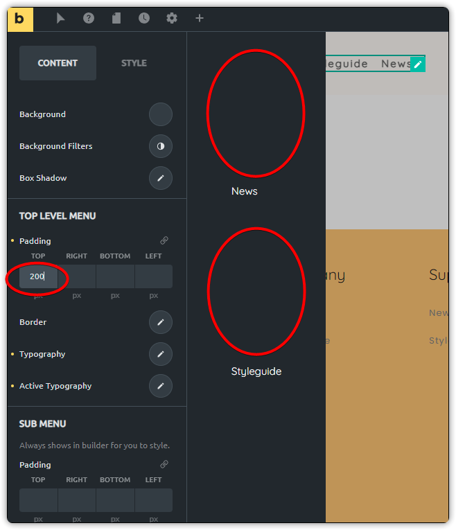
As you can see from my example, there is no padding above the UL within the nav element. Making the text sit right at the edge of the screen. There also doesn’t appear to be a way to add some padding above the UL in the mobile nav menu. Which means myself and anyone else who is a paying customer will need to accept that we need to write “one line of CSS” to fix a problem you could easily fix by adding the ability to add some padding to the mobile nav menu element itself.
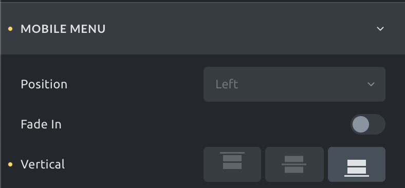
I don’t mean to be that guy but your little “No offense” statement is unprofessional to say the least. This shouldn’t be a feature request because it should just be a feature… Look at the image above, it looks like trash out of the box and would require custom CSS to solve the problem. Your team added a “top” setting, which no one would ever need… ever! Who wants to put a gap above the menu so the full screen menu starts below the top of the page?! Who requested that silly feature? Instead you could have given a padding option for the mobile menu itself. No, instead you tell people they should add one line of CSS so they can get wet while swimming.
Its pretty simple, the mobile menu should have a padding option. We shouldn’t need to use custom CSS to resolve this issue. We shouldn’t need to test our site after every update to make sure you guys didn’t change the nav menu selector again. We shouldn’t need to get on this support chat to ask how to handle this because it should just be there as an option. We also shouldn’t need to create a custom nav or mega menu to fix a problem because your team didn’t think to add a padding option to the mobile menu element.
Also, what is the “I am curious how many upvotes the idea gets 
 ” line about… That is just putting salt on the wound because you can’t see an obvious need for a built in feature that shouldn’t require a feature request or upvotes to get your team to add it. Maybe instead of insulting your customers and being condescending all in the same issue you could instead make a better product so we don’t have to use custom CSS to fix something to trivial as adding padding to the mobile nav menu.
For any future people that come across this BUG report and scrolls past the broken advice and the toxic belittling by the mod. This is the custom line of CSS you can add to give you some padding above the bricks-mobile-menu element… since the mod didn’t think it was important enough to add a padding option to the mobile nav menu itself.
.bricks-mobile-menu-wrapper {
        padding-top: 6rem;
    }
Obviously, change the padding value to whatever works for you.