Bricks Version: 1.4
Browser: Chrome 102
OS: Windows
URL: Index of /fest
Can’t scroll the mobile menu when you open main menu all the way bottom so that submenus are hidden.
Bricks Version: 1.4
Browser: Chrome 102
OS: Windows
URL: Index of /fest
Can’t scroll the mobile menu when you open main menu all the way bottom so that submenus are hidden.
Scrolls fine for me but I have to scroll using the left side of the menu, if you scroll on the right side it won’t because it doesn’t go that far. You’d likely need to address this with increasing the width of the mobile menu to 100vw or something like that.
Hey Hiekeun,
adding the following custom CSS to the menu should fix the issue:
root .brxe-nav-menu .bricks-mobile-menu-wrapper ul.bricks-mobile-menu {
  width: 100%;
}
Best regards,
timmse
I know I need to scroll using the left side. It’s scrolling but not all the way down.
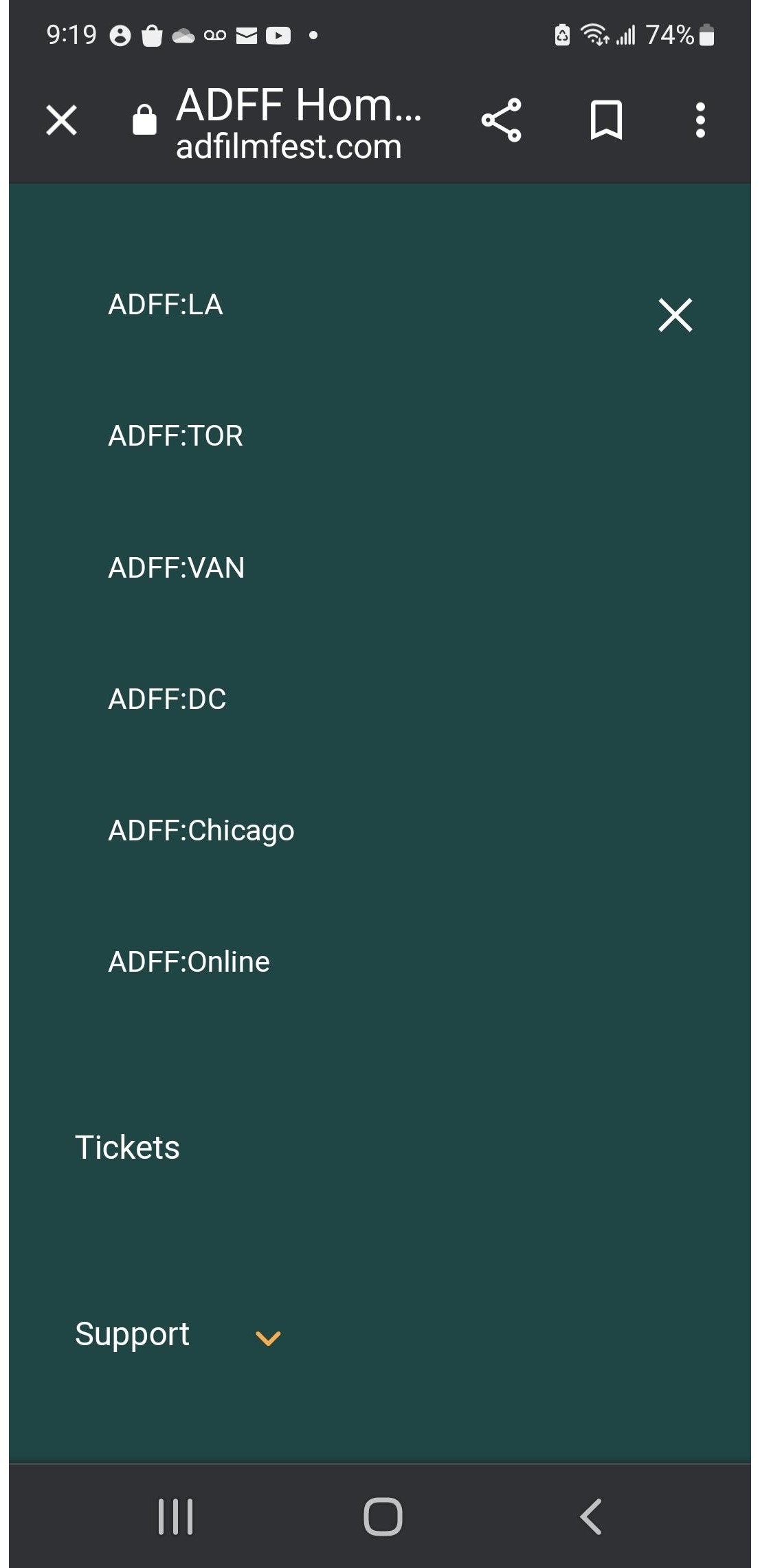
Can you see and select the submenu item, Festival Images?
Thanks for your quick reply.
It didn’t change any. Here’s the problem I noticed. Using Samsung Android phone, can’t scrolling much. Apple phone, you can scroll and looks like black scrollbar is on the right but can’t select menu. You know what I mean. My index finger at the top and menu is back to top as soon as I release my finger.
I think I see what you mean now… the last item is hidden by the browser bar (at least in safari on iOS) and so to see that last one I had to scroll a little further than usual. It’s still scrolling though so I think your original description of the issue was a little unclear, at least to me. It seems the main issue isn’t scrolling but just that once fully expanded you can’t see the very last item, right?
A video is probably best to properly show off the issue for others.
Thank you for your hint.
Solved by setting the height of mobile menu wrapper 100%. It works. I can scroll all the way down and select the last menu item.
------ ISSUE
However, it’s not working if I set any margin or padding to the mobile menu wrapper.
For example, I wanted to move down the mobile menu under the main navbar so that added following code.
.bricks-mobile-menu-wrapper {
margin-top: 60px;
}
Then the mobile menu didn’t show all submenu items.
Is there an ETA on when this will be addressed?
Hey John,
We have recently updated the Nav Menu element, so this problem should no longer be acute. Please get in touch with us if you still have problems.