In version 1.8, there was an issue where the body would scroll behind the menu when the mobile menu was active. That was fixed in today’s version 1.8.1. However, the mega menu items (dropdown menus) coincidentally can no longer be opened on mobile.
Hi @thomas ,
Before 1.8.1 it seemed to work even when not choosing any option from the “Toggle On” setting, now we have to set it to “On Click” specifically for it to work, which makes sense.
Is there a way to set this option on the Nav (Nestable) element so it sets it for all dropdown child elements? That would be a nice Quality of Life feature.
Thanks.
Edit: I just realized that this setting is not set per breakpoint basis, which resulted in me setting it to “Click or Hover” so it works as I intend it: Hover on desktop but click on mobile landscape and smaller screen sizes.
Hi Bret
I love the way you did your mega menu
Would it be any chance that you you share to me to try it in my site
I mean that you share the the template?
Thanks, and sure thing. Here’s a download link. I had to upload it to Droplr in a .zip file because they don’t allow .json. The link is valid for 7 days.
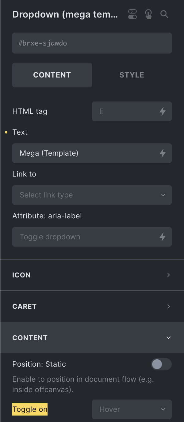
 Yes, it’s set to hover.