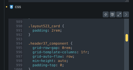
I found that the media styles went into the CSS box marked with: /* Extracted from pasted content that could not be mapped to a specific element or class. */
Just to make sure I understand the expected behavior correctly: Are you saying that when a class is imported from the HTML/CSS importer, any matching rules inside media queries should also be attached to that same class, ideally under the relevant breakpoint/custom CSS, instead of being placed into the generic “could not be mapped” CSS fallback?
So in your example, .header37_component would be created as a class, and the @media screen and (max-width: 991px) rules for .header37_component would remain connected to that class, via custom CSS control on that class?
Is that the behavior you would expect here?
I just want to see if I understand correctly, before doing anything.
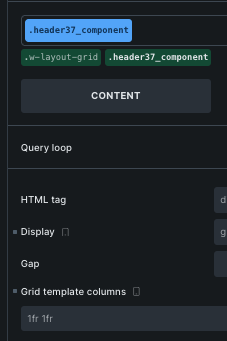
Yes, that is exactly what I am saying. For example, when I look at this class on the mobile breakpoint, I see “1fr 1fr” for Grid template columns (screenshot). It is in light gray, which indicates that it is coming from a higher breakpoint. But I think the correct behavior is to show “1fr” there because the media query has grid-template-columns: 1fr;.
In fact, I think that the issue is more generalized to all CSS rules inside media queries, even if they are only declared inside a media query. (I am not absolutely sure about this. Please correct me if I am wrong.) For example, this class .mobile-card-padding only exists inside a media query. I think it would be put directly into the “could not be mapped” and would not appear as a native Bricks class at all.
Thanks again for the report and the follow-up explanation.
I split this into two internal tasks:
One task for the builder UI placeholders not reflecting the effective values from media-query CSS on a class. So if a class has padding: 80px on the base breakpoint and padding: 24px inside @media (max-width: 767px), the UI should reflect the responsive value when viewing that breakpoint.
Another task for improving the HTML/CSS importer so matching class rules inside media queries stay attached to the imported class, instead of being moved to the generic “could not be mapped” fallback CSS/code area.
So yes, your expected behavior makes sense: if .test-card is imported as a Bricks class, then matching media-query rules for .test-card should remain connected to that class.
We’ve addressed this in Bricks 2.4-beta (beta release), now available for manual download from your Bricks account.
Please read the changelog entry before testing, and let us know if you experience any issues. Note: beta builds are not recommended for production sites.