Bricks Version: 1.3.7
Browser: 96.0.3 (64-Bit)
OS: Linux
Hallo @all,
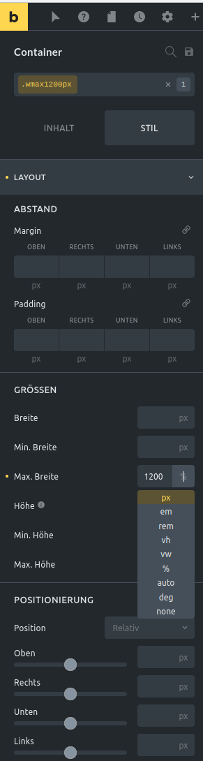
If you try to set a maximum width in pixels, this px unit cannot be selected. Instead, Percent always remains selected.
My temporary workaround is this:

Regardless of whether you have first entered the value or not, you set the unit to none.

Then, in the value field, enter the value along with the unit. In my case “1200px”.

Then you also get the pixel unit selected in the unit field.
Kind regards
Matze202
I later noticed that this class entry was duplicated in the source code.
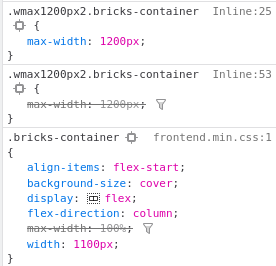
The class name was changed from .wmax1200px to .wmax1200px2 by me for testing purposes to determine that it is the same class entry.
In addition, I haven’t noticed any way to link such classes directly to separate display sizes via bricks without self-written CSS code.
If I only want to hook this to displays wider than 1250px and have the default 100% width for smaller ones, how do I do that?
Until there might be a solution for this, I’ve helped myself with the following custom code.
@media screen and (min-width: 1250px){
  .wmax1200px{
    max-width: 1200px;
  }
}
Alexa
3
Hi Matze,
This was already reported:
Image Max-Width cant be changed to px
1 Like