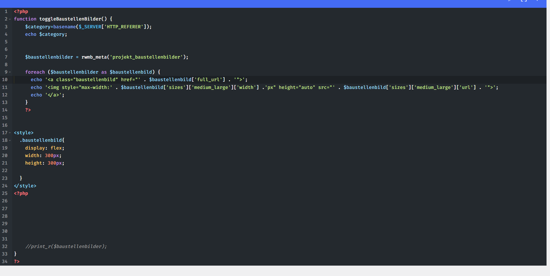
I am using metabox for my custom post type where I want to output some images based on the category-archive page the User is coming from. I can’t use the image galery element because of that custom conditions, so what I did is creating the output myself using PHP.
I’ve nested the img elements inside an <a> tag so I can get use of a lightbox. I want to have every <a> tag equal in width and height and want to center the images inside of it using flex-box. The <a> -Tags have overflow: hidden assigned.
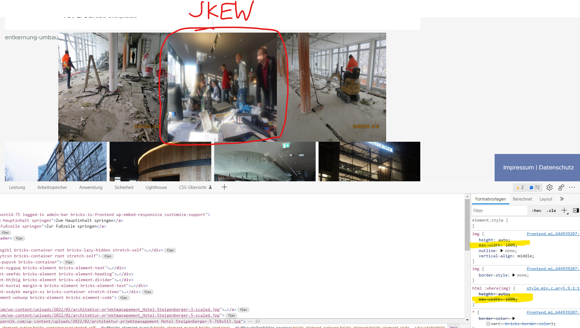
Now it seems that bricks assigns automatically a max-width of 100% to the images (see yellow marked in my screenshot). That’s not really a bug but kind of a behaviour I would like not to have!
I’m not sure if you need that two assignments (img and html :where(img) ) for something else, but for me it would be cool if they wouldn’t be there since they are skewing my images if I don’t assign the max-width value to them!
The max-width on the images primarily ensures that they behave responsively. However, if you set the width and height to 300x300px, and the image is generally not square, it will, of course, be squashed. For example, in your screenshot, I see that one of the images is e.g., 768x513 pixels - if you “force” it to be 300x300px, it can’t be displayed correctly.
Yeah but I only set the wrapper-container to 300x300px and I want the nested img inside to behave like a normal image. For example I have my 300x300 container and I have my image inside with the normal medium_large sizes… I want to center that Image inside my container and that’s where the max-width setting doesn’t come in very handy!
yes, but that’s only the nested image size. The Container itself which is wrapped around the image has the 300x300 px so I am technically not forcing the image to have that size but the container, which shouldn’t affect that image in any way (of course it does because of the max-width: 100% setting on the image itself, that’s whats forcing the image to be 300px width).
Don’t get me wrong. I’m totally ok with that solution. Your suggested solution works fine and my solution in the 2nd Screenshot (the first one was only to illustrate the problem, the second is with the solution for it) works also fine. I also don’t have a problem to set a max-width on that images, I just wanted to point it out because I wouldn’t expect that behaviour when writing custom html/css…
In the example of the images, the default styles are of course applied to every image and not only to “Bricks images”. Accordingly, they will of course be applied to your custom code as well. Overriding the styles shouldn’t be a problem though.
I mark the post as solved because it’s definitely not a bug

