Problem is not caused by the box shadow. Removed the box shadow and the mask is still not working correctly. Should be transparent outside the circle, but isn’t.
The “masked” box shadow was supported prior to version 1.9.8. I don’t know exactly the version when i was used the drop shadow first, but i think 1.9.4.
Did the round picture mask in Bricks (Border / Box Shadow / Border → Radius) and the box shadow with ACSS .box-shadow–l
Worked perfect until the update to 1.9.8. Now the mask seems no longer to be transparent, when using box shadow. ACSS or Bricks doesn’t make a dfference.
I am confused because your original report is about the image mask setting, but now you are talking about border-radius
Understandably, the box shadow is not visible when the image mask is used because the mask masks the shadow.
However, I can understand/replicate that the box shadow does not work as expected in combination with the border-radius and if the image has a tag (such as a figure or picture) in 1.9.8, as the styles are split between the tag and the img.
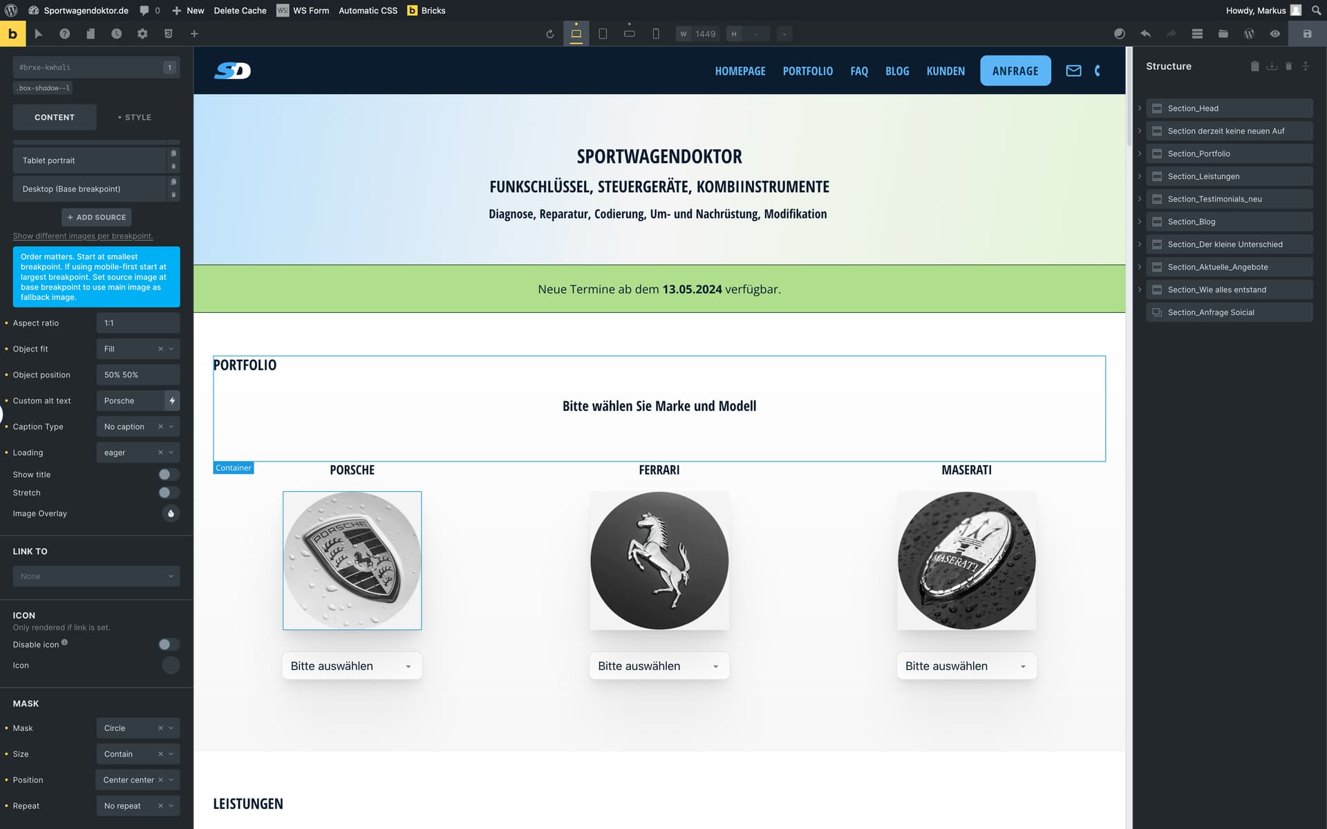
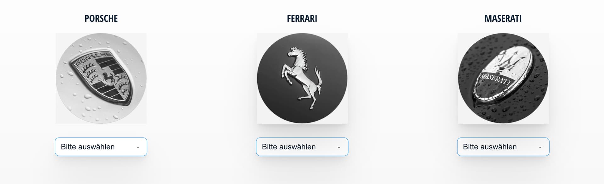
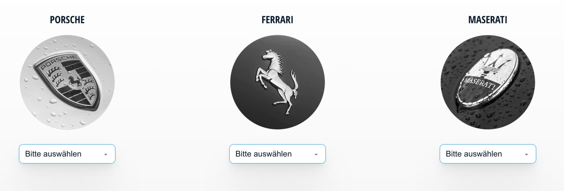
@timmse I’ve used “figure” tag on an image element, set a border radius (making it a circle), set a border (solid, 2px, with color) and also given it a box-shadow.
Before 1.9.8 this worked perfectly and gave a circle image with a proper border with shadow visible around it (see 2nd image in this post). Now it gives a circle with a square over it and shadow only outside of the square.
This is because now box-shadow styling is applied to the <figure> WHILE a border styling (including radius) is added to the <img>.
Simply adding custom CSS (which itself is applied to the <figure>) defining border-radius makes it look the same as it looked before the update.
Thank you for your explanation @Matiasko. This is what I have already confirmed:
However, I still don’t know what the original report is about (image mask + box shadow or border-radius + box shadow), as the statements overlap and are therefore somewhat confusing - at least to me
Sorry for the late response. I think in the end my problem is the same as Matisko reported.
The brand pictures in my example also used the figure tag. I’ve set the border radius, to create a round mask. That works perfect until you want to add a box shadow. The only difference to the example Matisko gave is that i’ve used ACSS to create the box shadow.
Ok. As long as it is tag + border-radius + box shadow the problem will be fixed in the next version.
With the “mask” setting, however, it is to be expected that the box shadow is not visible.

