Bricks Version: 1.1.3 Browser: Chrome 90 OS: Windows URL: not online anymore, but very easy to reproduce.
Currently, the Image Gallery loads the full sized images from the media library. If you change it to any other size, well, the other size is loaded but the Lightbox also displays this small image then. The Lightbox should display the full sized original.
Reproduce:
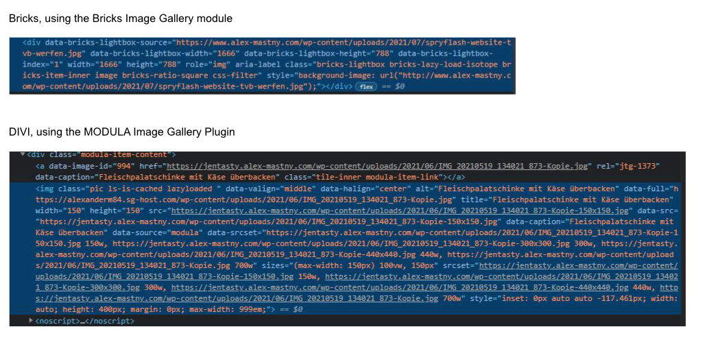
add an Image Gallery, insert a few images and examine the image sizes at the frontend. it has 2 times the same image like in my screenshot.
how it should be could be seen at the plugin MODULA (https://wp-modula.com/)
At this screenshot you can see the different image sizes (and they are really different, I tested them)
Hi @AlexMastny. We’ll a new “Lightbox Image Size” setting to the Image Gallery element in the next update (1.3.2). So I am going to mark this request as solved for now
Hey, I think the problem is not solved.
Image Gallery is not using diferent sizes for evrey screen, this is the problem. Your other element “posts” it is using diferent sizes of image, adapting the images to evrey size of screen, but in image gallery it is only using the size we choose on the preferences of the element.
It would be nice, and important for teh performance of Bricks, you allow that “image gallery” element can adapt the wordpress media sizes to every screen.
Well, the initial problem is solved. Previously, you were not able to select a Lightbox image size - now you are.
The images inside of the posts element behave exactly like the images in the gallery and won’t change per breakpoint. Or I’m completely misunderstanding you right now
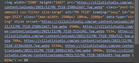
I´ll try to explain with some screenshoots. This is a “image” element fromBricks. You have srcset, and the different sizes of the image that can fit different sizes of the screen.
The next screenshoot is from “image gallery” from Bricks. We only have a src from the size of the image we choose. Not all the sizes from wordpress. I can choose in the element this size, as well as the size of the lightbox, so I think it would be good the image can fit the screen as it can on the “image” element.
We make portfolio pages for photographers and graphic designers and “image gallery” element is perfect for that, but we have the problem that we are always loading de full image. it would be good you use the same path that you have implemented on “image” element, so the image can fit the screen and loading the optimal size to improve speed.
And sorry for my two replays, I´m new on the forum, and bricks, and i limited to put put an attachment file on every replay.
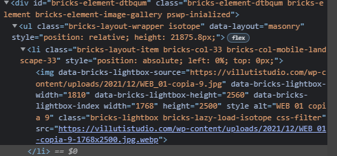
Hey, I think I found a solution to make this problem works. It is commented on your theme, inside “image-gallery.php”. I hope you can improve that to adapt image gallery to difrent sizes of screen, improving the speed.
And now the images get srcset, with the different sizes that Wordpress made. I am trying on different devices, and now your theme load the perfect image for every size of screen.
Hey. And the same with “posts” element. This element only get different sizes if we use lazy loading from Briks, but if we disable it, we loose srcset. We think is impoirtant to improve loading speeds with less size per image.
Changing this on the “posts.php” element on line 825 we get srcset without your lazy loading.