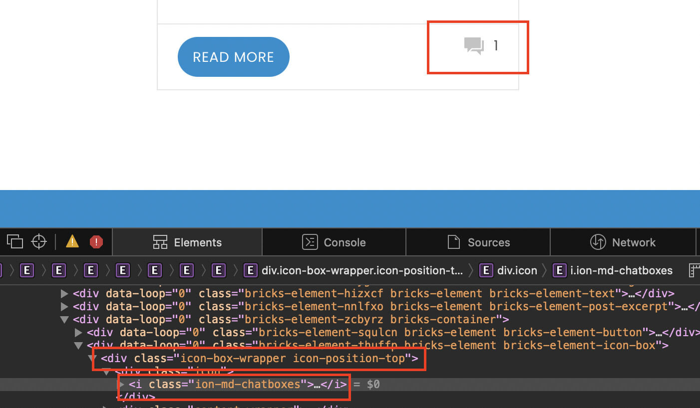
The new builder interface for the icon, does not reset icon classes correctly…
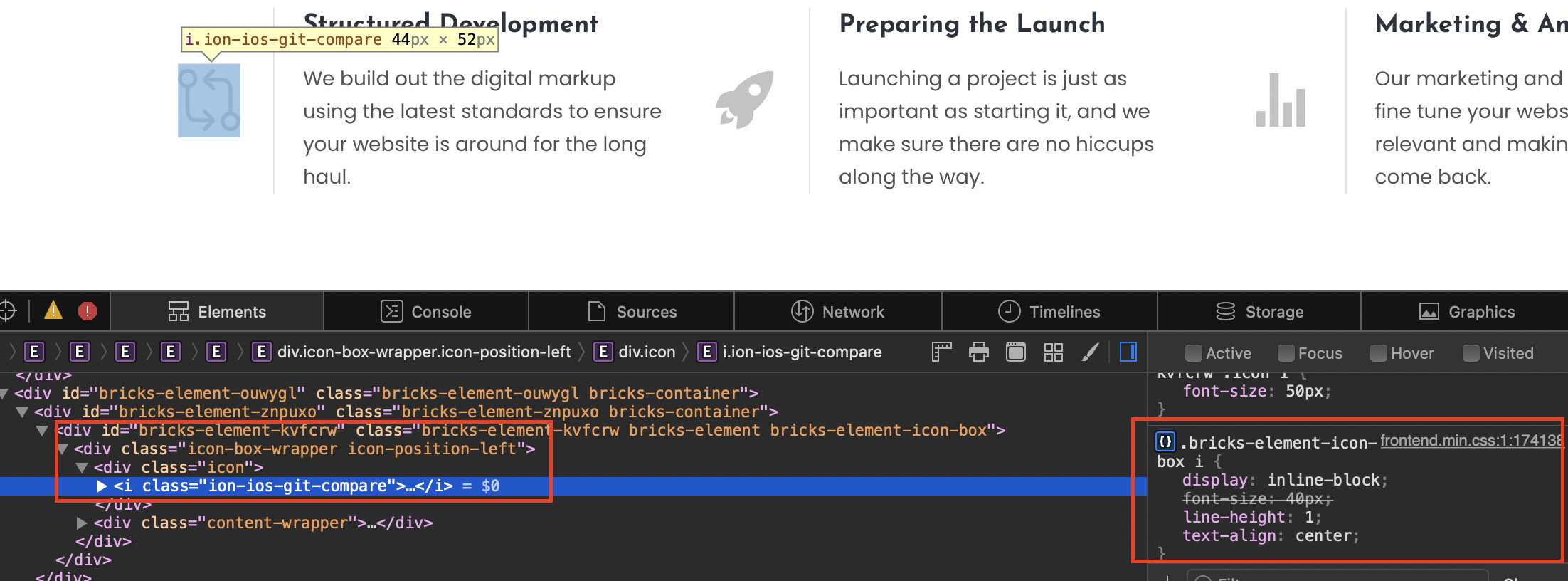
In the icon box, choose direction horizontal, that correctly displays the icon to the side of the content.
However in inspector it leaves the classes on the parent wrapper container of “icon-position-top” which in turn leaves 24px of bottom margin in play on that class, that shouldn’t be there…
Hi Rich, you are right that the icon-position-top class is always there, however it has no influence on margin-bottom because that is applied to .icon (default margin-bottom: 20px).
Probably the class is a leftover from a previous version. It doesn’t have a single property and is therefore superfluous from my point of view.
The issue is there is no way to align content box, not text align, but the content box in general to middle… The “Align” option under Icon only controls the Icon if the icon is smaller in height than the content box to the side of it.
What I am trying to complete is Icon 50px in size, content to the right side of icon, roughly 40px in height, content center aligned to icon…
The only work around I can currently find is to set the Icon height to match the height of the content box at 40px.
That is true, and I thought about doing that, but being this was about identifying bugs in the Icon Box widget, I have continued to utilize it and identify anything else that may not be working per concept if that is the right idea…
serious question: do you really want to display the icon so large, or did you notice it more incidentally?
The question I ask myself is whether it really happens so often that the icon is larger than the content, so that it justifies the content alignment option. If this is the case for one user out of say 1000, it is out of proportion. And as Alan already said, there is an alternative…
No my overall display goal is that the icon is 50px tall while the content to the right of it stands at 40px in height, so over all it is no where near as dramatic as I showed in the example. So I noticed it more incidentally, after upgrading to 1.3.7, when I noticed there was more space under my text than above next to the icon. Currently to resolve the issue, I have set the height of the icon to 40px to match the height of the content.
To follow Alan’s suggestion is not a problem, but then it leads to redundancy issue, why have a “Icon” widget and “Icon Box” widget, if you can’t do what you need with the “Icon Box” widget… maybe the widget itself should just be removed in favor of using two separate widgets.
I would think that by moving the alignment controls outside of the icon controller to the same level as the flex display level, or direction controller, could (I say this without having any real control to test) alleviate the issue…