Hi guys
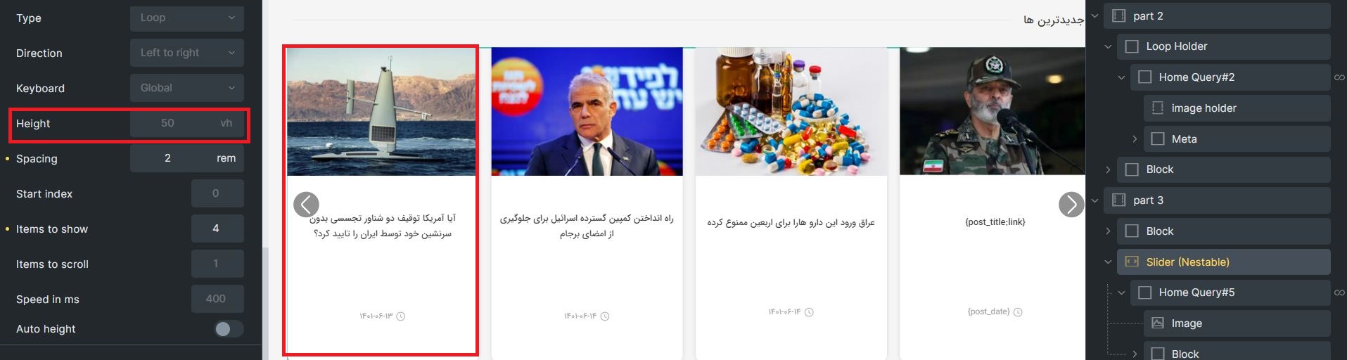
The height of slider is set to 50vh by default and cause some problems
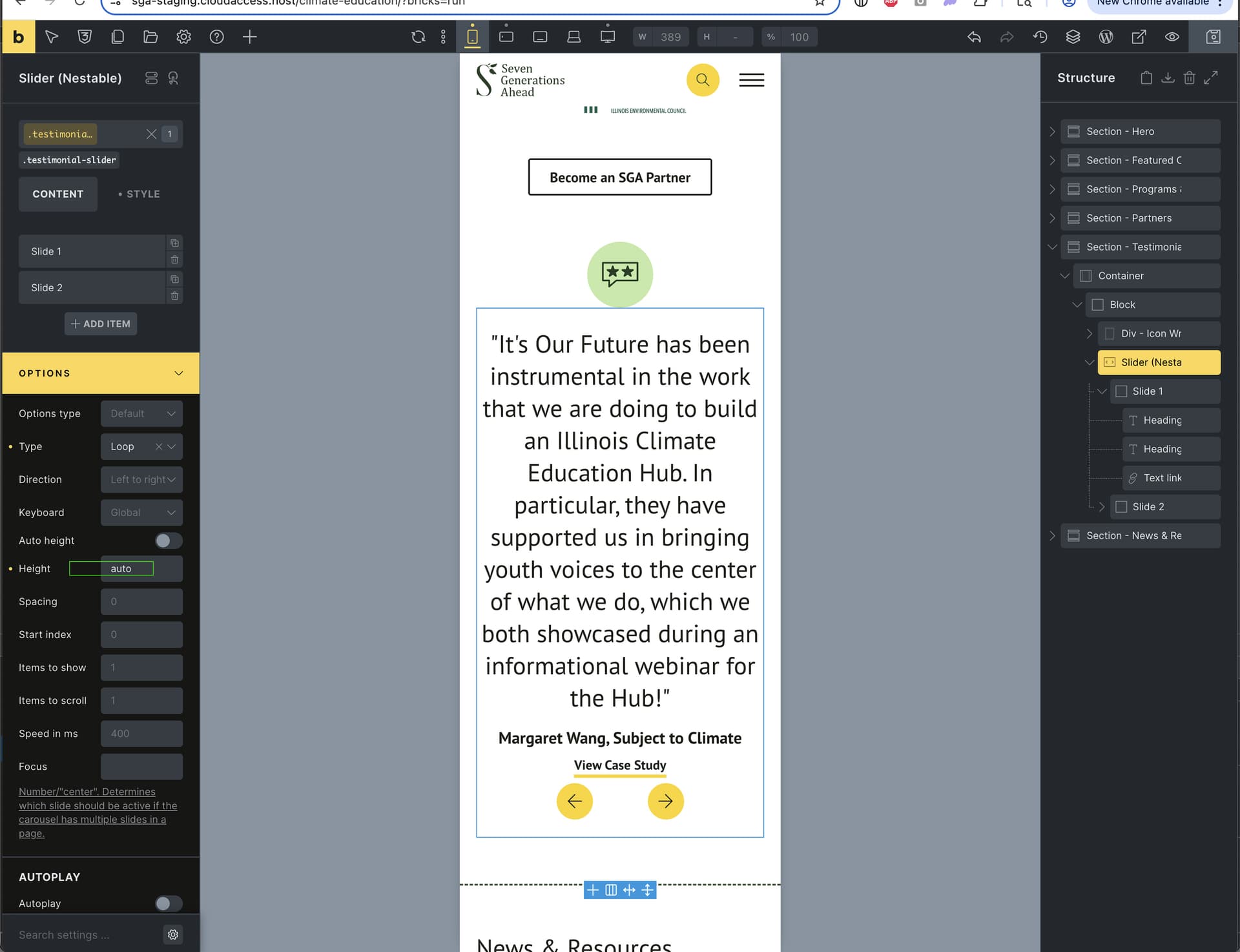
And auto height does not work either؛ i didn’t set height for the contents at the below of image, when the title is long enough, it breaks the structure and the total height doesn’t increase
I set it to - before i post it and it doesn’t work
The second issue was that when the title is so long the auto height must increase, but it doesn’t and the structure will be broken as i sent in previous message
Hi Mehdi,
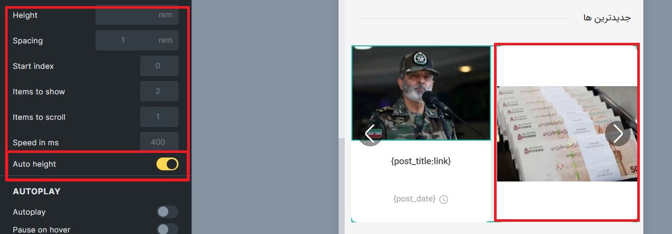
height: unset works for me without issues
autoHeight: Please take a look at the splide docs: If true , the height of slides are determined by their height. Do not provide perPage and perMove options (or set them to 1 ). That’s maybe the reason why it isn’t working as expected.
Hi!, I have had the same problem and I have managed to solve it by setting “unset”, could you tell me where I can do it with one click, according to update 1.9.1.1., please, thank you!
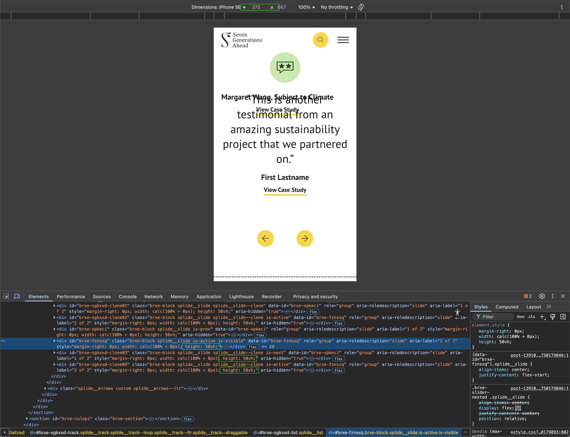
I’m following up because there is still an issue with the 50vh being automatically set in certain instances, using Bricks v.1.12.4, as follows:
If you have a mobile first setup, the 50vh is still automatically applied to slides on any screen which is narrower than the width of the mobile base breakpoint set in Bricks.
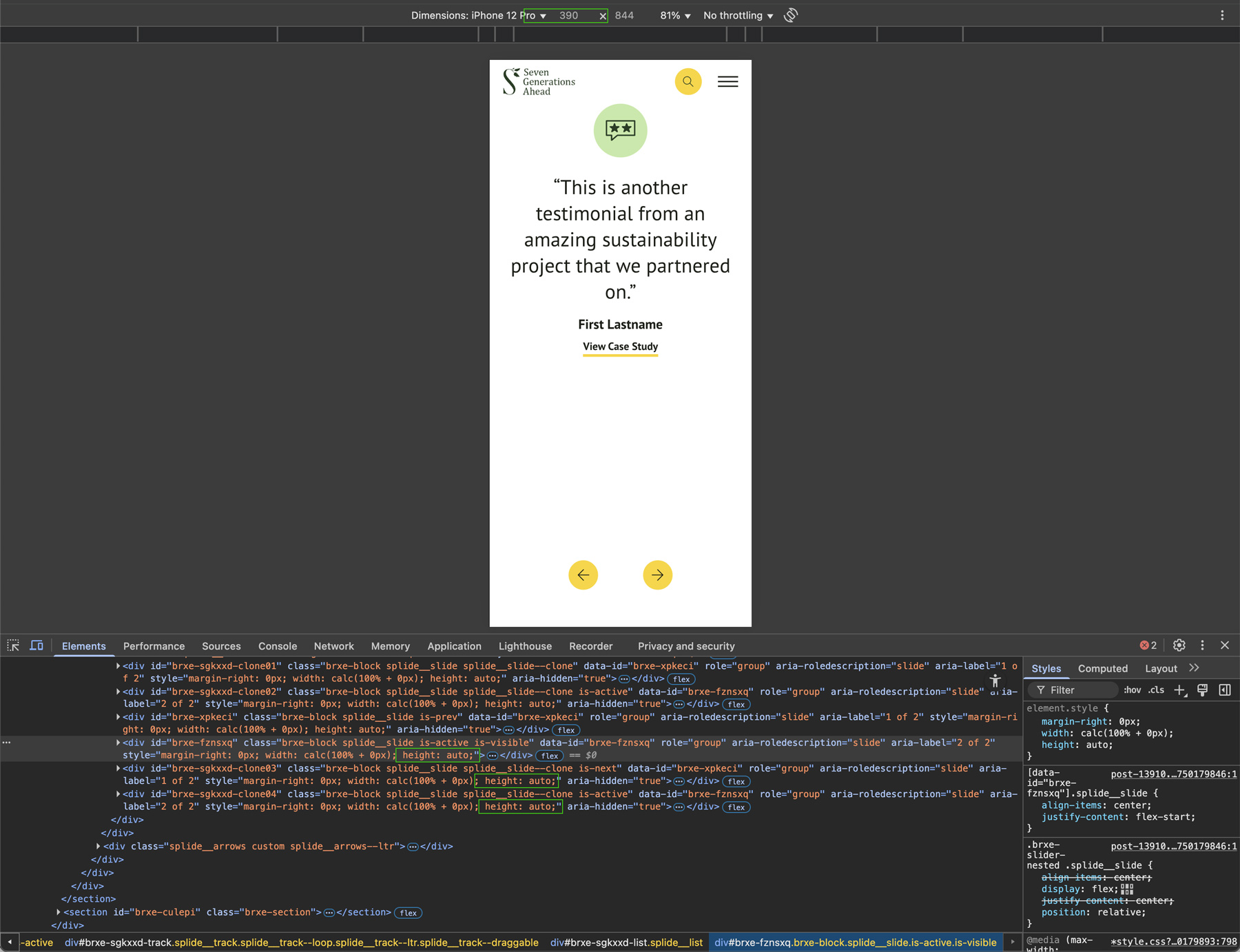
For example: If our mobile base breakpoint set at 389px, someone using a smaller screen like an iPhone SE which is only 375px wide, will still have all the slides’ height automatically set to 50vh. Only on screens that are 389px or wider, does the height I’ve set in the builder get applied.
You can see the difference in what inline style is applied to each slide, based on the screen width being below or above the mobile first breakpoint (389px in this case). Once the screen is narrower, the 50vh height is automatically applied:
I know there are other ongoing issues with mobile first setups, so I want to make you aware of this as well as v2.0 is getting close to being released. IMO, there should not be any breakpoint / media query for styles in a mobile first approach to take effect, those should just be the defaults.
For now, I have used CSS to manually override this with an !important declaration as follows, but this is not ideal / should not be necessary for a mobile first approach:
@media (max-width:389px) {
	.testimonial-slider .splide__slide {height: auto !important;}
}