SOLVED: Checkout Thank You template, Addresses at bottom should wrap on mobile

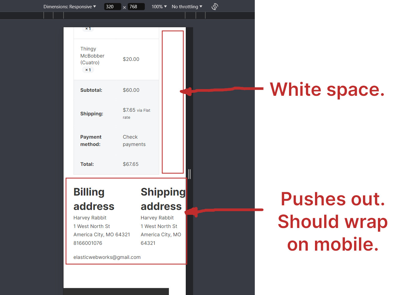
The addresses at the bottom of the Checkout Thank You template do not wrap on mobile and look bad on mobile. It pushes out and causes a white space on the right side of moble widths less than 375px.

Workaround:

Use this custom CSS in the Thank you checkout element for mobile landscape breakpoint (<=767px).

%root% .woocommerce-columns--addresses {
    flex-wrap: wrap;
    column-gap: 20px;
    row-gap: 20px;
}

Hi Mark,
Thanks for your report!

I agree, the columns should wrap :+1:

Best regards,
timmse

Hi guys,

We’ve fixed this issue in Bricks 1.10 beta, now available as a manual download in your account (see changelog).

Please let us know if you are still experiencing issues.

As with any beta release, please do not use it on a production/live website. It is only meant for testing in a local or staging environment.

Best regards,
M