Bricks Version: 1.6.3
When using the carousel element, you can set the typography on each field, but when you change responsive setting to e.g tablet you can’t change the typography settings cause “fields” is not shown anymore…
see the gif attached.
Bricks Version: 1.6.3
When using the carousel element, you can set the typography on each field, but when you change responsive setting to e.g tablet you can’t change the typography settings cause “fields” is not shown anymore…
see the gif attached.
I’ve noticed another bug on the carousel. If i set “spacing in px” under “settings” in a responsive setting, it doesn’t apply only to that @media query, but change it for all queries.
e.g I want a spacing of 30px on desktop, but only 10 on mobil and horizontal-mobile.
Hi Martin,
thank you so much for your report(s)!
I’ve added the issues to our Bug Tracker to get them fixed soon.
Best regards,
timmse
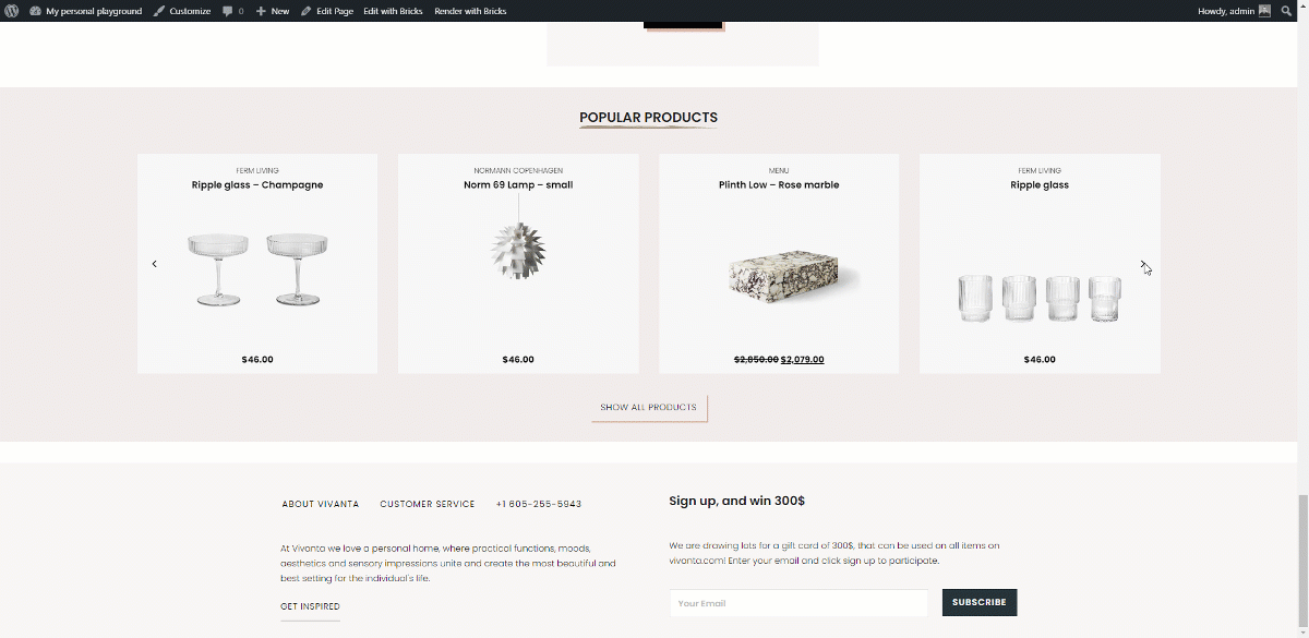
Great. Also noticed that the showing on mobile doesn’t load images outside of view. I have centered the carousel to show half of the last and half of the next.
You can see it live on www.explode.dk halfway down the page
Hi Martin,
this is because of lazy loading the images. Let me ask Thomas if we can do anything inside of the carousel to load the image that is in the viewport plus the previous and the next one.
Best regards,
timmse
great… the lazyload also breaks a normal carousel because of the viewpoint. But if you could load the previous and next it would properly do the trick here aswell
I wouldn’t call that „break the carousel“, because it behaves exactly how it should. The image loads when it enters the viewport 
True… Wrong choice of words… 
Hi Martin,
since Bricks 1.4 you can now disable lazy loading individually in every swiper.js element (slider, carousel, testimonials) using the “Disable Lazy Load” Setting under “Settings”. Please let us know if you encounter any problems.
Best regards,
timmse