Browser: All
OS: Windows
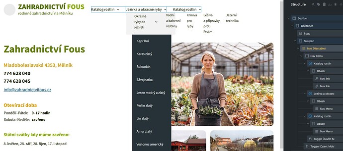
If I use classic Nav Menu element inside the Nested Nav, the preview in the builder is completely messed up:
As you can see, the first level has horizontal layout and the second level has default black BG, even though it should be light gray, as set up for the whole dropdown menu.
Basically, the dropdown menu has the same layout as if it was independent main menu, even though it is now a submenu.
Everything is correct on the front end though:
IMPORTANT: this behaviour appears only after first reload of the page in the builder. When the classic Nav Menu is inserted, everything appears to be all right - the menu looks the same as on the front end. Only after the reload (or reopen) the problem appears.
Could you please look into it? Even though the problem doesn’t affect the front end, it is almost impossible to design the dropdown menu in the backend.
And BTW, the multilevel dropdowns would need some improvement too. At least the carret should be rotated to point to the right, not down. Not to mention it is impossible to design the 3rd level other than by custom CSS. And yes, I know, there’s a special option for multilevel menu, but in fact I like this approach more.
Thanks

