It seems that when I set a container as an HTML tag of “a (link)” type and set a linked page, it adds an excessive width to the start of the container. It shows fine in Bricks but not on the front-end (which is weird because I thought 1.4 made it so the editor more closely resembles front-end display?).
I am using WordPress and I have set the container in the header. All works fine, except when I try to put an image in it. When I do this, the image is shown but the rest of the text that is supposed to go underneath it is not visible. The container only shows up on one line which makes it look very bad.
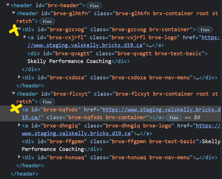
I think it is due to you nesting links. You cannot have container as a link if you have other elements as links inside the container such as the menu items.
Do you know if the menu and its container are wrapped by the container holding the image and text which has the link? If so this would still be the issue.
sibling containers can have their own links (as long as they are not wrapped by a parent container that has a link) but a child container or links inside a child container of a parent container that has a link cannot (even if the child container does not have a link).
It doesn’t really matter if you change the tag of the container or not - the styles of the container remain the same either way. Just set the width to “auto” and the problem is solved. Because the outer container is stretched, the inner container automatically gets the default width and distributes itself in relation to the available space - this is not a bug.
Why would changing the tag change the display of the container though? That seems like a bug to me. A tag is simply HTML semantics, it’s shouldn’t change the entire display of the container. Maybe I’m misunderstanding something here? But In my mind, changing the tag to an ‘a (link)’ shouldn’t change move the whole container over.
This behaviour doesn’t happen in Oxygen when wrapping them in a link, so I’m surprised to hear this is somehow normal/expected in Bricks. I’ve been developing this site in both Bricks and Oxygen (different URLs of course as different installs) since I have a lot of time on this particular project; using it as a better comparison between builders, and that’s why I assumed this was a bug in Bricks because achieving the same thing in Oxygen works as expected, while also not needing to set any widths manually to ‘auto’.
Apart from completely different approaches (section + simple div / container), Michael is right.
The main problem is that you already have the logo linked in your white header, and you want to put that into the container, which is also a link. And that doesn’t work. Accordingly, the container is empty… as you can see in the source code. Compare the upper header with the lower one:
Ah I think I see now… so basically the logo element (I thought I was using image actually so that’s my bad) is automatically linked to the homepage (seems hard-coded, I couldn’t find a way to disable that behaviour so I guess I need to swap it with an image instead), and so in that case the link is covered by the container link which is why it behaves in that way. If I had the logo element as an image instead, then it should work, right? I’ll try that out.
If I’m being honest, it still seems like strange behaviour as it still seemed like it didn’t match views between editor and front-end (I thought 1.4 made that a thing of the past?) and I’d have expected the link on the logo element would just be ignored/covered over by the container link, but I guess in this case it’s trying to avoid being covered which is why it’s moving like that eh? I think there’s room for improvement there, IMO anyways.
I still think that is a bug given that it looks different between editor and front-end and is treated just oddly IMO (being moved like that I guess simply so the logo element isn’t covered by the container link?). Strikes me as very strange, but if Bricks team believes it’s expected behaviour / optimized for UX already then I can let it go.
That you don’t see anything of the problem in the builder is irritating, but be glad that it is corrected in the frontend so that the markup is W3 compliant.
I’ll talk to Thomas if we can do something about it… but in the best case remember: never put a link in a link (not even in the query loop).
Right, that makes sense to me too, and my fault for using the logo element instead of the image element. But yes the difference between editor and front end is very irritating, makes things seem less trustworthy too when editing. I thought that was a thing of the past in 1.4 which is why I was also surprised to see it behave that way.