I was playing around with 2.0-RC — it looks modern and polished!
I have a few suggestions:
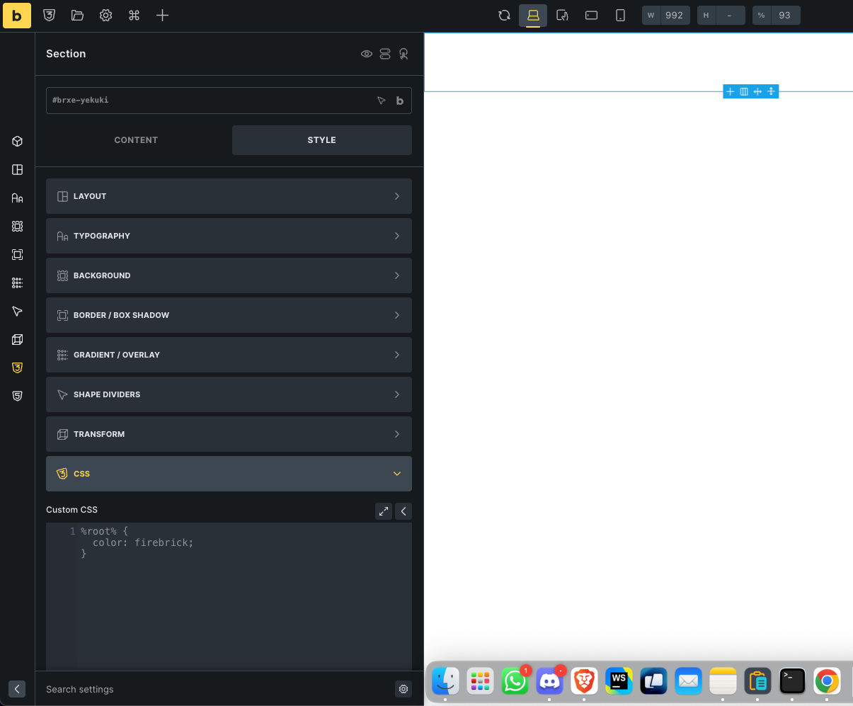
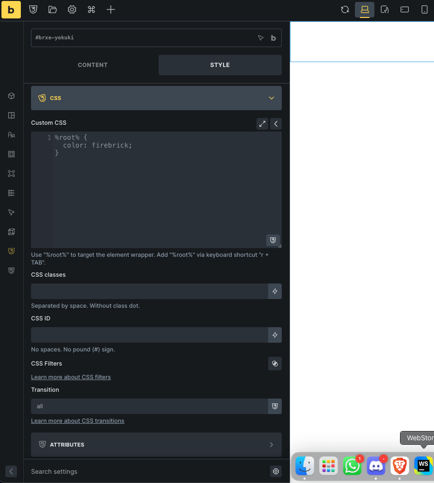
When clicking the quick-access vertical icons on the left panel (Content, Layout, Typography, etc.), the respective section opens, but you often have to scroll up to see it properly. For example, clicking the CSS icon opens it at the very bottom. It would be great if the panel auto-scrolled to the top after selecting an icon. See unscrolled.png vs scrolled.png for reference.
This might just be my personal preference, but the way the new vertical icons scale on hover feels a bit like the macOS Dock (when magnification is enable). It’s a bit distracting/annoying, a simple color change might feel cleaner.
I believe this has been suggested before, but worth repeating: when adding a Basic Text element, it should default to a <p> tag. In most cases, we end up manually switching it to that anyway.
Advanced Themer is good but it sucks with shortcuts, even they override the bricks shortcuts. I’m not sure if that something you can restrict, so other Add-ons don’t change bricks shortcuts.
I’m still playing with it, will post feedback in this thread if I feel improvements.
Thank you and your team for proving us such a great builder.
AND:
The locked/unlocked icon is hidden in the vertical menu, which would be ok, IF the background color of LOCKED classes would be RED instead of blue. Unlocked classes could remain blue.
This would be realy really amazing, if you could implement this tiny improvement.
Thanx in advance for this
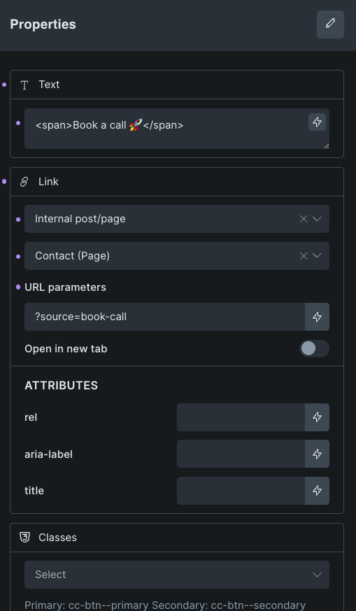
Great to see Components finally moving out of the EXPERIMENT label! in 2.0
I’ve been exploring the feature and ran into something I’m unsure about , either a limitation or something I’m missing.
I want to create a Button Component where the button text is automatically wrapped in a <span>. I need this to apply some advanced animations.
But I don’t see a way to add the <span> at the component level , it seems I have to wrap the text manually in each instance, which defeats the purpose of using a component.
Is there a way to handle this globally within the component?
Please let me know if there is a maintainable way to do this.