Hi,
I want to achieve a breakout on one side. I have scoured the internet, but have not found the right (CSS) solution. Was hoping you guys can help me out.
I want the left side to be the same as any other section. However, the right side needs to touch the right side of the screen. Now I am using a container to hold a ‘left’ block and a ‘right’ block. Whatever I try, I am not able to achieve this. This is due to the fact that on larger screens, the site relies on the max-width of the container. Not sure how to achieve this.
1 Like
Hey Brian,
do you want only one element to break out of the container or the whole container to be placed like you described? Do you maybe have some kind of wireframe?
If you want just a single element (like an image) to break out of the container you could use something like the following CSS on the image element:
root {
  /* 100% container width + half of the difference between the viewport width and the container width */
  width: calc(100% + (100vw - 100%) / 2);
  max-width: revert;
}
You should probably set an overflow of hidden on the surrounding section to prevent horizontal scrollbars since using 100vw can be problematic depending on the OS / browser.
Best,
André
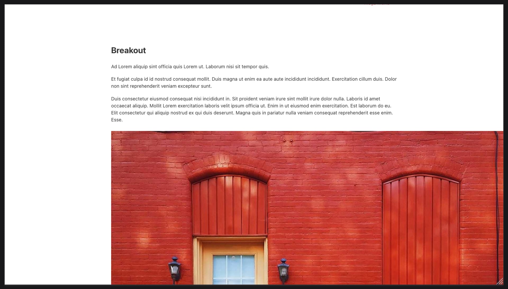
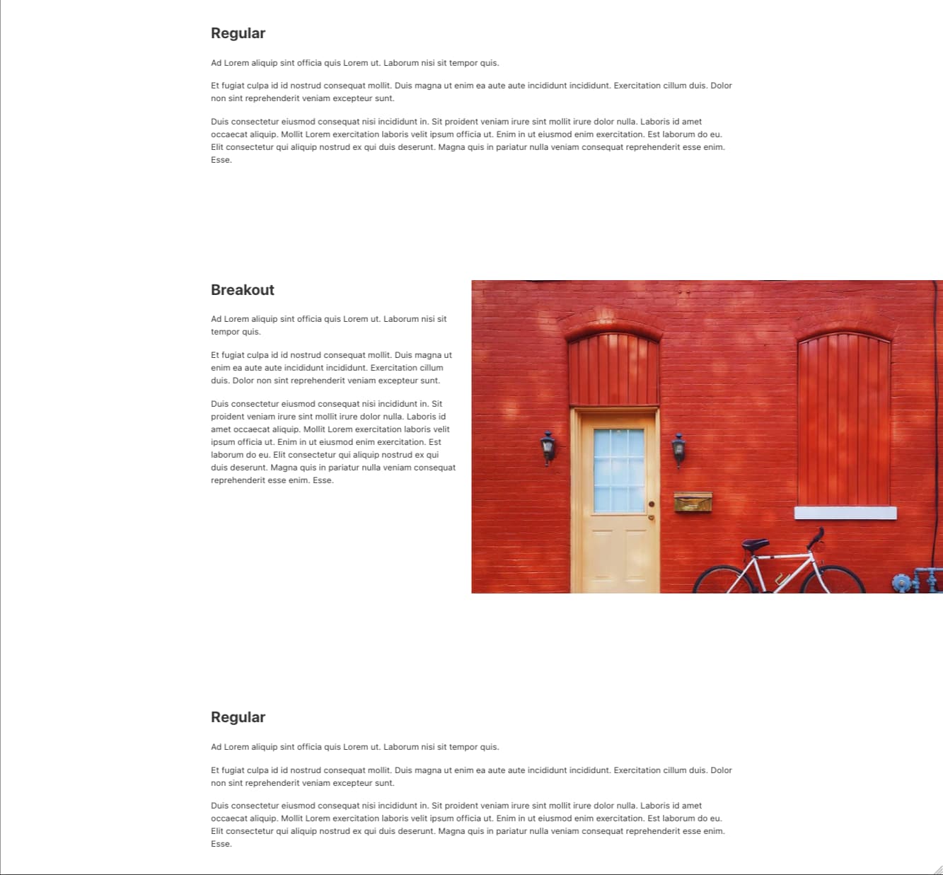
Hi! Thanks for the reply. In my case I am using a grid with two columns. I want the right column to expand beyond the container and be like the image you are showing in your example. I was fiddling around with this solution, since I know this one for just one column, but it gets real hard for me when using grid layout…
Hey Brian,
can you provide me with some kind of blueprint or something so that I can better understand? At the moment it’s just guessing… like this? 
Best,
André
Hi André, that is exactly it haha! I am struggling to make it responsive for every screen. Could you please share the CSS how you achieve this?
Hey Brian,
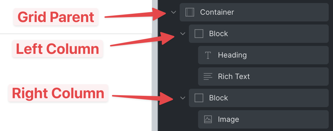
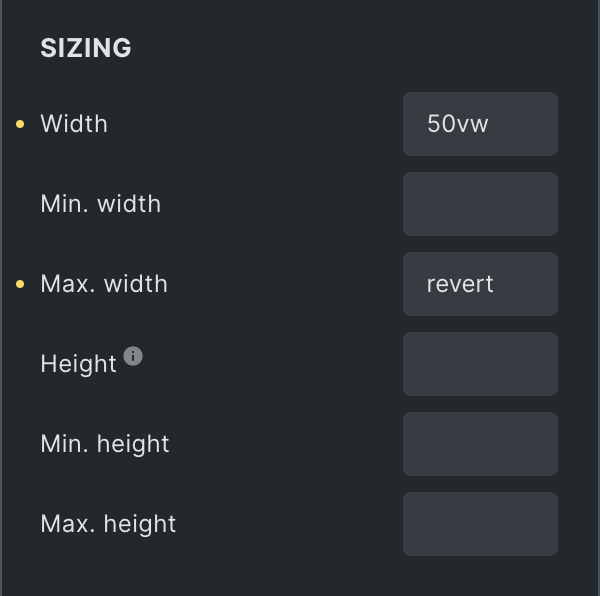
in this case it’s actually pretty simple. This is my setup:
I added a width of 50vw to the image (which sits in the right grid column) and a max-width of revert (to override the default max-width of 100%).
And finally I added some padding-right to the left grid column so that the text and the image do not touch.
Best,
André
1 Like
Hi André,
Thanks a lot for your help! With some adjusting to your previous CSS I achieved what I needed. Thanks!!