Browser: Chrome 110 OS: Windows URL: Link to a page that illustrates this issue Video: Short screen recording that illustrates this issue (free tool: jam.dev)
Hello,
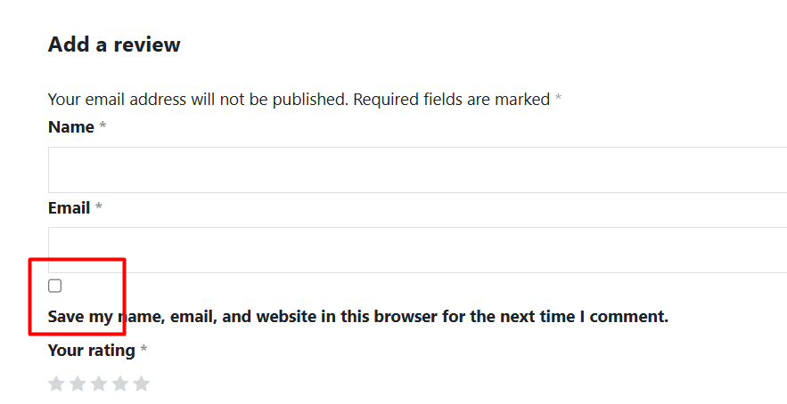
In the Comments element, the checkbox icon and text are in the wrong position, which affects the user interface.
thank you for your report. I can replicate this locally and I agree - having text in the same line would be better.
As a temporary workaround, you can use the following CSS:
We’ve fixed this issue in Bricks 2.0.2 now available as a one-click update in your WordPress Dashboard.
Please take your time to read the changelog entry before updating: Bricks 2.0.2 Changelog – Bricks, and let us know if you continue to experience issues.
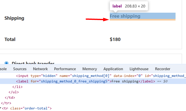
do you have a link to the page, where I can see this?
I’ve just checked locally, but I don’t have that margin-bottom:5px set there. Surely, it’s also not totally aligned for me as well :(, but I would like to gather all the information possible, before created another task.
The margin is not visible visually. I changed the p tag to flex and then the margin became visible. That’s why you didn’t find it. But if you look at the label inside the p tag as per the screenshot below, it has a margin of 5px.
Yeah, I don’t see this. I mean, I see the form, but this works only if I’m logged it, but if I logged out (of my try bricks profile), then I can’t access it.
Sorry I didn’t pay attention to your screenshot. You selected the focus tag, that’s why there is no margin.
If you select the <label> tag that has the text “Save my name, email, and website in this browser for the next time I comment.”, there is a margin that all labels actually know this margin to. So I’m not sure how that can be resolved.
Ahh, ok. I see it now. I do have a 5px bottom margin as well, but the funny thing is, even if I remove it, it doesn’t change anything on my local install.
Do you have a way to create a test site/page, where I can see that online? Not try.bricksbuilder.io, as there I can’t be logged out to see it, though.
The thing that I wonder is why it’s different in my and in your case, and this is something that I would like to figure out.
The thing that I wonder is why it’s different in my and in your case, and this is something that I would like to figure out.
Yes, removing this margin doesn’t make a difference for me either. But if you set the parent p tag (.comment-form-cookies-consent) to flex, then it will show its margin.