I’m testing the new nestable navigation for an upcomming project and have found the following limitation:
At the moment it is not possible to place the menu toggle outside of the nestable nav element and trigger the default mobile menu.
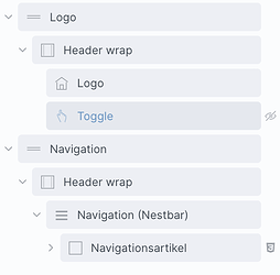
My setup looks like this:
On the desktop design there is a section for the logo and below a section for the navigation menu. They are in different sections because the logo section has a different background color.
But on mobile the logo and menu toggle should be in the same section. (See the structure below)
I’ve copied the ID of the nestable nav into the CSS selector field of the toggle but couldn’t get it to open the mobile menu.
