Slide that exceeds the screen ? (I don't know how to name it)

Good morning,
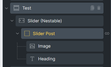
by playing with nestable slide I was able to reproduce almost everything that webflow already does with their slider in their different templates
but a detail disturbs me and I can’t understand how to reproduce it
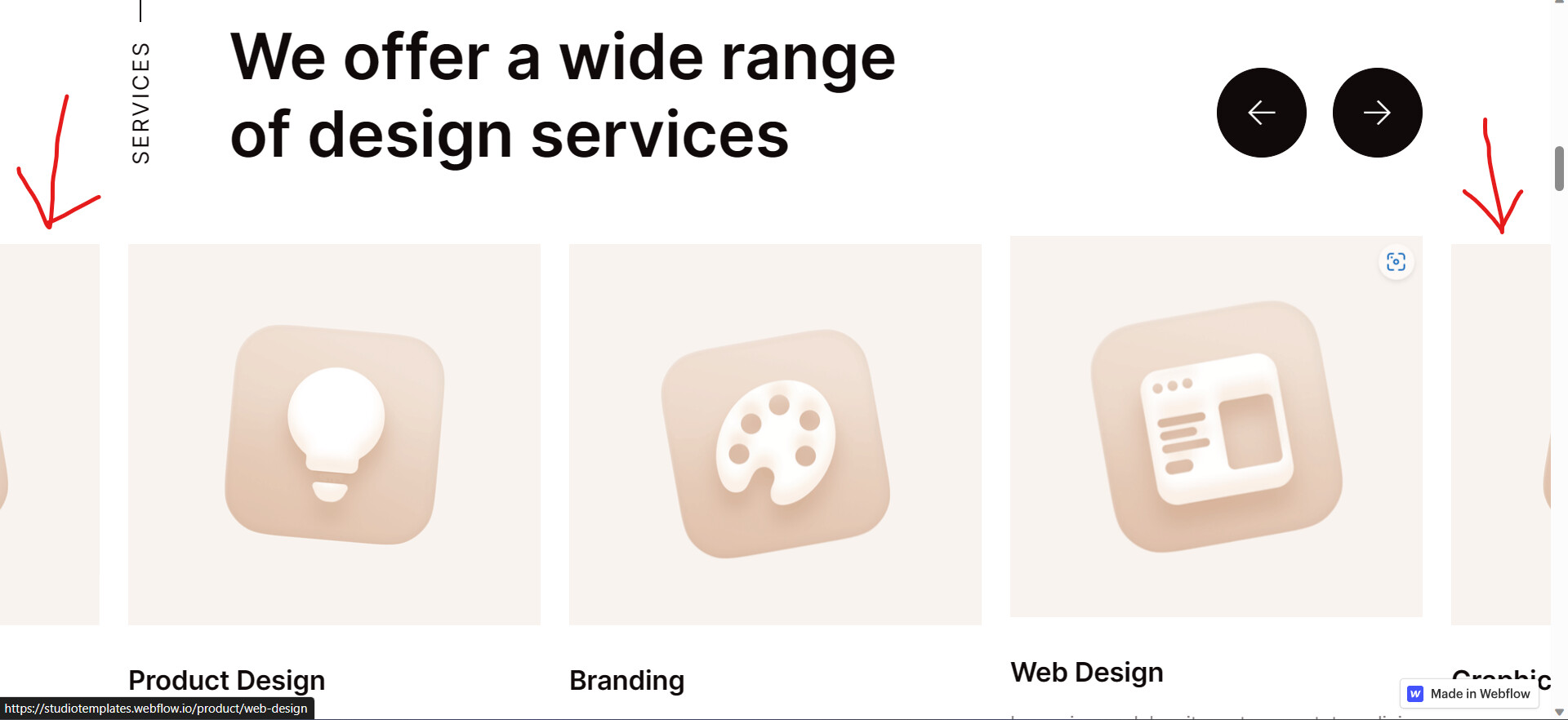
it’s the kind of screen overflow where I can already see half of the next card
what is the easy way to reproduce it?
source site


my structure
Capture d'écran 2023-06-09 034355

If you use the carousel, it has “center mode” that does that. It is allso called “showcase carousel” by Slide Anything. Showcase Carousel Demo - EdgeWebPages (Slide anything in showcase mode can’t have lazy-load on the images or the images half off the screen won’t load until they are in full view.)

There may be custom settings for the bricks slider that will make it do that, I don’t know. Bricks uses https://splidejs.com/

hello macksix I saw your answer and it did not help me to reproduce the slide

can you show a demo how to do it?

I also see that splide (thus briks?) has the power to display thumbnails (normally?) but I don’t see or know how to reproduce that too
unless it’s beyond me and bricks should include them next time 1.8.2?

I gave you all the info I know. Good luck.

For showing multiple slides and have them cut off at the side play around with the following values:

  • Set slide with to less than 100% maybe 40% or whatever fits your usecase
  • Use center Mode
  • Set slides to show to 2.5 or something

I think you might be able to just use padding as well as shown here on the 2nd example once you scroll down a bit

As for thumbnail sliders, check out this thread How to Sync 2 Sliders - #13 by tobiashaas

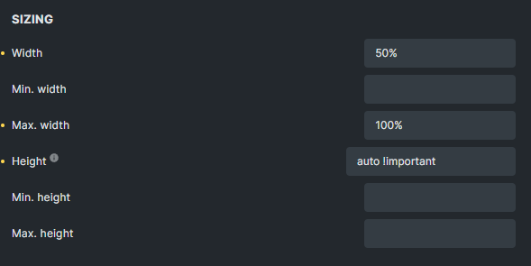
Here is a slider setup I’m currently using which isn’t exactly your use case but might give you a starting point, combined with the suggested settings above.

Custom options in Slider:

{
  "type":"loop",
  "autoplay": true,
  "perPage": 1,
  "padding":"2rem",
  "mediaQuery": "min",
  "autoWidth": true,
  "trimSpace": true,
  "updateOnMove": true,
  "gap":"-50px",
  "waitForTransition":false,
  "focus": "center",
  "breakpoints": {
    "640": {
      "gap":"-10%",
      "padding":"0",
      "perPage": 3
    }
  }
}

CSS applied to the slider, targeting the first child of the slides for the scale instead of the slide directly:

root .splide__slide .slide-content {
  transition: .3s all ease-out;
}
root .splide__slide:not(.is-active) .slide-content {
 transform: scale(.8);
}
root .splide__slide.is-active {
  z-index: 9;
}
root .splide__slide.is-active .slide-content-title {
  opacity: 1;
}

Settings on the actual Slide element:
image

Haven’t tried but in theory, if you copy my slider, change the gap to a positive value and the perPage value to 3.5 or something, you should get pretty close to what you’re after.

1 Like

You just have to add inline padding that’s it

2 Likes