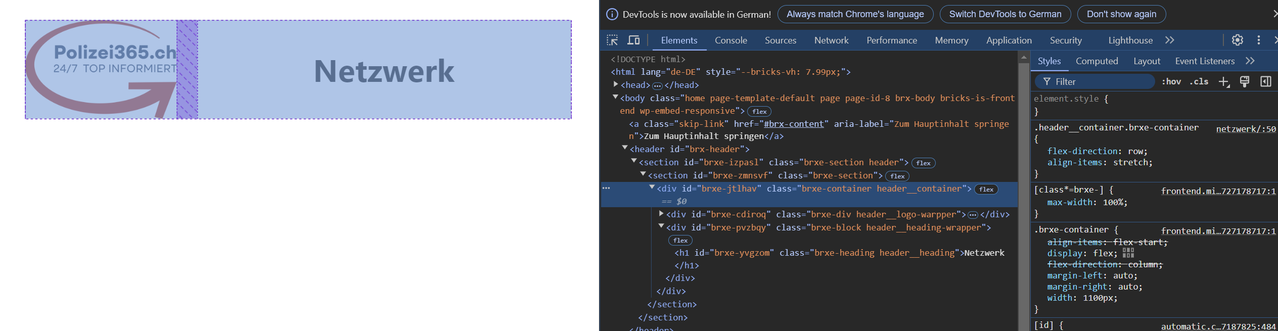
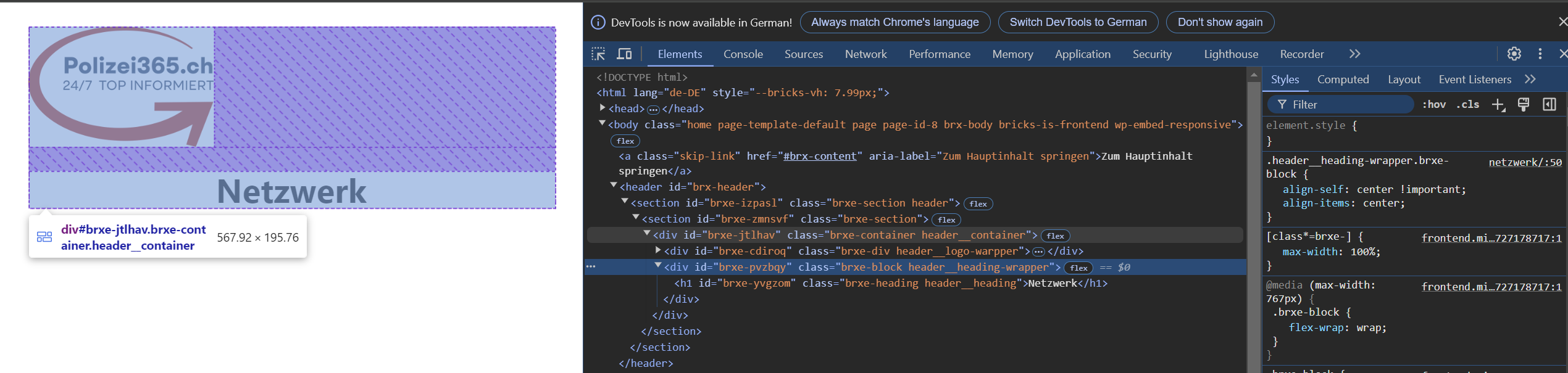
I have a section with a container (flex row) and in it I have a div and a block. the div should be a logo, which is max 200px wide. the block element on the right side is by nature 100% big. For some reason unknown to me, the block element jumps to its own row when the viewport is smaller than 768px. can someone explain why this happens?
Bricks automatically sets the flex-wrap to wrap at this breakpoint – I do not like this forced default behavior either. Maybe something that can be removed in a future version, @charaf, @Matej, @timmse?
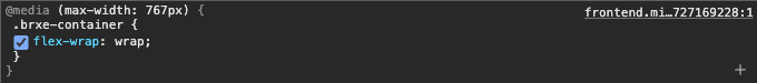
Make sure to explicitly set flex-wrap to nowrap (don’t let the placeholder value fool you) and you’re good to go.
For me, this default behavior is many times useful enough so that I don’t need to change it But it’s also true that it’s something that the user does not expect.
And for removing this. I wouldn’t mind, but the “old” websites would still need to have this default there to not break any layouts.
I think if a behaviour is influenced by bricks it would be useful to find it in the documentation. I had searched here (Understanding The Layout – Bricks Academy) beforehand and only found Flexbox with 100% width. An info here would have been enough for me so that I wouldn’t have had to ask the forum.

 But it’s also true that it’s something that the user does not expect.