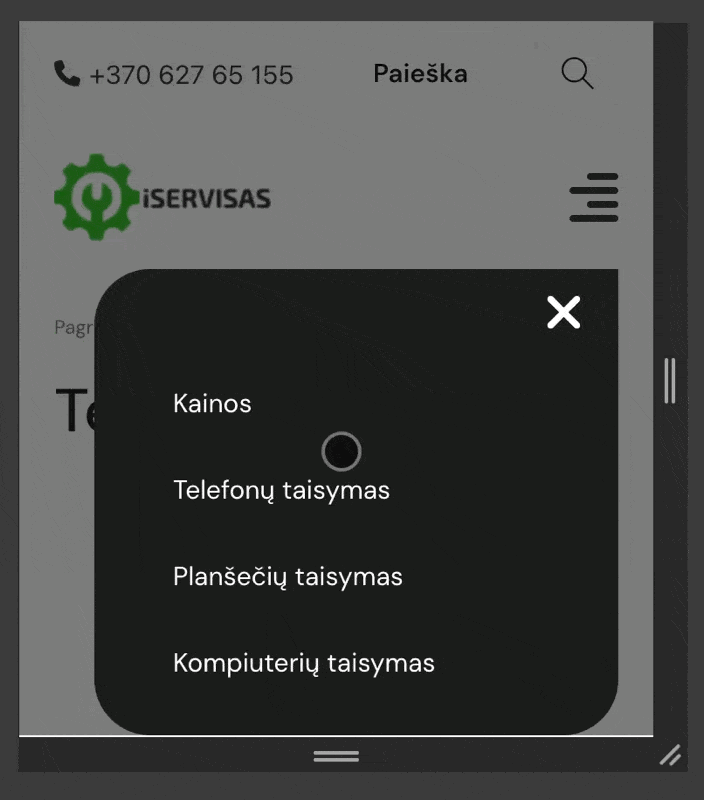
I’m experiencing an issue with mobile devices, my offcanvas menu doesn’t fit the screen height, and users are unable to scroll through the content. I’ve tried using recommendations by other posts to add overflow-y: scroll; and flex-wrap: nowrap; to brx-offcanvas-inner but it still doesn’t work. Any ideas? Thanks.
Thanks!
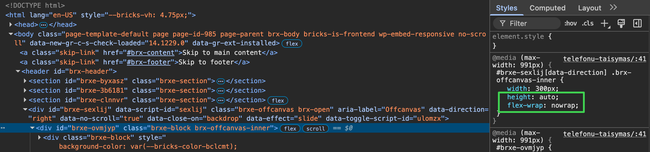
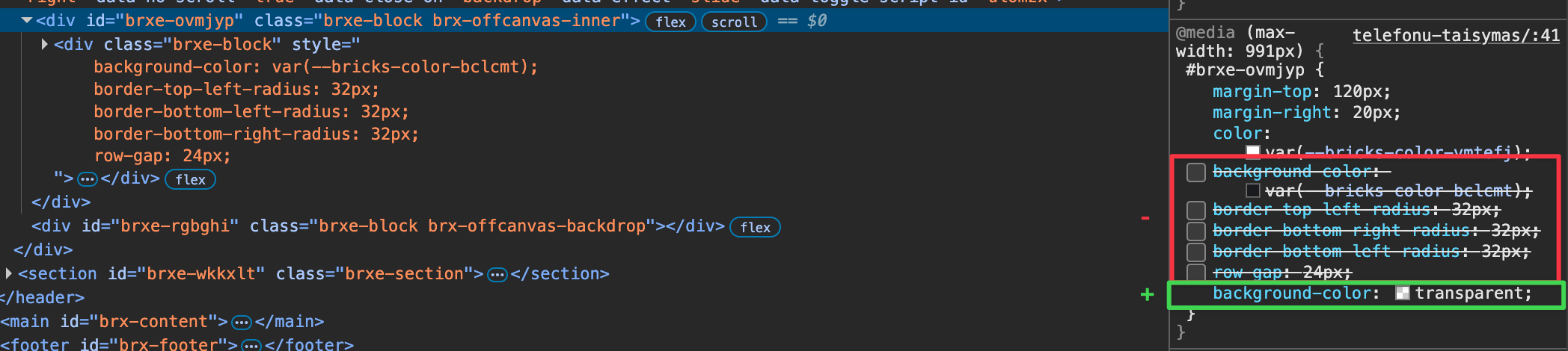
In your case, it’s a bit tricky because you want to limit the height. We have to play a little trick here.
It’s best to remove all the styles you have applied so far, especially on the smaller breakpoints. All of the following instructions should be applied to the tablet-portrait breakpoint.
Set the height of brx-offcanvas-inner to “auto” (in the offcanvas settings)
Apply flex-wrap: nowrap to offcanvas-inner (directly on the element)