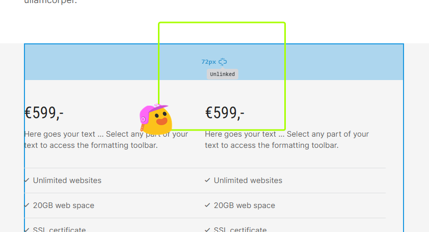
Here is my explanation of what would speed up my dealings with the settings of margin/padding. In words:
- having the “Linked” as “on” as a default value
- “Units” dropdown menu, either move it above the fields or exclude it from the switch with a Tab key of my keyboard. (or add support for selecting the unit with keyboard arrows).
Here is a video explainer:
Margin / Padding in the side panel (Builder) - Google Chrome - 9 July 2022 - Watch Video

