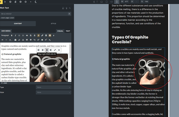
I’m trying to use the rich text element to write a paragraph with an image, and I’ve chosen to surround the image with text (right-aligned) on large screens. How do I make the image stand on its own row (full width) on small screens? Are there any CSS tricks or am I using the wrong element? Thank you!
I have given the rich text element an css class “article-1” and added below code:
@media screen and (max-width: 767px) {
.article-1 img {
display: block;
margin: 0 auto;
width: 100%;
max-width: 100%;
max-height: 30vh;
object-fit: cover;
float: none;
}
}
This works for me. but then I’d need to add that code every time I add a rich text element, and I’d need to set the CSS classes one by one, which is a pain in the ass. Is there a good way to make this easier in the future by modifying the theme files? Please note that I have also created a child theme.
Hey Eric,
of course you could also create a rule in the global CSS in the Bricks settings (or in your child theme or a code snippet plugin).
If you want the images (within rich text elements) to “stand on their own row” on small screens the CSS could look something like this:
@media (max-width: 767px) {
  .brxe-text img.alignleft,
  .brxe-text img.alignright {
    float: revert;
    margin: revert;
    width: 100%;
    max-width: revert;
  }
}
Let me know if that helps.
Best,
André
Thank You Andre, It works now. ![]()
