I’m having an issue with the responsiveness of my main slider. iPhone 13 Pro Max looks fine. The slider is between the blue bars. iPhone 12 the image overlaps the blue bars. iPhone SE image overlaps blue bars and the text in the area below. How do I make this responsive?

It’s because you’re forcing the height to be 80vh on the container of the slider. Use min-height instead of height for the 80vh so it’s allowed to change with the content height.
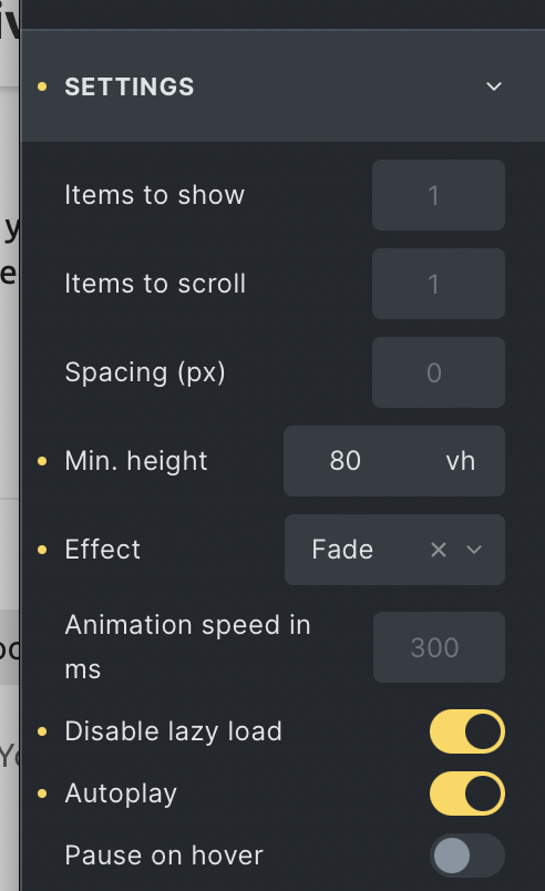
the 80vh is set on the min height field, not on the height field. If I make it less than 80vh it will not fill the area on an iPhone pro max.
On the container with the ID #brxe-fhbqdv, not in the slider settings.
1 Like
Thank you for your help.
1 Like