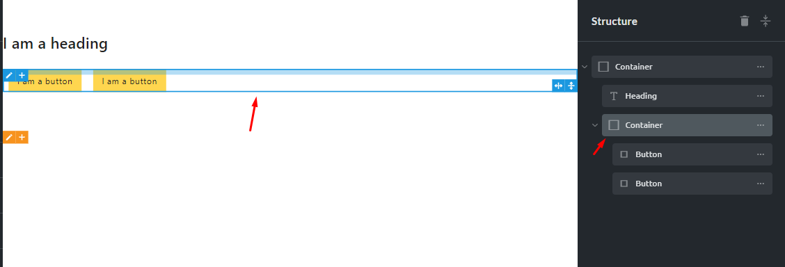
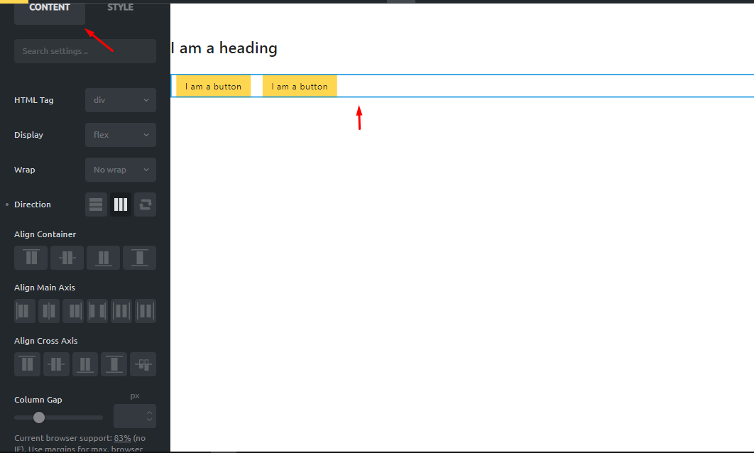
Remove the default fixed width for any inner container element and move the width of the container option to primary tab. So that we don’t need to always put the width to auto every time we use a container. This greatly helps improving the speed of workflow.
In below example I added container with title and two buttons side to side. But when I set the main container to flex horizontally the design gets messed due to fixed width of the inner container of buttons. Whereas we put the width of the container to auto everything works fine.
EXACTLY!!!
Please make things simple and don’t overcomplexify basic elements…
Don’t assume things and let us choose.
Or add a simple div element with everything AUTO.
Or add a default width in theme settings for containers (separate from .root ones).
Actually containers are very confusing in the current state, since they can act as divs but also more…
In Oxygen builder, there are sections (div inside div as root container with dedicated options) and simple div elements, and although the internal stuff in sections is not perfect because we can’t style the sectipon and inner div separately, this is a bit less confusing, and we also have the possibility to use a simple native HTML div which is not interpreted as anything, and can be used to group things, as a thumbnail or even whole site container.
Issue is the same as img tag and wrappers: we should always have the choice to use a simple tag like img or div with default HTML settings.
It helps building more complex stuff without having to UNSET properties or juggle with nested stuff that we can’t style or add classes or attributes to.
I guess I don’t have the perfect solution yet, because each time I try on new builder I have to adapt to its container philosophy (and explain to clients who can’t use HTML tags or code blocks).
But if I had to do it in pure code, I would use:
section tag with default 100% width (because background color or image need to extend to site edges)
div tag with no default which could be used as generic container or section inner container (like Oxygen)
section-inner class to style divs acting as root containers inside sections
card class to style card divs
etc.
This way I can have the cleanest and lightest possible code, like for instance a flex section with div thumbnails inside and no intermediate div if I don’t need it.
So in a builder, to help people who don’t know code or too much CSS, I would probably provide:
a section element like Oxygen, but which would insert a section tag AND a centered inner div with default site max-width (maybe with a section-inner class or section > div CSS rules) so that we can style them separately after they are inserted
a div element which would be a simple not styled div
IMHO the problem is not that easy because of the sitewide content max-width which requires a nested div to allow the use of padding on the div and the section to extend to 100% width.
To my knowledge, no builder managed to find a clean and simple solution to this.