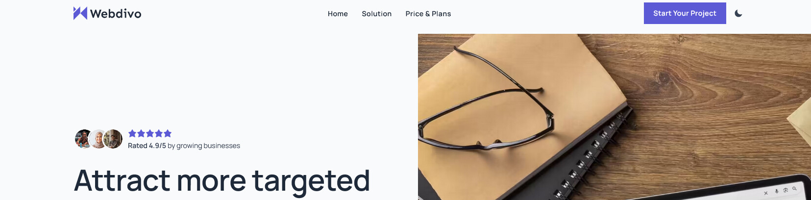
Just finished a full rebuild of my website: https://webdivo.com a couple of weeks ago
My previous version had two problems: the copy was unclear, and I was too focused on unnecessary styling and animations. This time I stripped it back. The only goal was making it easy to understand what I do and who it’s for.
Question about the landing page (service page): do you think I should keep the home link in the navbar here?
The navbar originally only contained anchor links within the same page. The idea was to keep visitors on the page once they arrived. However, I received some feedback in the Bricks Facebook Group saying it was confusing, and that I should include at least a Home link.
Your site has excellent scores on Google PSI, which I really like as for me this is a benchmark.
I myself don’t use the home link in a nav bar, but I think 50% of webbuilders are opposed to this and 50% is in favour of this. It is a topic of discussion.
I am now on the page for the SEO service and the nav bar has changed. It is not the same as on the home page, so that is something I don’t like.
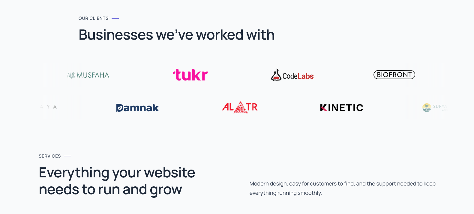
Regarding the design, I would add some more spacing between the elements. For example, on the homepage I would add more space between Our Clients and Services:
That’s exactly what I was referring to. Originally, the service page navbar didn’t even include a home link, to prevent visitors from leaving the page.
Since this page is a hybrid between a service page and a landing page, I plan to use it for ads in the future.
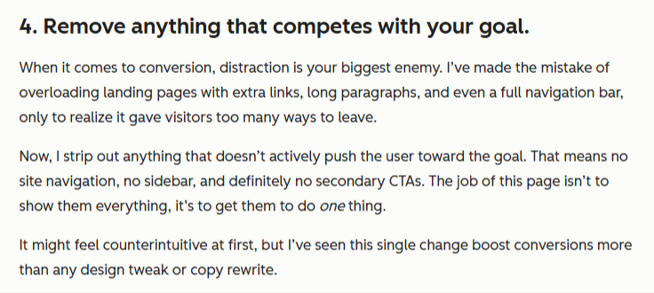
From what I’ve been learning, HubSpot recommends removing anything that doesn’t directly move the user toward the main goal.
That’s why I’m using a different navbar on this page, to keep visitors focused and within the page. Do you think this approach makes the page more confusing rather than more focused?
Before this redesign, my website was too cluttered and focused on unnecessary styling and animations. I was trying too hard, and my conversions dropped significantly. That’s why I’m a bit obsessed with conversion now.
I am not an expert on landing pages, but I always believe in ‘don’t confuse the visitor’ and I do find it confusing when I go to a service page that the nav bar is not the same as the homepage.
The homepage, service pages, portfolio / work page, about, contact - these are all on the same level in a website structure. So I would stick with using the same nav bar on all these main pages.
What sort of ads do you want to use on this page? If you mean special offers for your SEO service, that could also be on the homepage and on the SEO page. If you put on: ‘New offer xxx’ - Google will see you have updated your homepage, and that might even increase your SEO score for this page.
My advice would be to get more information about how a landing page is used, from different sources. Only use is when it is really of great value.
It is always good to be obsessed though, especially when it comes to conversion.
I like the overall look and feel of things, and the google ratings are a nice touch on the services pages. I agree with @Lydia about the navigation - it should be consistent throughout the various pages of your site.
For landing pages - typically the ones that don’t have any other nav options are setup for PPC type campaigns, and would be set to noindex. That’s done to keep organic and paid traffic separate. So you could consider duplicating these pages, and removing navigation on them if you’re planning to run paid ads. Otherwise, I’d say keep the navigation consistent across the site.
On the homepage - where you have the client logos marquee that moves as you scroll - did you do that with custom javascript, GSAP, or a plugin? Just curious, it looks nice.
I see, thank you. That make perfect sense now. Mine is still a service page I think, so yeah I’ll remove the custom navbar for now.
About the scroll, it’s a custom script. I used to use gsap before for that for the scrub, but I tried to minimalize that now as it kinda tempted me to do more animation if I use gsap again
Btw I changed the navbar now, thanks once again (and to you too @Lydia )