The current toggle mode functionality only allows users to switch between dark and light themes. It would be highly beneficial to include an additional option that allows users to select either dark, light, or system preference themes.
2 Likes
You can set “auto” for dark mode in the new style manager settings.
So it respects the system preference.

1 Like
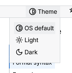
in MDN site you can choose dark light and system for use system theme from OS. currenly in beta 2.2 only have option to select dark or light. if user accidentally click on the theme switch it stay that. only way to get system preference to clear local storage that some use don’t know.
1 Like
You misunderstood what he means, though. Or I did. But PErfect Dark mode means something else (to me at elast)
Settings in your screenshot affect how a website will be presented to the viewer based on their OS settings. So you can set the website for first-time visitors to be displayed light, dark, or Auto (auto meaning on their operating system or browser extension). Thats all to it.
Let me give you another angle. It’s pretty clear the color generator in Bricks (or CF or AT) has been built with light mode as the default starting point. When you generate palettes, the core colors are optimized for light backgrounds, and dark mode variants are treated as secondary adjustments derived from those.
For most workflows, this makes sense – particularly if you’re designing light-first.
However, in my workflow (and I suspect this applies to quite a few others working on modern projects including OP who posted this), clients often specify dark mode as the primary visual direction, with light mode serving as an alternative or optional variant.
Right now, there’s no straightforward way to reverse this logic. Even with the “Dark Mode” toggle enabled during generation, the process still forces you to:
Select a base color suited for light backgrounds,
Cross your fingers that the auto-generated dark variant will be usable,
Then work backwards from there.
It’s counterintuitive and adds unnecessary friction when dark mode is supposed to be the foundation of the entire design system.
AFAIK, only Automatic CSS has this covered.
What Would Help
A simple toggle at the project setup stage would solve this – something like:
“Primary design mode: Light / Dark”
If “Dark” is selected: The generator treats dark mode colors as the foundation,
Light mode variants are generated as derivatives (mirroring the current behavior, just inverted).
You could even update the UI label from “Enable Dark Mode” to “Enable Light Mode” based on the selected primary mode – small touch, but it would clarify intent.
My Question: Is this something on their roadmap? (edit: i submitted the idea)
Or if not, is there a recommended approach for dark-first projects using the current tooling that I might be missing?
Really appreciate the work you’ve put into this tool – just thought I’d share this perspective since I think it would genuinely expand usability for teams working in dark-first contexts.
From a user perspective, it is essential to provide three options for selecting the site theme: dark, light, or system/auto (controlled by the operating system). While many websites currently offer only light or dark mode, I propose implementing a standard mechanism that allows users to choose their preferred theme or to enable the system/OS to automatically set the theme for the site. This approach would create an optimal solution for users when selecting between dark and light themes.
Isn’t that already there (I mean OS/Browser preferred theme) ? I am not in the office, but I swear I saw this…It is called Auto or somethig ? As in one can set, light, dark or automatic (auto works exactly in the way that you are proposing )