Has anybody managed to serve different background videos on different breakpoints?
I am building a webpage that uses a background video. In desktop, it has to be full HD, which is not a problem as the video is “only” 8Mb.
The problem is that the same Full HD video is served all the way to the phone, and those 8Mb are definitely too much for mobile users over 4G broadband.
Sadly, there is no HTML “scrset” for video, just for images. But it must be some way to serve different videos for different breakpoints.
Embedding YouTube video as background video is not a good solution, as the video is served in low quality for a few seconds, and after that the HQ video is served. Looks terrible.
You can try to compress the video down a bit more using free software called HandBrake. Make 2 versions, 1 for desktop and 1 for mobile. And use media queries in custom CSS to grab the video files accordingly.
The video I am serving is compressed with HandBrake, the original clip was 38Mb, the compressed version is only 8Mb. For an FHD version, I think it is quite a good file size. I don’t mind serving 8Mb video on desktop and laptop.
That’s the problem, it doesn’t exist a straight HTML or CSS feature to do this at least not one that I have found.
Yes, that would work visually, but by using “display: none” the video is still loading. Meaning that actually both videos would load on every screen size device.
I found a post suggesting your approach, but it seems like the video was removed from working with inline media queries.
BUT, over Facebook, @maximebeguin linked me to a quite simple and elegant JavaScript solution that it worked. Alright, it doesn’t load a smaller video on smaller screen sizes as it removes it completely, but at least removes the video completely (and not just hide it) on those devices. I leave the link here
Not sure about other browsers (I havent tried others yet), but with Brave (chrome) this doesn’t work for me. On full desktop video plays fine… as I go down to the breakpoint for mobile video… Nothing shows.
Even when I refresh page at mobile size, no video shows.
That means that the code is working, at least partially. As you resize your browser, at certain breakpoint, the video disappears. That’s a good start! But it seems like it is not being replaced by the next one video that should load in lower breakpoints.
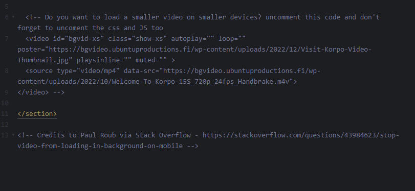
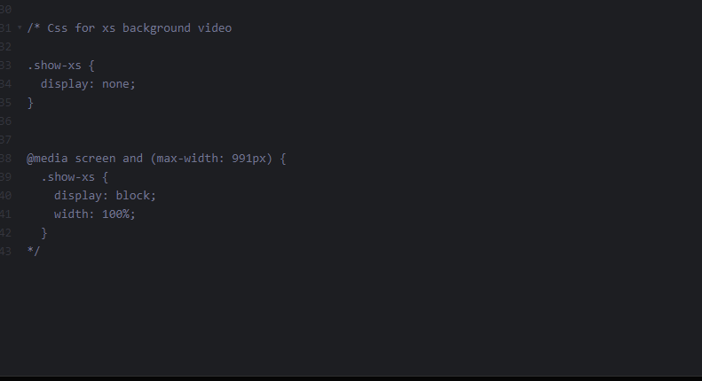
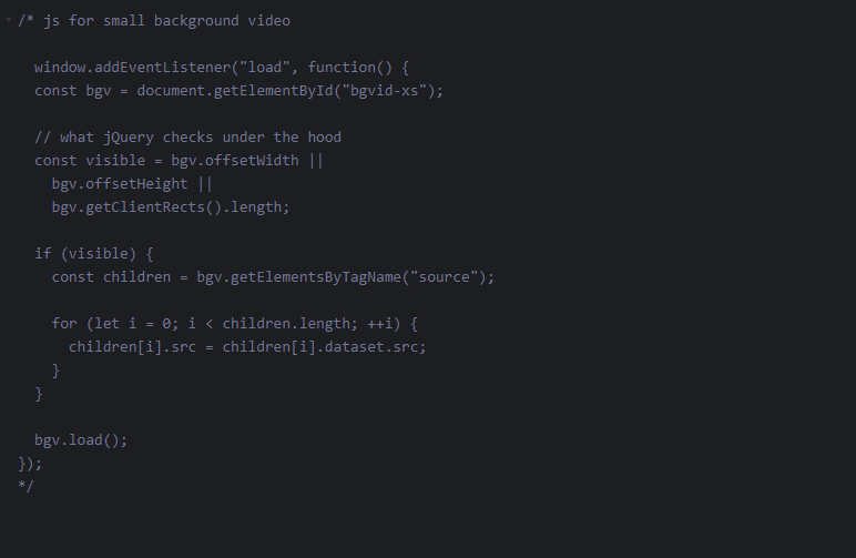
Have you noticed that the code to load different videos in lower breakpoints is commented?
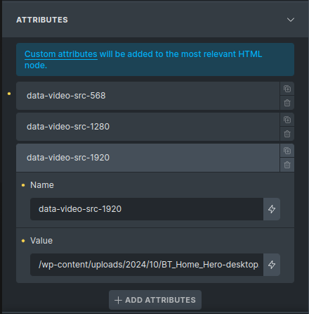
I wrote a code snippet that allows you to use the bricks custom attributes in the editor to set background images. It works on the principles of the previous solution by @UbuntuProductions but aims to be more dynamic in how it treats the breakpoints.
All you need to do is add the dynamic video breakpoint as an attribute using the data-video-src-{breakpoint} on the section containing a background video:
If all goes well the video should update based on the screen resize.
Here is the code snippet:
    const VERBOSE = false; // Debugging
    const videoWrappers = document.getElementsByClassName('has-bg-video');
    const activeVideos = new Map();

    function setBreakpoints() {
        Array.from(videoWrappers).forEach((wrapper, index) => {
            const attributes = wrapper.dataset;
            const videoSources = Object.keys(attributes).filter(key => key.includes("videoSrc-"));

            const breakpoints = new Map();
            videoSources.forEach(key => {
                const breakpoint = parseInt(key.slice(key.lastIndexOf('-') + 1));
                const src = attributes[key];
                breakpoints.set(breakpoint, src);
                const video = wrapper.querySelector('video');
                if (!video) return;
                video.setAttribute('data-video-id', index);
            });
            activeVideos.set(index, breakpoints);
        });
    }

    function switchVideoSource() {
    const screenWidth = window.innerWidth;
    const videos = document.querySelectorAll('[data-video-id]');
    videos.forEach((video) => {
        try {
            const videoId = parseInt(video.getAttribute('data-video-id'));
            const breakpoints = activeVideos.get(videoId);
            if (!breakpoints) return;

            let activeBreakpoint;
            let activeSource;
            let smallestDifference;
            for (const [breakpoint, source] of breakpoints) {
                let difference = breakpoint - screenWidth;
                if (VERBOSE){
                    console.log('bp:', breakpoint, 'sw:', screenWidth, 'diff:', difference, 'sd:', smallestDifference)
                }

                // Set smallest if not exist
                if ( difference >= 0 && (!smallestDifference || difference < smallestDifference)) smallestDifference = difference;

                if (screenWidth < breakpoint && difference === smallestDifference) {
                    activeBreakpoint = breakpoint;
                    activeSource = source;
                } else if (screenWidth > breakpoint && !smallestDifference){
                    activeBreakpoint = breakpoint;
                    activeSource = source;
                }
            }

            // Update video source if it's different
            if (video.src !== activeSource && activeSource !== '') {
                // const wasPlaying = !video.paused;
                video.src = activeSource;
                video.load();
                video.setAttribute('data-active-breakpoint', activeBreakpoint.toString());
                // if (wasPlaying) {
                //     video.play().catch(e => console.error('Error playing video:', e));
                // }
                if (VERBOSE) {
                    console.log(`Updated video ${videoId} to breakpoint ${activeBreakpoint} with source ${activeSource}`);
                }
            }
        } catch (error) {
            console.error('Error switching video source:', error);
        }
    });
}

    // Cleanup function
    function cleanup() {
        activeVideos.clear();
        // Remove event listeners
        window.removeEventListener('resize', handleResize);
        window.removeEventListener('unload', cleanup);
    }

    // Use requestAnimationFrame for smoother resize handling
    let resizeTimer;
    function handleResize() {
        cancelAnimationFrame(resizeTimer);
        resizeTimer = requestAnimationFrame(() => {
            switchVideoSource();
        });
    }

    // Initial call
    window.addEventListener('load', function() {
        setBreakpoints();
        switchVideoSource();

        window.addEventListener('resize', handleResize);
        window.addEventListener('unload', cleanup);
    });
PS: This was a proof of concept and I am sure it could be optimized
I would love to see this kind of implementation to the native breakpoints in bricks as the functionality is not too difficult really.

 at least not one that I have found.