NO BUG: WooCommerce Quantity Plus & Minus styling

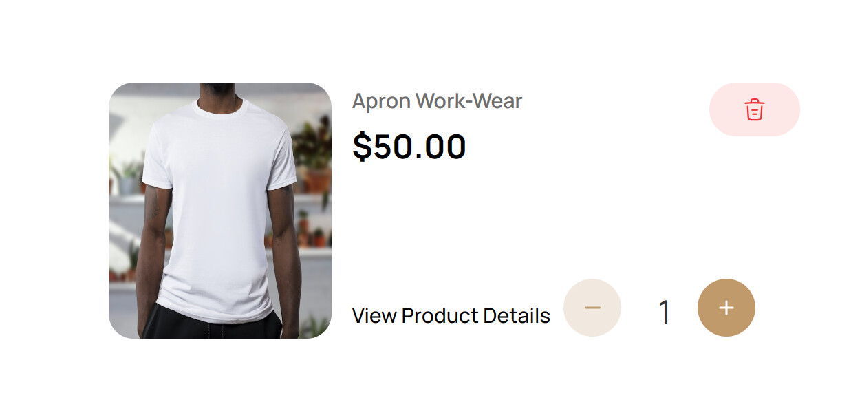
I used the {woo_cart_quantity}, I went to Custom CSS and styled it to become this below.

Now I want to adjust the size of the SVG button on mobile view, it didn’t work. Let me paste the code here


.action.plus svg {
  display: none; /* Hides the original SVG */
}

.action.plus::after {
  content: url("https://asyn.projecth.xyz/wp-content/uploads/2023/12/Frame-44.svg"); /* Replace with your actual URL */
  display: inline-block;

  @media only screen and (max-width: 768px) { /* Adjust breakpoint as needed */
    width: 17px; /* New mobile width */
    height: auto; /* Maintains aspect ratio */
  }
}


.action.minus svg {
  display: none; /* Hides the original SVG */
}

.action.minus::after {
  content: url("https://asyn.projecth.xyz/wp-content/uploads/2023/12/Frame-45.svg"); /* Replace with your actual URL */
  display: inline-block;

  @media only screen and (max-width: 768px) { /* Adjust breakpoint as needed */
    width: 17px; /* New mobile width */
    height: auto; /* Maintains aspect ratio */
  }
}

1 Like

@charaf @timmse

Any help? I’ve gone far.

Hi Abey,
This is far from a bug, as it is simply because you are not getting along with your custom CSS - and that clearly exceeds the technical support :wink:

However, something like this should work…

.action.plus svg,
.action.minus svg {
  display: none;
}


.action.minus::after {
    content: "";
    background-image: url(https://asyn.projecth.xyz/wp-content/uploads/2023/12/Frame-45.svg);
    width: 100%;
    height: 100%;
    background-repeat: no-repeat;
    background-size: contain;
    background-position: center;
}

@media (max-width: 768px) .woocommerce-cart-form .product-quantity .quantity .action {
    width: 17px;
    height: 17px;
}
1 Like

Bricks Builder is revolutionary and the best page builder. Now I feel like a front-end developer :innocent:

The language it uses is HTML language, making you better understand the use of HTML & CSS.

Beginner & Developer friendly.