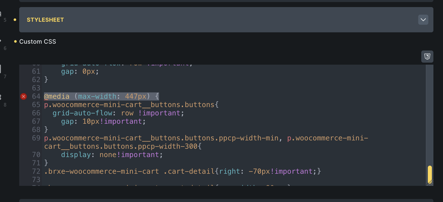
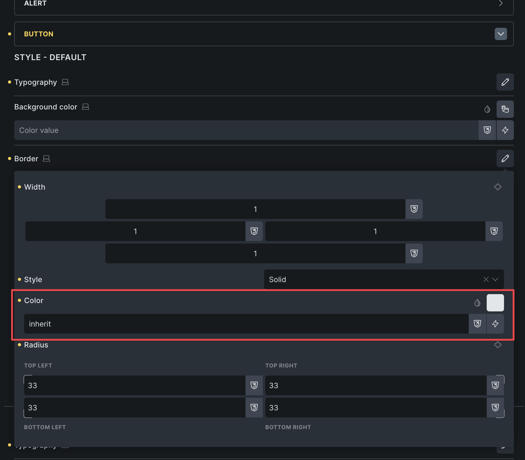
Since updating to Bricks 2.2, my theme’s styling is broken. Button styles are not rendering correctly in the builder preview, although they display fine on the frontend. Another issue is with button element styling: I use default button styling for general CSS (applied to all button types—primary, secondary, etc.), but if I add a border to the default button style, it doesn’t carry over to the other button styles. To fix this, I have to manually duplicate the same styling for each button type, which feels redundant and bloated. Before version 1.9.2, everything worked as expected.
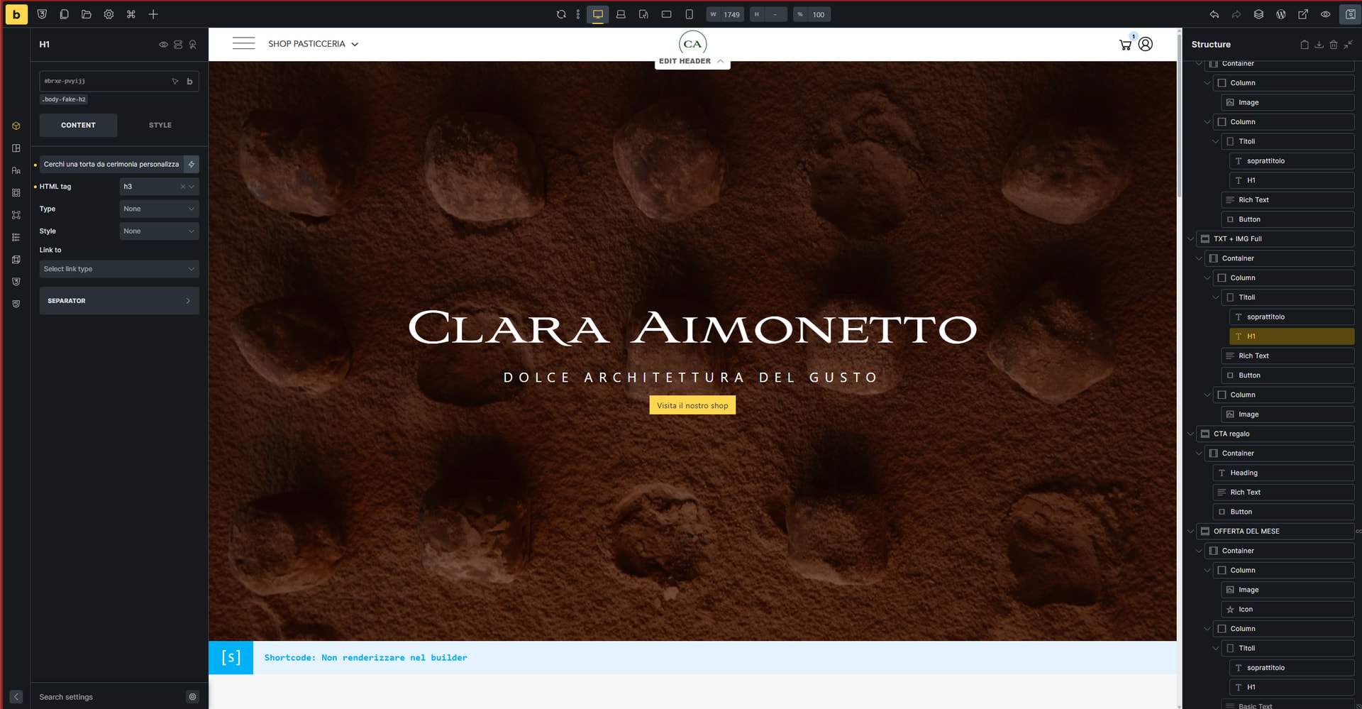
I show an example below, Visual Builder:
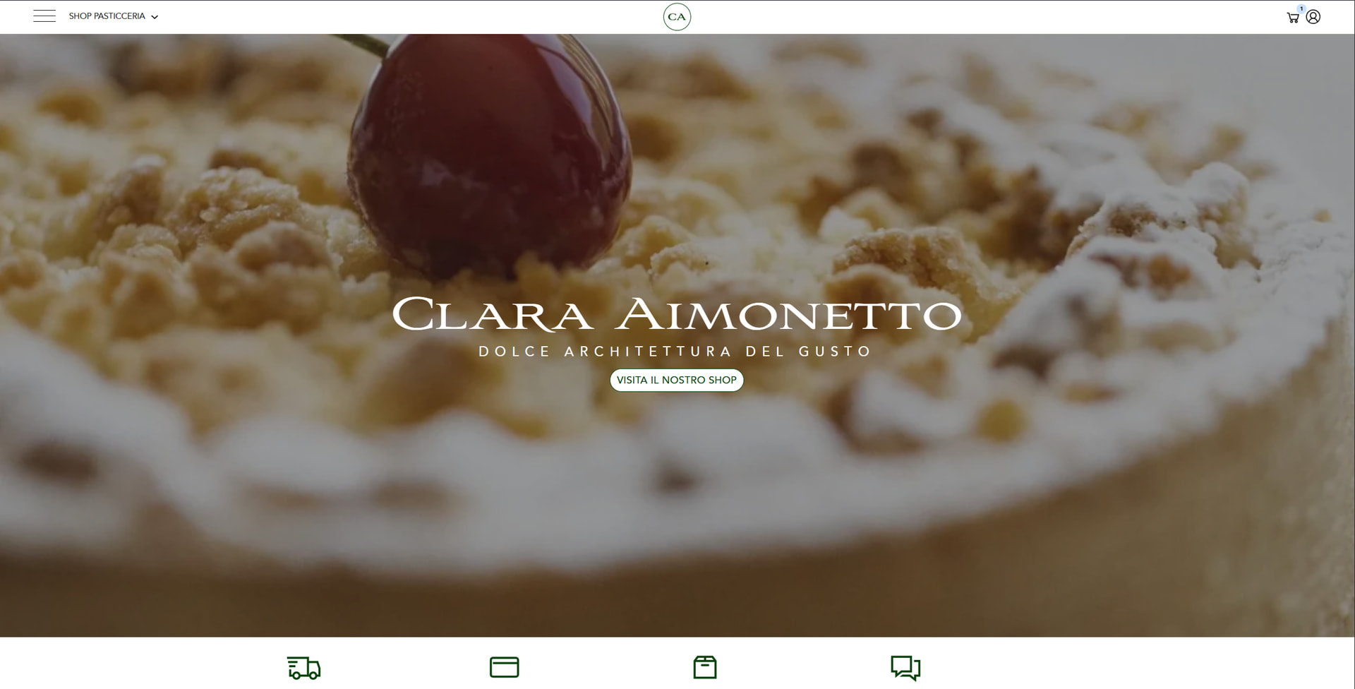
What I really see in front-end:
This is my json theme style, if you want to try:
{

  "label": "tema_sito_v1",

  "settings": {

    "_custom": true,

    "conditions": {

      "conditions": [

        {

          "id": "ubgxca",

          "main": "any"

        }

      ]

    },

    "typography": {

      "typographyBody": {

        "line-height": "var(--body-line-height)",

        "color": {

          "id": "vytmbm",

          "raw": "var(--color-5)",

          "light": "hsl(0 0% 9%)"

        },

        "font-family": "custom_font_88"

      },

      "typographyHeadings": {

        "line-height": "var(--heading-line-height)",

        "font-family": "custom_font_56",

        "font-weight": "500"

      },

      "typographyHeadingH1": {

        "font-size": "56"

      },

      "typographyHeadingH3": {

        "font-size": "38"

      },

      "typographyHeadingH5": {

        "font-size": "16",

        "font-family": "custom_font_88",

        "font-weight": "400",

        "letter-spacing": "5px",

        "text-transform": "uppercase"

      },

      "focusOutline": "thin dotted transparent ",

      "typographyHeadingH4": {

        "font-size": " 24"

      },

      "typographyHeadingH1:laptop": {

        "font-size": "50"

      },

      "typographyHeadingH2:laptop": {

        "font-size": "40"

      },

      "typographyHeadingH3:laptop": {

        "font-size": "32"

      },

      "typographyHeadingH4:laptop": {

        "font-size": "22"

      },

      "typographyHeadingH1:mobile_landscape": {

        "font-size": "42"

      },

      "typographyHeadingH2:mobile_landscape": {

        "font-size": "34"

      },

      "typographyHeadingH3:mobile_landscape": {

        "font-size": "28"

      },

      "typographyHeadingH4:mobile_landscape": {

        "font-size": "22"

      },

      "typographyHeadingH1:mobile_portrait": {

        "font-size": "38"

      },

      "typographyHeadingH2:mobile_portrait": {

        "font-size": "34"

      },

      "typographyHeadingH4:mobile_portrait": {

        "font-size": "20"

      },

      "typographyHeadingH5:mobile_portrait": {

        "font-size": "13"

      }

    },

    "button": {

      "sizeMdPadding": {

        "top": "0.7em",

        "bottom": "0.7em",

        "left": "1.6em",

        "right": "1.6em"

      },

      "sizeLgPadding": {

        "left": "2em",

        "right": "2em",

        "top": "0.8em",

        "bottom": "0.8em"

      },

      "sizeXlPadding": {

        "top": "1em",

        "bottom": "1em",

        "right": "2.2em",

        "left": "2.2em"

      },

      "typography": {

        "text-transform": "uppercase",

        "font-weight": "700",

        "font-family": "custom_font_88",

        "font-size": "18",

        "line-height": "125%"

      },

      "lightBackground": {

        "id": "twpkpi",

        "raw": "var(--black)",

        "light": "black"

      },

      "lightTypography": {

        "color": {

          "id": "wrqnan",

          "raw": "var(--secondario)",

          "light": "#ffcf00"

        },

        "text-decoration": "underline"

      },

      "secondaryTypography": {

        "color": {

          "id": "lxxzuk",

          "raw": "var(--color-6)",

          "light": "hsl(0 0% 100%)"

        }

      },

      "secondaryBackground": {

        "id": "dizufd",

        "raw": "var(--dark)",

        "light": "#161616"

      },

      "border": {

        "radius": {

          "top": "33",

          "right": "33",

          "bottom": "33",

          "left": "33"

        },

        "width": {

          "top": "1",

          "bottom": "1",

          "right": "1",

          "left": "1"

        },

        "style": "solid",

        "color": {

          "raw": "inherit"

        }

      },

      "primaryBackground": {

        "id": "axprry",

        "raw": "var(--primario)",

        "light": "#08420d"

      },

      "primaryTypography": {

        "color": {

          "id": "bgobkd",

          "raw": "var(--white)",

          "light": "white"

        }

      },

      "primaryBorder": {

        "color": {

          "id": "axprry",

          "raw": "var(--primario)",

          "light": "#08420d"

        }

      },

      "secondaryBorder": {

        "color": {

          "id": "axprry",

          "raw": "var(--primario)",

          "light": "#08420d"

        }

      },

      "secondaryOutlineTypography": {

        "color": {

          "id": "dizufd",

          "raw": "var(--dark)",

          "light": "#161616"

        }

      },

      "secondaryOutlineBorder": {

        "color": {

          "hex": "#3d3836",

          "id": "tdwffr",

          "name": "Color #3"

        }

      },

      "sizeDefaultPadding": {

        "bottom": "0.6em",

        "top": "0.73em",

        "left": "1.5em",

        "right": "1.5em"

      },

      "secondaryOutlineBackground": {

        "raw": "transparent"

      },

      "primaryOutlineBackground": {

        "raw": "transparent"

      },

      "primaryOutlineTypography": {

        "color": {

          "id": "twpkpi",

          "raw": "var(--black)",

          "light": "black"

        }

      },

      "sizeSmPadding:mobile_portrait": {

        "bottom": "8px",

        "left": "var(--lt-spacing-small)",

        "right": "var(--lt-spacing-small)",

        "top": "9px"

      },

      "sizeDefaultPadding:mobile_portrait": {

        "top": "9px",

        "bottom": "8px",

        "left": "var(--lt-spacing-small)",

        "right": "var(--lt-spacing-small)"

      },

      "typography:tablet_portrait": {

        "font-size": "16"

      }

    },

    "css": {

      "stylesheet": ".credit-footer:hover{\n  color: var(--bricks-color-rxonet);\n}\n\n\n/* Scorrimento fluido */\nhtml {\n  scroll-behavior: smooth;\n}\n\n/* Offset di 100px quando si arriva a un elemento con un id */\n*[id] {\n  scroll-margin-top: 100px;\n}\n\n.credit-footer {\n  text-decoration: underline;\n}\n\n  .bricks-button{\n\t\ttransition: all .45s ease-in-out;\n\t}\n\n@media (hover: hover) {\n  .bricks-button:hover{\n\t\topacity: 0.6;\n\t}\n}\n\ntable{\n    width:100%;\n    border-collapse:collapse;\n    margin:20px 0\n}\ntd,th{\n    padding:10px;\n    text-align:left;\n    border:1px solid #ddd\n}\nth{\n    background-color:#f4f4f4\n}\ntr:nth-child(2n){\n    background-color:#f9f9f9\n}\ntr:hover{\n    background-color:#e9e9e9\n}\n\n/*.wc-block-components-sidebar-layout.wc-block-cart.wp-block-woocommerce-filled-cart-block, .wc-block-components-sidebar-layout.wc-block-checkout {\n    max-width: 90%;\n}\n\n.single_variation .amount bdi {\n    font-size: 22px;\n    color: var(--bricks-color-wwrwgx);\n}*/\n\np.woocommerce-mini-cart__buttons.buttons.ppcp-width-300 {\n    grid-auto-flow: row !important;\n    gap: 0px;\n}\n\n@media (max-width: 447px) {\np.woocommerce-mini-cart__buttons.buttons{\n  grid-auto-flow: row !important;\n    gap: 10px!important;\n}\np.woocommerce-mini-cart__buttons.buttons.ppcp-width-min, p.woocommerce-mini-cart__buttons.buttons.ppcp-width-300{\n    display: none!important;\n}\n.brxe-woocommerce-mini-cart .cart-detail{right: -70px!important;}\n\n.brxe-woocommerce-mini-cart .cart-detail{max-width: 80vw;}"

    }

  },

  "id": "tema_sito_v1"

}
Same thing also happen with text font, in Visual builder I see:

What I really see in front-end:

Note: I’m using custom fonts, but I don’t think that’s the cause. This started happening after I converted the old color palette.