Browser: Chrome 110 OS: macOS / Windows / Linux / etc.
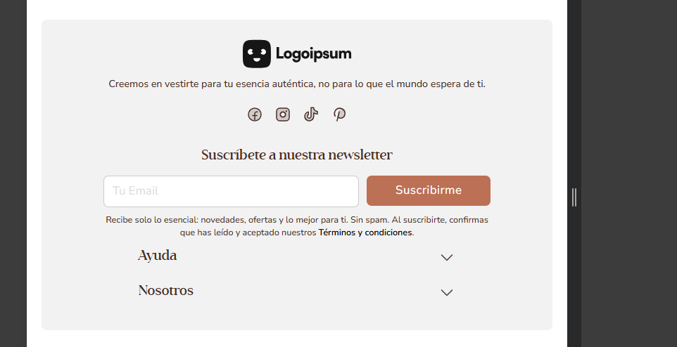
While editing the footer, there was no issue with the structure breakpoint. i was shows correctly, both in bricks editor and in the preview.
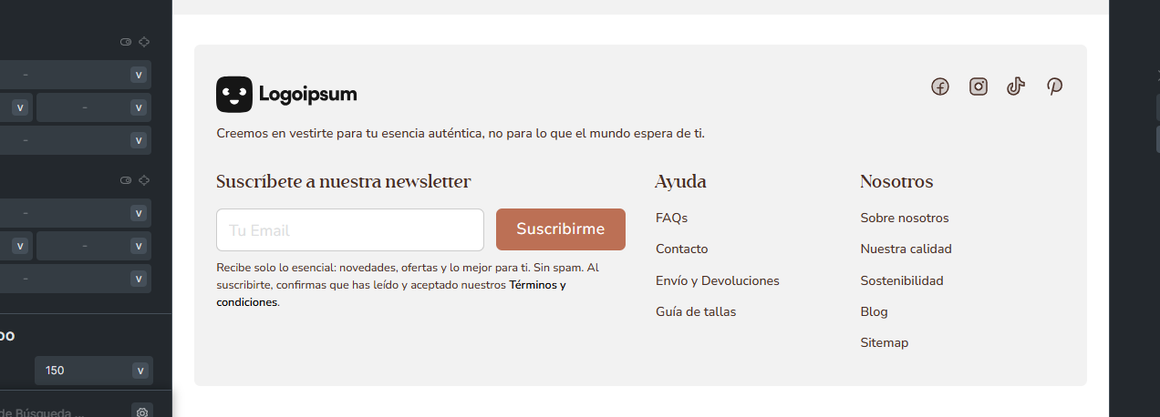
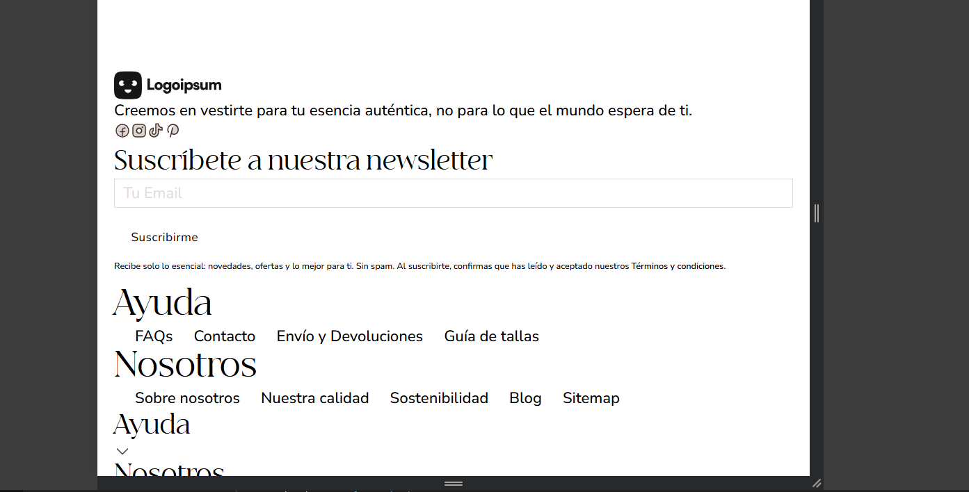
but then when I went back to cahnge something, (just the radius) the structure and style of the footer breaks when in the laptop o larger viewport but when in the tablet or smaller viewport, everything is correct. this issue is only seen in the preview, not in the editor.
Thanks for the link!
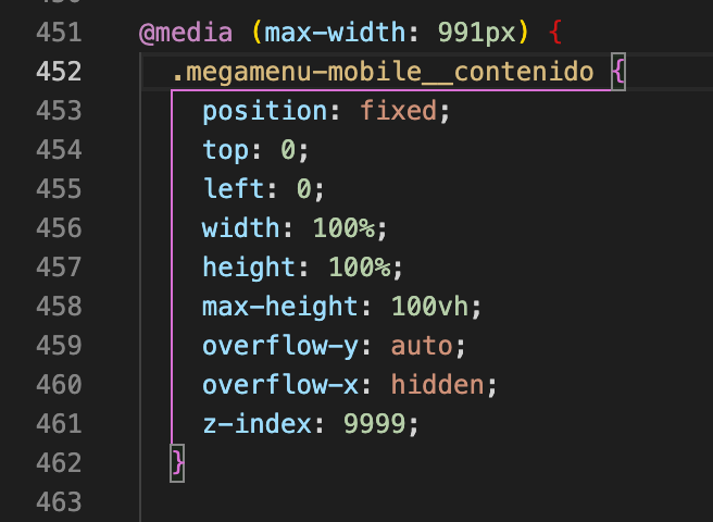
As far as I can see from the styles, there’s an opened media query that isn’t closed properly, causing the following styles to break:
Please check your header template, especially if there’s custom CSS.
Thank you so much! this was the issue I removed it and everything is bakc to normal now. Thank you so much and sorry for the trouble. I should have noticed this.
Before closing this issue, I wanted to point out that this custum CSS I added is because i’m facing an issue with the offcanvas on mobile. the content is not scrolling ( i haven’t checked the (not scroll (body)) in the editor. I searched on the internet, tried chatgpt but with not result to solve this issue.