NO BUG: (Sticky) Mobile Menu Creates Horizontal Overflow (backdrop-filter)

Hi there,
i just noticed a potential bug with the following configuration:

  • Header, set to sticky and full content width
  • Nav element inside
  • Using the following settings for mobile menu EXCEPT FADE IN

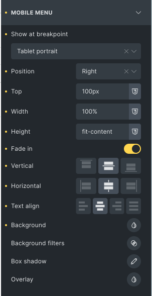
As long as fade in is deactivated, .bricks-mobile-menu-wrapper is causing horizontal overflow.
My guess is it’s due to the translateX(100%) set to hide the menu (*).

Workaround:
Once you activate the fade in option, it doesn’t cause an overflow anymore.


I can share the URL privately if you want to check some details.
I am not assuming issues here but I haven’t checked in detail, if AutomaticCSS has some part in this.

( * on a side note: I am not even sure why it gets pushed out if I don’t select an option for it to that. As an user, I am not expecting that behavior.)

This is what the menu looks like when opened:

Hi Chris,
Welcome to the forum!

Would you please send me the link via DM? Thanks!

Best regards,
timmse

I would like to but can’t: I am too new an user here :slight_smile:
Can you manually grant me DM access?

That’s why I wrote you a direct message you can reply to without any rights. Please have a look in your inbox :slight_smile:

Couldn’t see it before getting the second trust level :thinking:

Thanks for the link! The backdrop filter causes the problem :smiley:
Please see this report for reasons and a possible solution:

By the way, your .blob class also leads to a minimal overflow. You should add overflow: hidden to :has(.blob).

Best regards,
timmse

1 Like

Interesting, never heard of that one.
Thanks for the tip :slight_smile:

If you don’t mind, could you blur or remove the actual website? It’s not meant to be seen yet