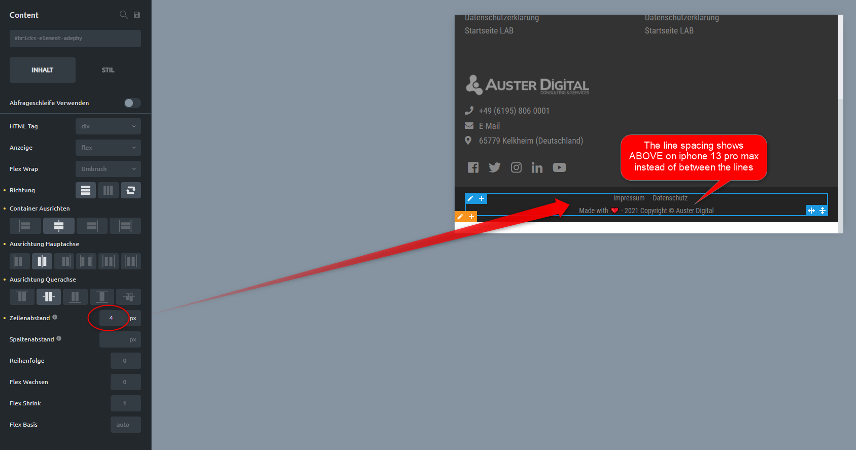
The footline is a container with 2 elements (menu + basictext) in it.
For desktop and tablet it is horizontal.
For Smartphones it is vertical.
And if I define a row-gap for smartphones then this means the distance between both elements.
In the editor it shows correct (vertical distance between elements)
On mobile devices it shows wrong (space above both elements not in between).
I have no clue what you mean with your comment…
Now I saw it, the subject of this ticket was wrong named
Sorry for unwanted confusion…
I’ve exported your template and imported it into my dev site and found the problem: the flex-direction reverse is causing the problem. I need to investigate a bit further, but in the meantime, you can change the order of your basic text element to 1 on mobile, which has the same effect as the column-reverse, except for it is working with gap
As announced, I dug deeper and rebuilt the example without further ado in the simplest form in HTML/css: the result is the same, which shows that it is not a bricks bug.
I’m sorry, but unfortunately, we can’t do anything about it. As long as CSS Grid is not implemented yet, I suggest the solution I have already proposed.