The portfolio section, where we have listed our popular videos is not getting responsive on mobile. When trying to make it responsive or change an element design, it carries over to the destkop version as well. Making it hard to be responsive for both devices
You have a container or so set with the big video in it to 33% width
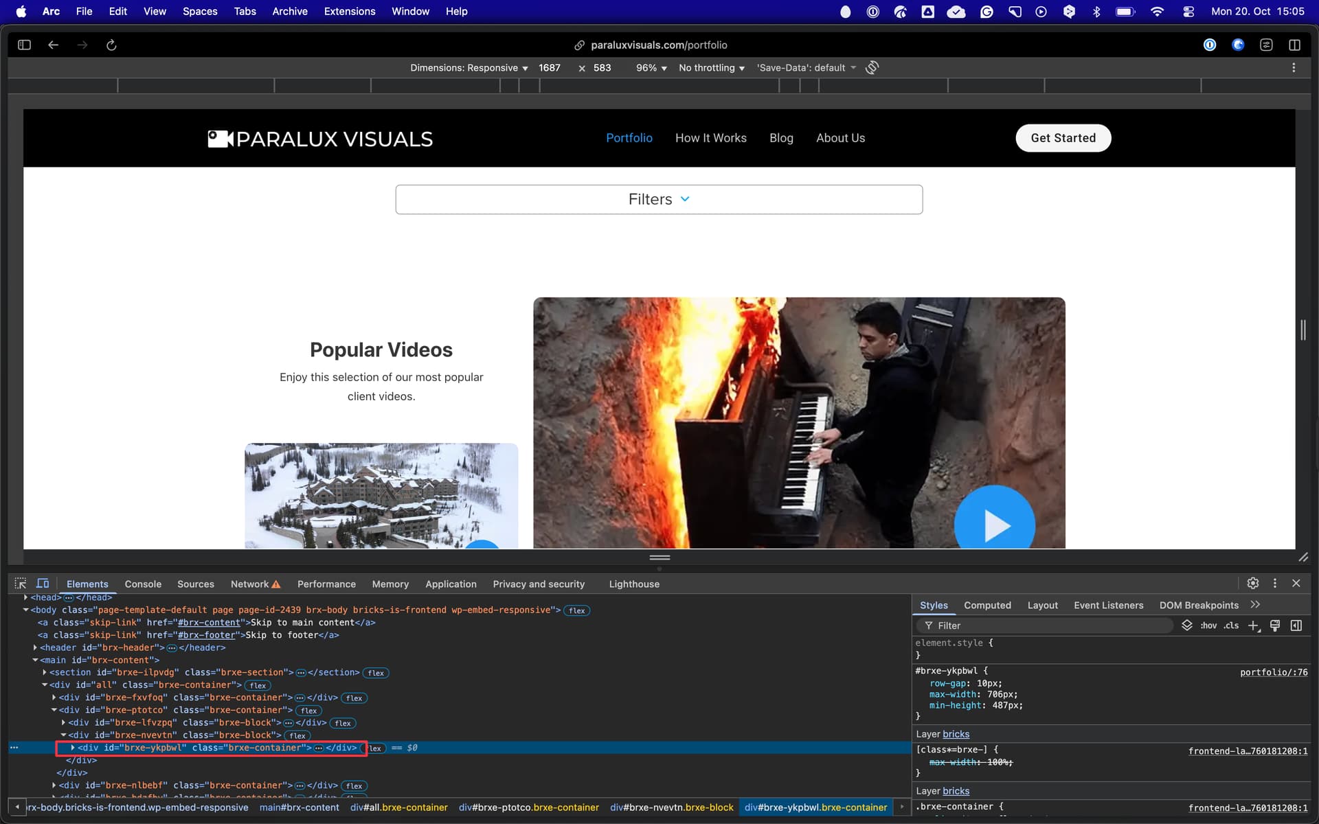
#brxe-nvevtn
That carries over to mobile view shrinking the video.
You can set different values at breakpoints. Main thing is that they carries down. Like pc goes for all, unless you set another for tablet. Then tablet goes also for phone, unless you change phone as well.
Hi Tucker,
Welcome to the forum, and thanks so much for your report!
The reason for the problems is primarily fixed widths (or max-widths), which have to be adapted on smaller breakpoints. 33% is still 33% even on a small breakpoint
Please remove all widths and max-widths/heights from the #all container and the wrapper elements (blocks, containers) within on all breakpoints (or start from scratch)