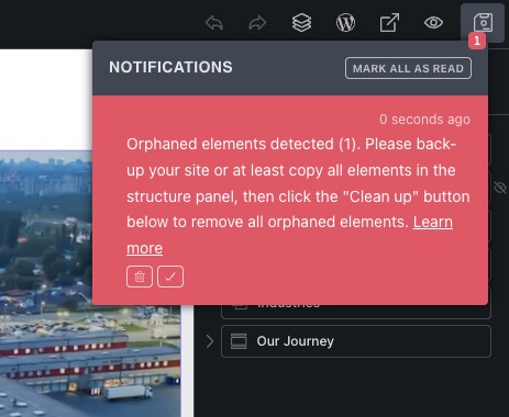
Feel this popup would be better placed in the centre of the screen or give it the ability to move it as it’s not possible to copy all elements in the structure panel (advised in the notice) as this notice covers the structure panel…
I’ll have to mark this as a no-bug, because there is a place where all notifications are shown and you can easily ignore it by clicking the “check” icon instead of “trash” icon.
I strongly suggest that you clear the orphaned elements, though, as there is very little chance that it could mess up the layout (I haven’t heard of this yet), but if it does, you can use history to undo it.
@Maexxx, it’s happening mostly in 1.12.4 (and older) versions, as we fixed the cases that we noticed, but basically, it happens when the parent element is removed from the JSON structure we use to render elements, but the child elements are not.
So the child elements will still be in the structure, but they will not be visible (will not render), because they don’t have any parent.
There is a corrupt data checker inside Bricks settings that will get rid of all those orphaned elements, so you don’t need to see the the error every time: Bricks 2.0-beta Changelog – Bricks
It’s still important that you can review all pages before we automatically remove them, that’s why the notice.
The notification says to ‘click the “Clean up” button below to remove all orphaned elements’ but there is no “Clean up” button anywhere. Can you clarify how we remove them, besides going to the General Settings page and doing the global option? Thanks.
I totally assumed that trash can was to dismiss the notification! Haha. Thanks for pointing that out.
Indeed, I agree about having clear and concise buttons. Keep it simple. The icon choices are not intuitive at all.
Take care.