I created an open/closed indicator in the header using HTML/JS, and it had worked/looked fine but now the header is all sorts of wonky on mobile (and presumably tablet–I don’t have one at hand this second to confirm but it seems likely). None of the styling options are being applied correctly, and the remainder of the page is thrown off as a result.
The weird thing is that the mobile version of the header looks perfectly fine inside of the Bricks Builder, but the second you navigate to the frontend on a mobile device it looks terrible.
For the life of me, I’ve not been able to isolate the issue. As this is a client website, I don’t want this problem to continue forever so instead of continuing to try to troubleshoot, I’m here for help.
Tablet breakpoint is 991px. Mobile-landscape i s 767px. Mobile-portrait is 478px.
I’m inclined to believe that a lot of the rendering issues are from a single issue because this all started happening at once, and I haven’t made any major changes in a couple of weeks and I just don’t have the breadth of dev knowledge to fix this on my own.
In the editor, the page looks exactly as it should and did.
It would have to be the whole site because they weren’t local changes. And not all at once. So like I’m bouncing back and forth between templates trying to find where I may have added something weird but I don’t do a ton of coding by hand for this very reason.
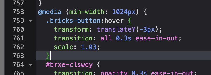
Would you mind me asking how you uncovered that? Because I scrubbed through the page’s SOURCE CODE and breezed right past like 20 times and missed that single bracket throwing everything off. So I was just curious if maybe there’s like a tool or technique you used to sort of narrow things down? Then I wouldn’t have to bug anyone else…
usually, when there is an issue like this, I copy-paste different styles from the page source to the Visual Studio Code, where I can format the CSS, and if there is an issue, it will mark it with red - that way it’s very easy to see issues like this


