Browser: Any
OS: macOS
When you click on a mobile menu item that has a sub-menu, its icon shifts to the right:
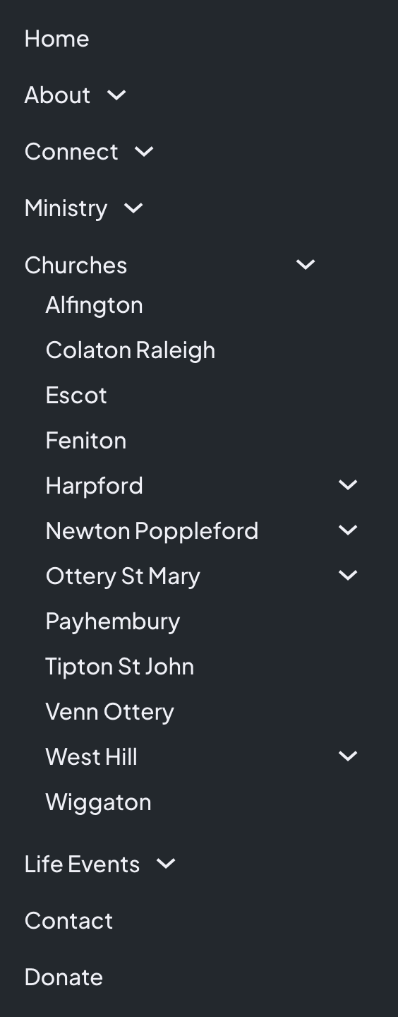
Before opening a submenu:
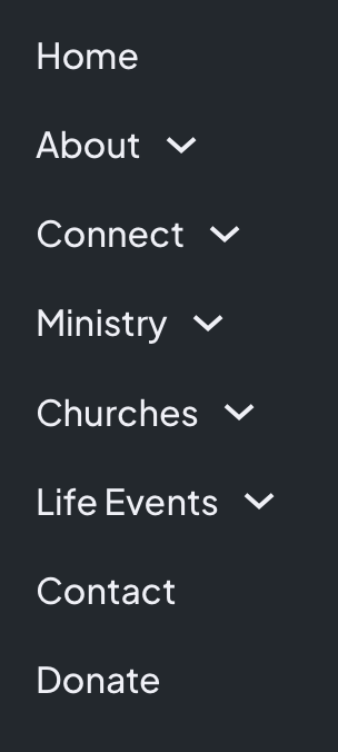
After opening the Churches submenu, its icon has shifted to the right:
Browser: Any
OS: macOS
When you click on a mobile menu item that has a sub-menu, its icon shifts to the right:
Before opening a submenu:
After opening the Churches submenu, its icon has shifted to the right:
Hi Simon,
Thanks so much for your report!
Can you provide me with a live link so I’m able to take a look at the styles?
Best regards,
timmse
Hi Stefan,
Take a look at Home – Otter Vale Churches. Shrink that page to get the mobile menu and then go click on any of the dropdowns. You will see the icon move to the right. It’s clearly moving out to the edge of the submenu but it would be better visually and for usability if it stayed where it was originally.
Thanks
You’ve have set space-between to your submenu toggle.
.brxe-nav-nested.brx-open .brx-submenu-toggle {
justify-content: space-between;
}
You can use " justify-content: start" or don’t use justify at all.
Hi Martin, you’re right but I didn’t set it! This is the default Bricks value.
For anyone else, you can change it by selecting a dropdown in the structure panel and then going to content > item > justify content and selecting start.
I tried creating a custom class to do this rather than setting it at the ID level but it is being overridden by:
.brxe-nav-nested.brx-open .brx-submenu-toggle {
justify-content: space-between; }
So in the end I just added this as custom css to nav nestable on the breakpoint the mobile menu appears and set it to justify-content: start.
@timmse, we can set default styling for dropdowns at the nav nestable level but this doesn’t include the justification. Perhaps it should be added so it doesn’t have to be overridden using custom css or by having to edit every dropdown?
Thanks, Martin, for joining!
@simon .brxe-nav-nested.brx-open .brx-submenu-toggle is way more specific than a single class and, therefore, cannot be overwritten with a single class. Unfortunately, this cannot be avoided due to the menu’s complexity.
Instead of editing every single dropdown you could also use the mobile menu “align items” setting:
Align items doesn’t stop the icon jumping to the right when you open the submenu, all it does it align all the icons to one side or centrally. The only one that stops the icon jumping is justify-content. That’s why I find it odd that it is not set to start by default.
When I set flex-start in the top level, nothing jumps for me, not even in nested dropdowns. Please test this in a new, simple menu and see what happens. The less factors/settings, the easier it is to understand (as I said, especially with such a complex element).
We think it makes sense that the whole menu item is clickable and the user has the maximum space available, which is mainly an advantage on mobile. Therefore space-between is the default.
I’ll take your word for it as I don’t have time to create a new menu and test it I’m afraid.
I already poster this in a different topic (SOLVED: Nav menu>Mobile menu - text not center anymore)
But here is better, yes I too have this problem:
The menu item that has a submenu in it is not centered and when opened (if the submenu item names are longer) the icon is way off to the right… Screenshots on 1.8.1 and 1.7.3 below.
I was able to fix this in 1.8.1 by adding the following css:
for the icon not to be far right:
@media (max-width: 780px) {
.menu-item-has-children {
display: flex;
flex-direction: column;
align-items: center;
}}
for the menu item to be centered as possible:
.bricks-mobile-menu .brx-submenu-toggle {
margin-left: 25px
}
This is a fresh local install, only bricks no plugins…