Hello,
I build a website and in the mobile version altough i see it correcty in the builder, when i view it on th site is looks very different.
Any thoughts why that might be ?
Hello,
I build a website and in the mobile version altough i see it correcty in the builder, when i view it on th site is looks very different.
Any thoughts why that might be ?
You’ll always need to share the URL for this type of thing, there’s no way to know from a screenshot.
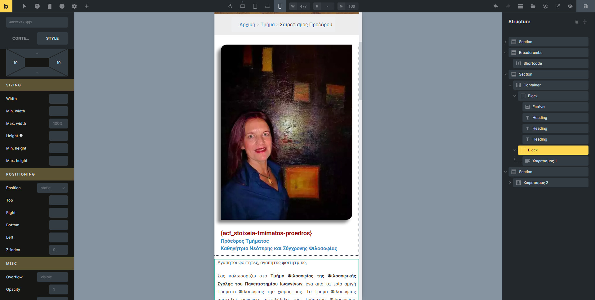
I am sorry, you are right… here it is
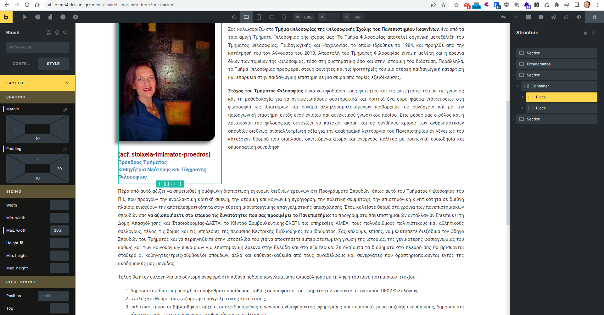
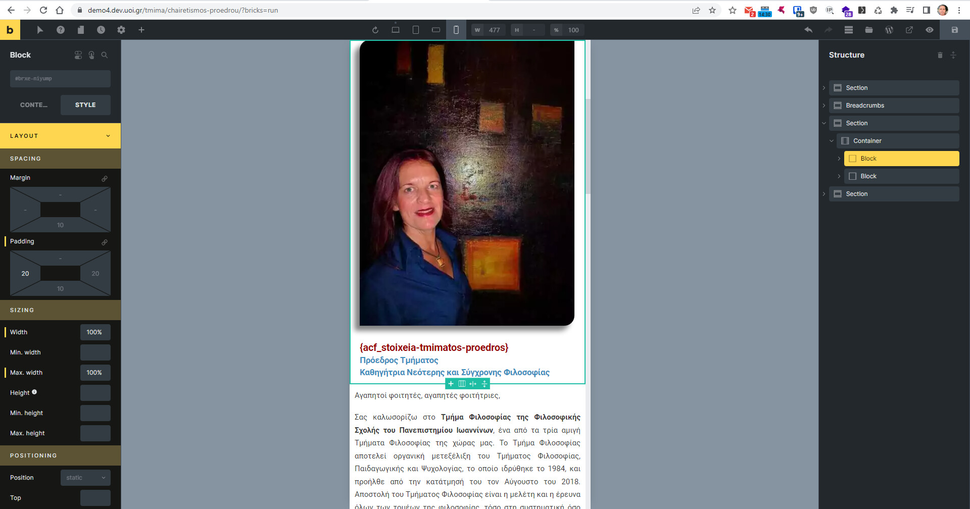
There’s a max-width of 33% on the div surrounding the image, would need to be set back to 100% for mobile.
I might be stupid but i don’t understand.
I have a container with two blocks and i want in desktop view the first block to be 30% of thw container width and in mobile view to be 100% and the second block to go bellow.
What am i doing wrong ?
I see now that each block takes 50% of the container width and even if i set the first block to 100%, it takes 100% of the 50% and not 100% of the container width.
You’re adding the max width 100% at the wrong breakpoint. below 478px looks fine, which is why it looks fine in the builder. higher than 479px is where the 33% max width is added.
I recommend always using chrome dev tools, as it makes it easy to see the widths where it’s going wrong…
See how below 478px it looks the same as in Bricks, but above that it’s too small because of the max-width setting.
Thank you might not be enough !!!