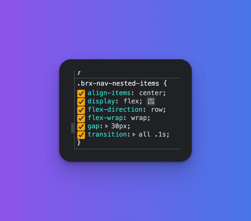
The nav items container has flex wrap applied by default.
This should ideally not be there as it is unnecessary default styling and we have to turn it off once we add more items in the menu
brx-nav-nested-items
The nav items container has flex wrap applied by default.
This should ideally not be there as it is unnecessary default styling and we have to turn it off once we add more items in the menu
brx-nav-nested-items
Hi Dan,
flex-wrap ensures that the menu items wrap automatically if there is not enough space. Without the wrap, they would be squashed and accordingly, it is definitely not an unnecessary default styling.
Nice one without flex-wrap, especially on lower breakpoints 
Best regards,
timmse
Fair play - i do not know what was happening earlier but all my header links were lined up in a column, when it was set to row and was all over the place, removing wrap worked but a fresh install works properly now.
It seems ‘flex-wrap’ has since been removed? This now causes the issue you show above @timmse
Here is a vanilla Nav element with Mobile Menu > Show at breakpoint > Never
When the screen is narrow they break out of the container: Menu test – Try Bricks – t999d618
Hey Sly,
This report is about the nav nestable element, not the „regular" menu element. There you can either set the alignment manually (column/row), or add
.brxe-nav-menu .bricks-nav-menu {
  flex-wrap: wrap;
}
Thanks I have used the custom CSS for now.
Can you tell me what you mean by ‘setting the column/row manually’?
Switch the menu alignment from horizontal to vertical if there’s not enough space.