Browser: Opera
OS: Win 11
Video: Bird Eats Bug
Hey Stefan,
Apologies if this is not a bug, but not sure as it does not feel how it should behave, so I want to check just in case.
Many thanks
Mick
Browser: Opera
OS: Win 11
Video: Bird Eats Bug
Hey Stefan,
Apologies if this is not a bug, but not sure as it does not feel how it should behave, so I want to check just in case.
Many thanks
Mick
Hey @Michael, did you check it on the frontend (or put an element into the empty block element)? This might just be related to the fact that the empty block element in your example gets a minimum height in the builder (so that the user can easily work with it, put other items into it and so on). So the 100% height of the div + the minimum height of the block are causing the overflow in the builder.
Whatever it is: the object-fit: cover setting has nothing to do with it. The image never overflows its elements bounds.
Hey @aslotta
Yes checked on the front and seems its more broken 
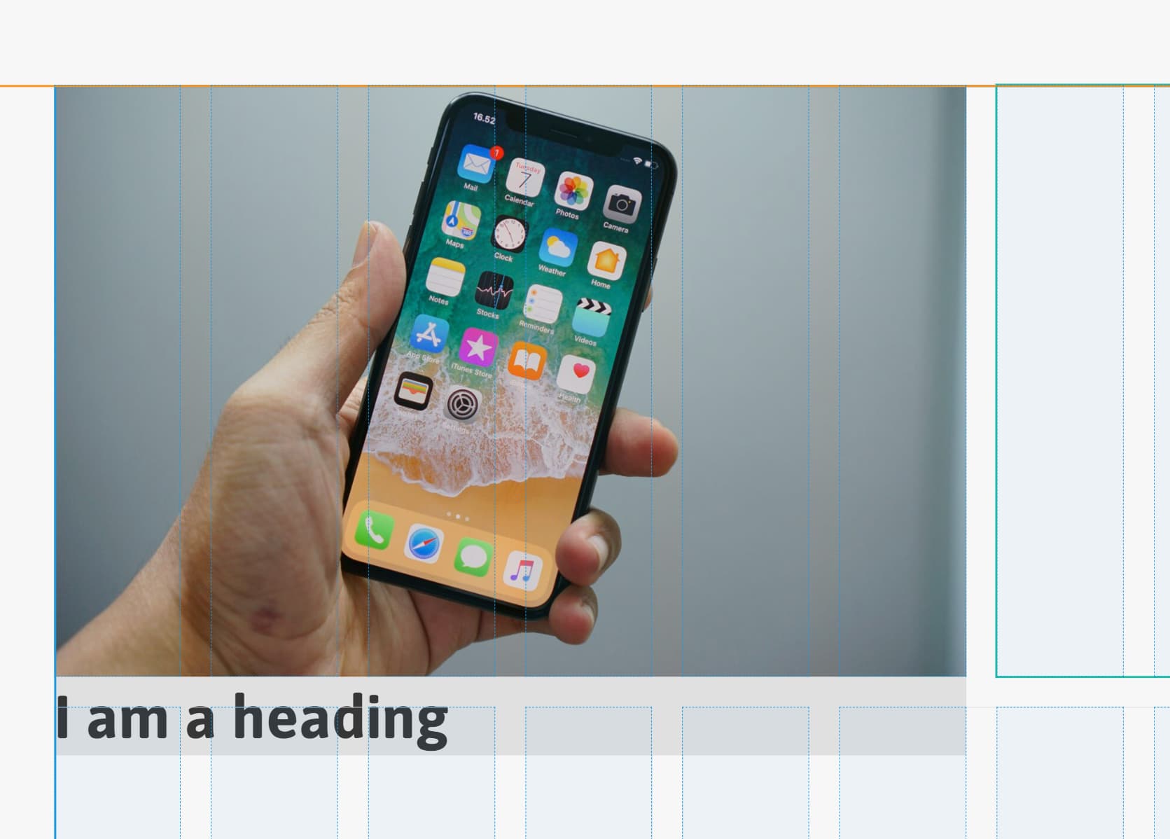
Here is an image with an element inside of it
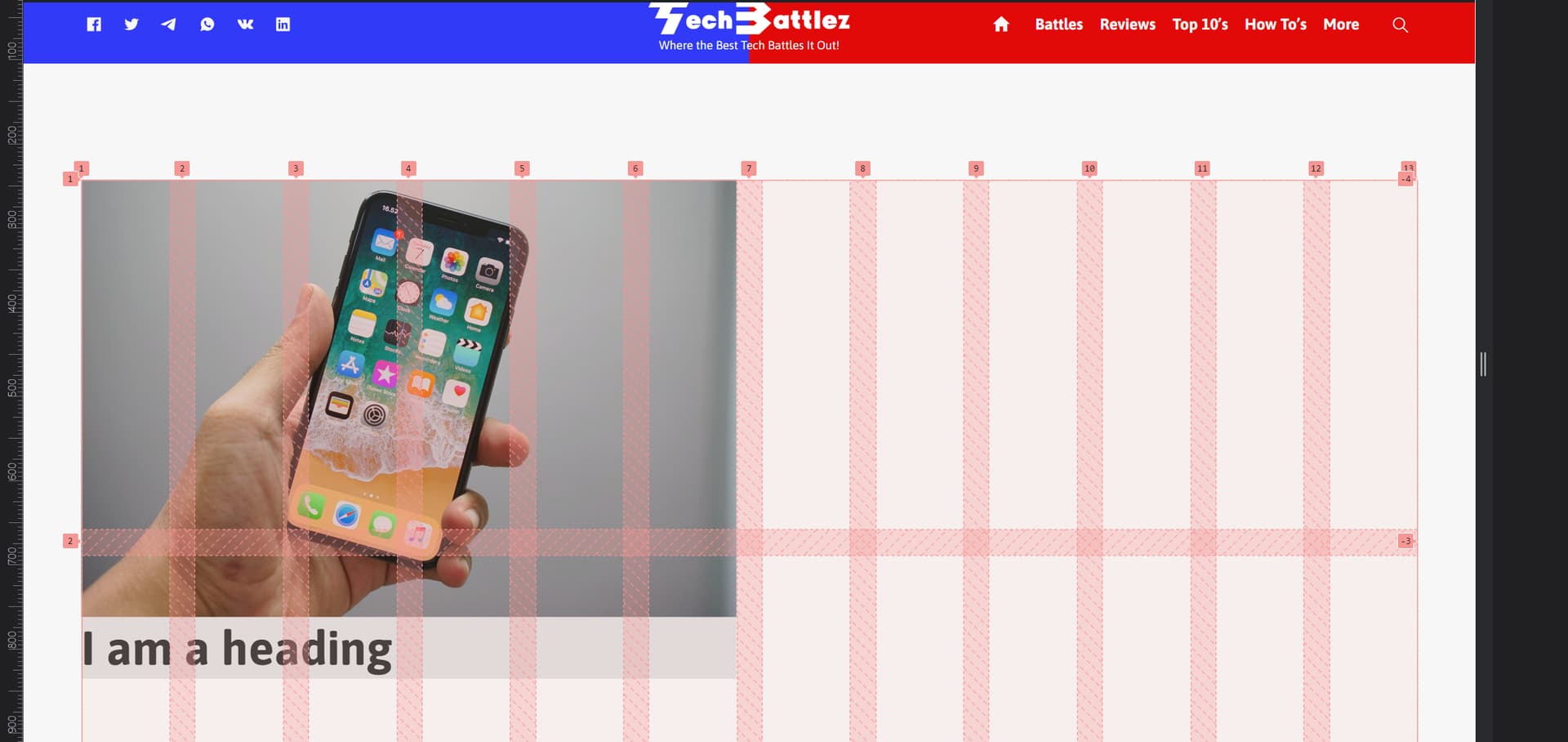
And here is the front end
I have a feeling it has something to do with using VH as height for the rows possibly?
It’s not a Bricks bug, the same would happen if you added the same CSS outside of Bricks.
You’re basically setting both the height and the width of the grid item (forcing it to be the six columns with the 1/7, and then also be exactly 45vh) and then adding content inside which doesn’t quite fit that height at certain screen widths.
The solution will depend on what you expect the grid to do, eg for this content would you want the content height to be reduced to 45vh? - meaning the image would no longer take up 6 columns, or for it to always take up 6 columns, and for the row to adapt size to be the size of the content, rather than always the strict 45vh.
Hi David,
Thanks for the reply, Yeah I had an inkling that it was not a bug and perhaps down to CSS understanding.
The part that throws me off is why would the image not take up only the available space when set to object-fit:cover, even if it is 1px it would only show 1px worth of image regardless of size as it would do in say a flexbox container?
Does Object fit not work with CSS Grid?
I am not overly familiar with GRID, But what I was looking to achieve is a 2, 3, and 4 grid structure that is responsive that has more prominence in terms of size for the items at the top. Pyramid style I guess.
Hey @timmse
I appreciate you have marked this as no bug, but I come across it again.
This time the grid container does not have an explicit height and only a repeat(12, 1fr) on the grid container width.
Image is set to object-fit: cover ( it makes no difference giving the image a width, height or width and height of 100%), I also tried wrapping it in a div and setting the width and height on the div to 100% (100% of the grid item) too, but as soon as I add the image it extends the grid.
I had a look for solutions online, and they all just seem to add object-fit: cover?
What I am trying to achieve in this scenario is the image to take up the space in the grid cell created by the content added to the cell to the side of it.
Kindest Regards
Mick
You’ll have more luck if you instead post in the how-to and provide the URL with your current attempt, so people can see what CSS is being added and where it’s going wrong. It won’t be a Bricks’ bug, as it’s related to just the CSS that is controlling the layout. (it may not be looked into here, as it’s not a bug)
From what you’ve wrote, it may be that you’re misunderstanding what object-fit cover does. Object fit won’t change the height/width or positioning of the image. It’s only to prevent the stretching of the image, within the same original space (which will be all controlled by the grid)
Hi Michael,
The image in your screenshot has an intrinsic size that is larger (higher) than the content. Accordingly, the height of the row grows, because the image would not fit in there otherwise. This is not changed by object-fit.
If you change the image size to thumbnail, for example, you will see that the height of the row is oriented to the left column, because the content is now higher than the image. Then object-fit would take effect to adjust the image to the row/content height.
However, there are two possibilities:
In both cases, remember that the image wrapper needs a minimum height when you switch to a single-column grid.
Do you have a link with a concrete, plain HTML/CSS code example?
Best regards,
timmse