Browser: Chrome 110 OS: macOS / Windows / Linux / etc. URL: Link to a page that illustrates this issue Video: Short screen recording that illustrates this issue (free tool: jam.dev)
Hey I’m new to bricks and I’m learning to use it.
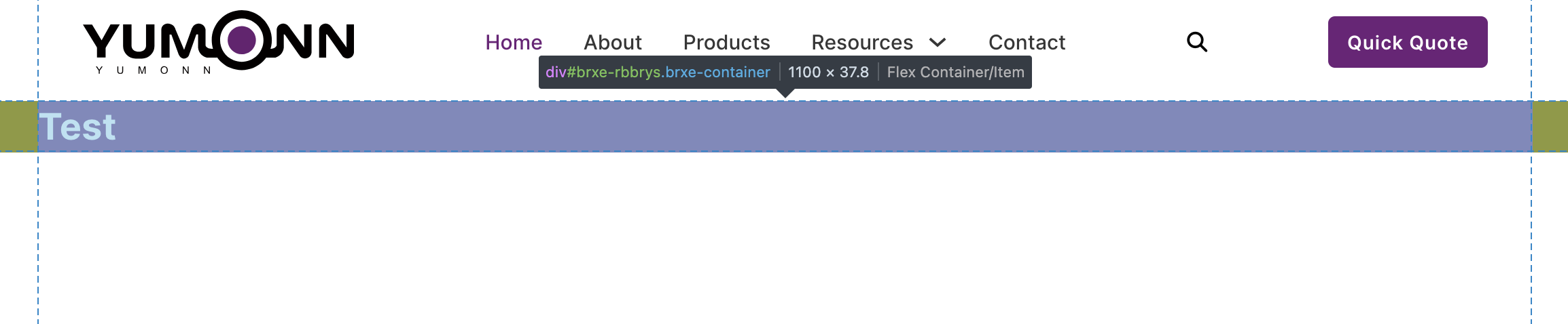
I want to know why the container’s width is not the same as the one on the frontend?
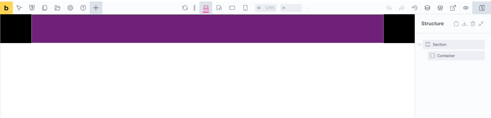
For example, I dragged a container with the width defaulted “1100px”, with the section background colored black and container background colored purple.
I can’t replicate the issue locally. It should be the same in the backend and in the frontend. Do you have a link to the website, where I can see this container?
Maybe you have some other CSS, that overrides your container width?
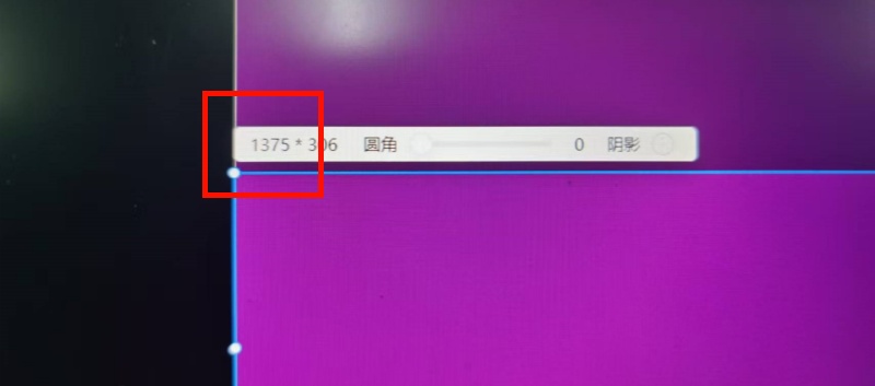
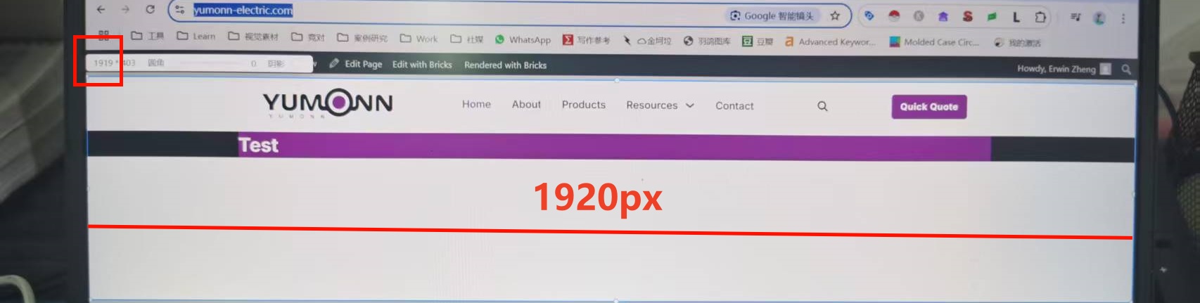
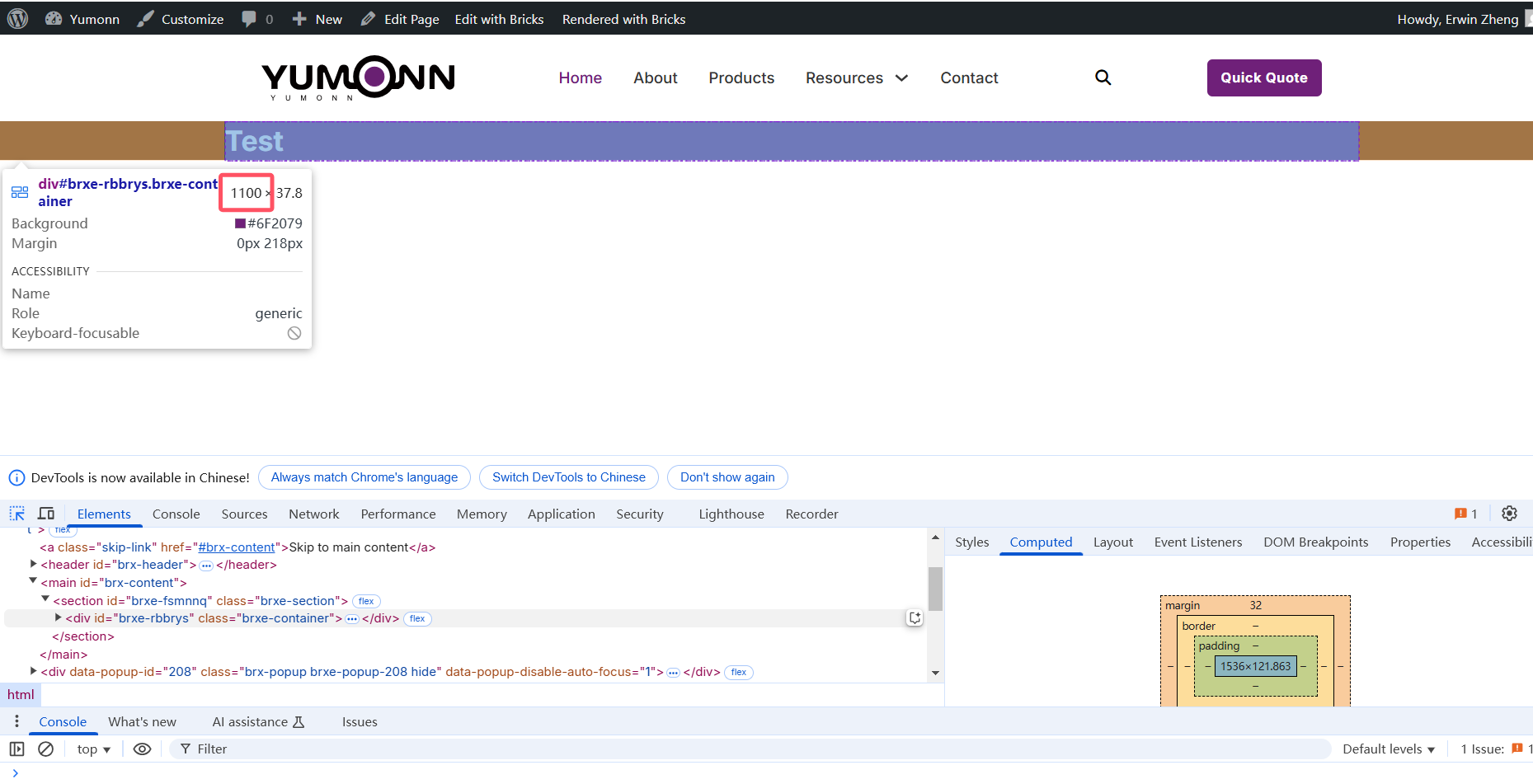
as you can see, if I check the website by developer view on my desktop, it’s indeed 1100px width, but if I use other tool to measure, it seems different.
Here is the thing, in my previous building experience, I always set the content width of 1600px,
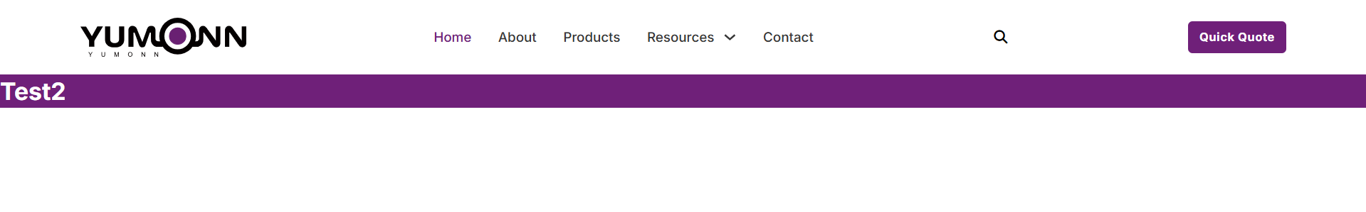
This time ,If I set the element-container width from 1100px to 1600px, as you can see the from the screenshot above, the container is 100% width, around 1920px. why does it happen, do I set something wrong?
I’ll mark this topic as no-bug, as it’s not a bug The value that developer tools are showing is the correct one.
From the screenshot that you posted above, we can see that your screen size is actually 1536px, and not 1920px - unless there is something on the sides that I don’t see.
So, when you set it to 1600px, the width would be 1536px, as that’s 100% of the screen - which is set by default, to not cause overflow.
I believe that if you measure the width of the screen with developer tools, it will not be 1920, like you indicated.
My guess, why is this confusing, is because different devices, with different settings, has different Pixel Density. One CSS Pixel is not always equal to 1 device pixel. If you check the linked article, you see what I mean.
Same would apply if you zoom the website or have some scaling set up in the OS settings.
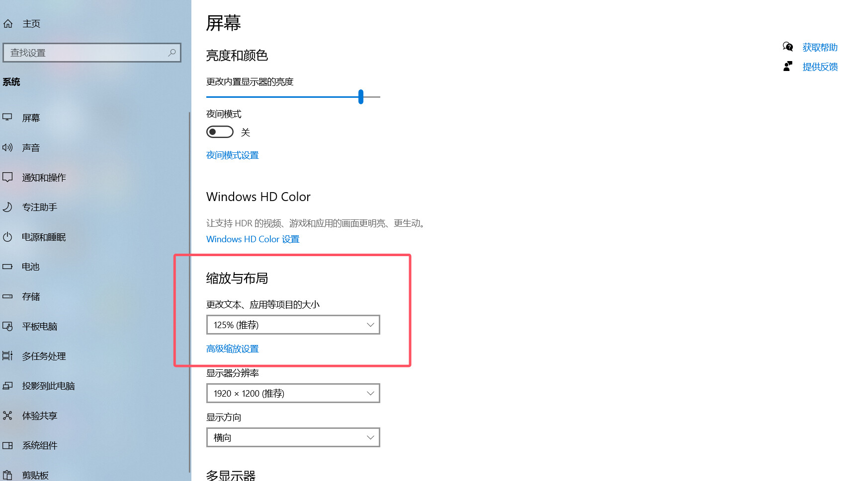
Hi @Matej, I’ve found the culprit! The laptop I’m using has its default Scaling and Layout set to 125%, which caused the discrepancy in the resolution. After adjusting it back to 100%, the issue was resolved.
 The value that developer tools are showing is the correct one.