Browser: Chrome, Edge, Firefox
OS: Windows/Android
URL: https://macconvention.ca
Video: MAC Convention 2025 – Turning the Tides — Mozilla Firefox - 31 March 2025 | Loom
I have been working on this for a few days now and can’t figure it out.
- My site has horizontal scrolling on mobile
- My site has no horizontal scrolling on desktop
- Once the site width is less than 530px a horizontal scroll bar appears
- This only happens on the front page
- Once I scroll past the hero section, the horizontal scroll bar disappears and never reappears until I refresh the page
- It disappears when I disable the Hero section of the front page
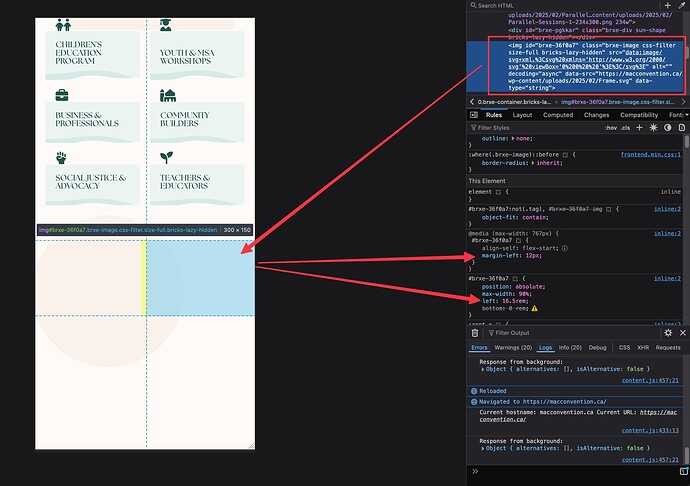
- Inspect element doesn’t show any elements wider than the screen
- Currently the hero section is just a two column grid container with an image and some text - I have tried rebuilding the hero section in multiple ways but I always run into this issue
I have tried
- Using overflow hidden
- Changing the site width
- Making the header sticky
- Adjusting padding and margin to 0
- Adding in width of 100%
My website is macconvention.ca
